How the mobile revolution is challenging open source user interfaces

No readers like this yet.
Different cell phones

Opensource.com

In the past couple of years, a powerful paradigm shift has occurred in user experience (UX) design. UX designers used to focus on desktop users but now, mobile devices and mobile users are at the center of attention. The evidence for the importance of this paradigm shift is stifling: Morgan Stanley predicts that by 2014, mobile users will exceed desktop users. Google’s executive chairman Eric Schmidt says that "if you don’t have a mobile strategy, you don’t have a future strategy."

Most importantly, this shift is not exclusive to consumer software or proprietary software; enterprise and OSS vendors have now begun creating their user interfaces with a mobile approach in mind, too. The mobile revolution has shown users how a simple experience can be much more satisfying than complex and crowded interfaces. Reduced screen space forces designers to focus on what’s really at stake for the user, which in turn leads to UIs that are increasingly decomposed to their bare essentials and therefore much simpler to use. And simplicity leads to more effective usage, higher productivity and lower training and support costs.

The mobile revolution is all-encompassing, and it has put quality UX design in the spotlight. Every digital business - be it open source or not - needs to face this challenge. “Creating mobile user experiences that delight users forces us to rethink a lot of what we have taken for granted so far with desktop design”, says UX strategist Lyndon Cerejo. He’s right: the mobile revolution requires a huge amount of re-thinking from UX designers. A good starting point for that process is an evaluation of changed user expectations.

Understanding new user expectations

The mobile revolution has had many consequences, but the one most relevant to good UX design is how users’ expectations are changing. After all, it is these projected expectations that guide the professional UX designer’s strategy. What are those changed expectations? Let’s take a look:

  • Mobile users want a seamless, minimally disruptive user experience that is enjoyable, not painful and cumbersome.
  • Mobile users want to use their software on touch-based devices the same way they use it on the desktop. What works on the desktop has to work as well, if not better, on a mobile device.
  • Apps have turned mobile users into multi-taskers. Apps split different tasks into manageable portions and allow users to work on various tasks in parallel, while keeping a clear focus.
  • Mobile users want to be aware of, and kept up-to-date with, all that’s happening in their environment, at all times. 
  • Mobile users want to customize and personalize their devices to reflect their own needs and personalities. 

If you have a smartphone or tablet, you’re probably aware of these already. For instance, you’ve certainly personalised your device, and you’re probably used to encountering highly usable interfaces.

Open source software and mobile-inspired UX design

Those expectations are directly responsible for mobile trends and new design principles. There are a number of OSS projects that have taken up those expectations and that have designed mobile-inspired user interfaces. Here are two examples:

  • Ubuntu’s Unity desktop is reminiscent of interfaces we know from the mobile world, and consciously so. “Ubuntu will power tablets, phones, TVs and smart screens from the car to the office kitchen...While the interface for each form factor is shaped appropriately, Unity’s core elements are arranged in exactly the way we need to create coherence across all of those devices”, says Ubuntu founder Mark Shuttleworth. Ubuntu’s Heads-Up Display (HUD), Dash and app launcher help users be even more productive by being able to access app functionality from the keyboard, while on-screen notifications and indicators provide real-time information on the system. Speed, convenience and real-time information: three key principles of Unity’s design that have been reinforced by mobile trends.
  • Plasma Active is an open source project to produce a touch-oriented interface for “all types of tablets, smartphones and touch computing devices such as settop boxes, smart TVs, home automation or in-vehicle infotainment”. Plasma Active has taken the mobile user’s new expectations and transformed them directly into their UI. The navigation is intuitive (all the more important on smaller screens), highly customizable and adaptable to the user’s tasks and needs. “Activities” are used to group apps, widgets and contacts that contextually belong together, while widgets help users accomplish  specific tasks or retrieve focused information. Users can personalize and tailor activities to their needs by adding files, apps and even websites to them. 

These are just two examples of how open source products are changing with the times, by leveraging the trends in mobile UX design and the corresponding changes in user expectations to produce innovative new interfaces.

Magnolia CMS 5.0: The first mobile-inspired CMS

After exploring mobile trends and how they affect open source UX design, let’s look at how Magnolia, a Java-based and open-source Content Management System (CMS) tackled those challenges. At Magnolia (full disclosure: I’m the CEO), we take those new user expectations and the trends that go with them very seriously. In 2010, realizing the need to create a fresh and smooth user experience to support all the new features planned for Magnolia 5, we hired a dedicated UX designer, Andreas Weder, and charged him with the vision for creating a truly new user experience for the browser-based Web interface of Magnolia CMS.

The result of our hard work, Magnolia 5, is scheduled to be released in Spring 2013. We demonstrated it for the first time at our fall conference in September 2012, and recently released the Alpha 1 preview along with a screencast.

Design goals

Andreas and his team developed designs and ideas for Magnolia 5 that are heavily inspired and influenced by metaphors and interfaces from the mobile world and that bring related concepts to our browser-based interface. They strove to make Magnolia’s new user experience as intuitive and enjoyable as using apps on a smartphone. Their primary design goal was to ensure that ease of use and customization were features that should not be restricted to a tablet or smartphone. In sum, we envisage a CMS as simple and flexible as a smartphone.

Design implementation

Building on these goals, Andreas and his team came up with some innovative ideas. The key design concept was that Magnolia 5 should be “driven by touch”:  Andreas aimed to be as close as possible to the mobile world while designing. He tested and improved his mock-ups on a tablet first. Decisively enough, he finished the UI for the tablet first, too, before adapting it for the desktop.

Throughout the whole process, mobile users and their expectations were what Andreas was focusing on. Knowing those changed user expectations was paramount to designing the new user interface for Magnolia 5. The result is clear: Magnolia 5 on iPad has a stunning, native feel to it.

Other key ideas of the Magnolia 5 UX include:

  • Apps: Magnolia 5 introduces Apps to reduce the complexity involved in CMS publishing workflows. Magnolia’s apps will be similar to the ones found on Apple and Android mobile devices. This new approach is designed to help content authors focus on closely-related tasks, by providing them with all related and necessary functionality in a single App.
  • Pulse: Pulse gives content authors and teams real-time information about content changes, warnings, and statistics. Every time a user goes back to Pulse, he or she will realize at a glance what has happened to the elements being worked on. If there is a problem or something that needs a quick solution, the user can react to the issue directly within Pulse.
  • Favorites: Favorites allows authors to improve their efficiency by adding custom shortcuts to frequently-used actions, as well as bookmarking sites they need to edit often.
  • Improved Navigation: The Magnolia 5 Apps screen serves as a central hub for all the tasks an author can do with Magnolia. The user can switch between Apps using the Apps screen, keyboard shortcuts or even a swipe gesture if using Magnolia on a tablet. There is also an action bar, that shows all actions that can be called on the currently selected item. These navigational features reduce the learning curve for new users and make it easier to perform common tasks.

Many of these elements are visible in the following screenshot of the new Magnolia 5.0 UI, running on an iPad (you can see more examples here).
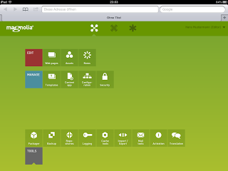
Magnolia 5.0 UI

Design collaboration

An important lesson that the mobile revolution taught us is the importance of collaboration and participation - something that the OSS community has naturally always understood. Throughout the UX design process, getting feedback and buy-in from customers, partners and users is critical to arriving at a result that is satisfactory to all. That’s why at Magnolia, we started communicating information about the new release and its revolutionary GUI very early, despite it not being production ready. These are the main channels we used:

Conclusion

The paradigm shift from desktop to mobile has put UX design in the spotlight, because the mobile revolution has shown users and designers that a quality UX can be done in a much simpler and more effective way. Nowadays, mobile users expect a flawless interface that caters to their needs and gives them a seamless and intuitive experience. Open source projects have increasingly recognised these trends in recent years and acted on them by releasing mobile-inspired UIs. Magnolia 5 (to be released in 2013) is a prime example of this trend: driven by touch, its Apps, Pulse and Favorites epitomize everything a user expects of an open source CMS in the mobile age.

User profile image.
Pascal Mangold is the Chief Executive Officer (CEO) and Co-Founder of Magnolia and has had over 15 years of software development and sales experience. At Magnolia, he oversees sales, business development, budgeting, and financial controlling. Pascal leads all graphical user interface design efforts of Magnolia software products.

16 Comments

*shudder* Blech. Metro-style UI.

Why is it that everyone seems to think that kind of over-saturated, funhouse-colored, throw-back to the hardware-limited 20th-century flat UIs is somehow essential to writing a good, responsive, touch-friendly UI?

I'm sure some people will disagree, but I just can't stand it. I guess I'll stick with either custom WordPress themes and plugins or even more custom Django-based solutions for the site renovations I'm currently working on.

Agree. Worst part for Windows 8 is, that you cant even recognise, what is simple picture and what is button anymore.

I've not actually played with Metro UI, so I don't really have an opinion there.

What touch-friendly UIs do you regularly use and like (and why?)

Finally, are you wanting to use WP plugins or custom Django-based code for presenting touch UIs to content editors or to end users (or both?)

My main problem with Metro is that, in many ways, it sacrifices not just desktop usability, but principles which apply universally in the name of an art style.

For example, while the screenshot in the article doesn't look quite this bad, Windows 8's de facto official implementation of Metro look and feel doesn't clearly indicate what does and doesn't respond to clicks/touches.

Another bullet dodged in that screenshot is how the live tiles make it difficult to quickly identify a specific application so you can click/touch it.

Finally, as a matter of personal taste, I just think that flat design is a huge overreaction to excess skeuomorphism and that using it is an equally large design mistake.

As for touch-friendly UIs I use regularly, circumstances have conspired to keep me only working with them for others to use.

I use them when I'm out or need to test one of my creations and I borrow a smartphone from a friend or family member, but the only portable device I've found where the benefits outweigh the downsides enough for me to own it myself is the old 600Mhz version of the <a href="http://www.openpandora.org/">OpenPandora</a> palmtop PC which:
<ul>
<li>...uses a resistive touchscreen (stylus/fingernail without multi-touch. Doesn't respond to the fat-finger touches.)</li>
<li>...runs Ångstrom Linux with a <a href="http://boards.openpandora.org/index.php?/topic/2189-what-does-your-pandoras-desktop-look-like-share-screenshots-here/">normal Xfce desktop</a> (A mouse-oriented UI with fonts and icons set bigger than the old 800x600-era defaults and single-click mode enabled)</li>
<li>...Has a hardware keyboard and D-pad mapped to arrow keys which are often used for UI navigation</li>
</ul>

I also don't own anything like a tablet PC for home use because I'm a bit obsessive-compulsive about smudgy screens and my <a href="https://en.wikipedia.org/wiki/File:PRS-505_IMG_0579.jpg">Sony PRS-505</a> eBook reader is still working perfectly.

Thanks for engaging!

I've not used anything Windows in over a decade and wonder what I'll think. I'll have to putz around with some Metro devices and see what my experience is.

I didn't participate in the design process from the Magnolia 5 UI, but I am helping with the user interface guidelines, so I'm not as biased as if I was the designer, but I'm still far more biased than a third-party non-dev seeing the interface for the first time. :) My initial experience was that if something looked clickable, it was. Some of the touch actions weren't intuitive to me until I accidentally did them (like swiping between active apps.) Are you curious enough to download Magnolia 5 and try it?

I don't understand what you mean by "... the live tiles make it difficult to quickly identify a specific application so you can click/touch it." Can you explain in other terms?

(Edit: Aha. You mean something like, "In Metro UI, the live tiles make it difficult." and not, "In Magnolia 5, ..." as we don't use live tiles (but who know, we might in those few cases where it makes sense – like a calendar app that displays the current date on its icon.)

Personally, I don't have a strong pro-/anti- position on skeuomorphism. I'm more of an implementation wonk – I'll generally pick a brilliant implementation of something that breaks all the "rules" over an average implementation that follows current best practice.

No, I do NOT want the same interface on my phone and on my desk. They serve different purposes and fulfill different tasks. When will UX designers relearn this very basic concept?

Thanks for the comment!

This indicates to me that we should have put a stronger emphasis on how the UI changes between devices with different form factors.

If you take a look at the last two images in the Magnolia 5 screenshot gallery on page <a href="http://www.magnolia-cms.com/magnolia-cms/on-the-pulse/gallery.html">http://www.magnolia-cms.com/magnolia-cms/on-the-pulse/gallery.html</a>, you can see an example of how we change what controls are shown to a user based on what device they are using.

Your design team, like far too many others these days, still doesn't get it. People do not need a UI which takes up so much space on a desktop. People do not need a UI which places itself at the center of the interaction.

If a computer's OS and UI get between the end user and his or her task, then they have failed at their most basic requirement. The OS and UI need to facilitate the ability for each person to work at his or her own pace in their own way.

Every. Single. Tablet Inspired. UI. fails at this very basic requirement when it is forced onto a desktop. Desktops are _different_. They are used for _creation_, not consumption. The UI MUST get out of the user's way as much as possible. When it must be invoked, it must be discoverable. Anything else is an annoying distraction.

And btw, I have yet to see a tablet inspired UI which handles multiple monitor set ups gracefully. Does yours?

Thanks for sharing your opinion! However, I do get the impression that it isn't based on having used the software. Have you tried the <a href="http://dev.magnolia-cms.com/blog/2013/02/magnolia-5-0-alpha-2-is-ready">latest alpha</a>?

I'm happy to discuss the points, but I think that it's important to know that we're each working from a similar point of reference.

Agreed. The tiny screens you have to use on a mobile device force a simplicity on the GUI - but that actually limits usability and productivity, rather than enhancing it. Would anyone in their right mind, who works in an office job of any kind, willing spend their whole working day on an iPhone? Of course not. You want a comfortable keyboard and mouse and the biggest screen, or two, you can fit on your desk. The best GUI design for the desktop is still one that is feature rich, well-organized and discoverable. Mobile devices and desktop computing are two very different niches.

And how many people, who spend their entire working day doing web site design, will choose to do that on a tablet, when they could be working on a PC with a large screen and an ergonomic keyboard? This sounds like a solution in search of a problem. I repeat - it does no one any service to hide features and to dumb them down. Dumbing down creates a false sense of improvement by lowering the initial learning curve. But the longer the use any system, the less important that learning curve is, and the more important features become.

Thanks for the comments!

As mentioned in <a href="#comment-11511">comment-11511</a>, we should have put more emphasis in the article on how we adapt the admin interface based on the device the user is on.

Also, people won't be using the administration interface for design or development work – there are different interfaces for this. Instead, people will be using the interface we focus on in this article to publish and manage content. Think of uses cases like a manager approving the publication of a new article from their mobile device or someone creating short articles while roving a conference floor.

Open source desktop manager developers are "chasing money" without having a clear idea or strategy of what money they're chasing. It's a bunch of me too, I wanna be like Apple. Nevermind that Apple is a walled garden ecology, antithetical to much of the value of open source. A Linux game developer doesn't look at UI bloat the same way as an office app developer. And the game developers split on what kind of games they want to develop, whether more casual or more hardcore.

Thanks for the comment!

While Apple is on everyone's radar, the are in a rather different space that we are. We'd be misguided to try and adopt Apple's strategies, as we don't have the same resources and our values are quite different.

However, we do admire what Apple did with the iPhone – that was an amazing game changer that merits study.

Hi! Zak from Magnolia here. Thanks for the comments! Feedback, glowing or otherwise, is always interesting. A few of us here have been watching the comments and wondering if there was anything that we should engage with. While most of us are working like mad on Magnolia 5, I'm game to chat about this a bit with people who are interested. I'll go through what folks have said, comment where I think I've something to ask or add, and then do a quick sum up in another comment.

So, reading through the comments, it feels like we didn't put enough focus into showing what we're doing in the article. Lesson learned for next time.

If there are other comments, I'd be glad to hear them. Also, I'm curious to find out who went so far as to run the alpha (<a href="http://dev.magnolia-cms.com/blog/2012/12/magnolia-5-0-alpha-1-at-your-service/">http://dev.magnolia-cms.com/blog/2012/12/magnolia-5-0-alpha-1-at-your-service</a>. It's a pretty fast setup, even if you aren't a Java guru, and gives you a much better sense of what we've done.

Creative Commons LicenseThis work is licensed under a Creative Commons Attribution-Share Alike 3.0 Unported License.