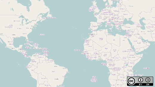
As you've surfed the web, you've surely come across many sites using embedded maps to display data. Humans are visual creatures, so presenting temperatures, crime statistics, or population densities on a map often makes quickly discerning patterns and spatial relationships easier than presenting the same facts as a boring table. Visualizations based on maps can be quite sophisticated and even show patterns across time as well as space; Maps Mania is one blog showcasing many great examples of online maps.
But displaying data on an embedded map doesn't need to be a complicated affair. You can do it using open source tools. In this post, I offer some tips for getting started doing this.

Image courtesy of Gordon Haff. CC BY-SA 4.0.
Choose your map
The first thing you need is the map. Most people are familiar with Google Maps, which you can use at no cost for most light use. However, unlike Google Maps, OpenStreetMap (OSM) uses open data released under the Open Database License. Created by Steve Coast in the UK in 2004, OSM uses crowdsourced data collected from surveys, GPS devices, aerial photography, and other free sources. While OSM tends to be inferior to Google Maps for driving directions and certain other tasks, it can be considerably more detailed for features such as hiking trails that haven't generally appeared on traditional maps.
At this point, I should draw a distinction between the OSM data and the tiles based on that data. A tile is (typically) a 256 by 256 pixel visual representation of map data. People create most web "slippy maps" by placing tiles side by side to create the illusion of a very large map they can display at a wide range of zoom levels. This approach has many advantages, which effectively boil down to efficiently using both server and network resources and providing a nice experience on the client as you pan around maps and zoom in or out.
The OSM project renders and serves up a set of standard ("Mapnik") tiles as part of the project. These tiles are licensed under Creative Commons Attribution-ShareAlike 2.0, which allows free use with attribution. However, OSM has usage policies in place for tiles. These serve to prevent excess load on its service. Tiles based on OSM data are also available from a variety of free and commercial providers, each of which have their own usage policies. You shouldn't run into usage restrictions and limits with most casual use of these, but it's worth knowing that even though the data is free and open (and can even be used to set up your own mapping service) you can't really use OSM's tile servers for heavy commercial use.
Embed your map
You now need a way to embed a map, manipulate the map tiles, and overlay other data onto the map. Leaflet is a popular choice for doing this. It's an open source Javascript library that lets you easily create "slippy" maps with tiled base layers, panning and zooming, and various layered features such as markers at specific geographical coordinates (i.e. latitude and longitude). It handles interactions with the map, has a fairly rich and well-documented API, and also works with a wide collection of plugin that provide additional features.
Leaflet isn't designed to provide all the features of a full geographic information system (GIS), which tend to include many capabilities related to map projections and sophisticated overlays using both vector and raster data; however, as a result, those products tend to be more complex. If you want an open source library with more features than Leaflet, use OpenLayers, which is released under the 2-clause BSD license.
Display your map
Finally, you'll want data to display on your map. This can be something simple and static like a set of points of interest around a city typed into a list (along with their latitude and longitude) to be displayed with markers on a map. It may also be data scraped or otherwise transferred from the web. You'll often find that the most time-consuming part of creating an embedded map is massaging data into a usable form. However, governments and other sources are making an increasing number of rich datasets are available in easily consumable form—either as a downloadable file or through a web service. For example, you can find almost 158,000 open datasets at the US government's data.gov.
Mapping and mashing up these data just takes some HTML, CSS, and Javascript skills. Leaflet provides some good examples to get you started. In practice, if the datasets you're working with are dynamic, require pre-processing, or are large, you'll probably want to start thinking about loading the data into a database. In "Use OpenShift to Map River Levels With Flask, MongoDB, Leaflet, and OpenStreetMaps," I discuss a more complex web app that displays near-realtime USGS river gauge data obtained from the USGS web service. (In this follow-up post, I outline the details of parsing the data; this article details the process of dealing with a relatively complex real-world data format.)
Lowering the barriers to effectively visualizing location-linked data means more effective communication: Make something easier or cheaper and you get more of it. Some is "just" educational or fun. But (when done properly and honestly) more effectively communicating data about people and places can also be important tools for better understanding public policy and the world around us.


3 Comments