Proposed changes to comment section

No readers like this yet.
Website updates

Opensource.com

Thanks to our community members who provided feedback and bug reports on our commenting section. We are currently working to resolve these issues and improve the way comments are laid out. But before we make those changes, we wanted to open up the proposed fixes for your feedback.


Below is a mock-up highlighting the proposed changes. One thing that is not specified in the graphic is the (re)addition of role-based badges and special badges. Some of you may remember that we briefly had badges displayed in the comments section, but chose to remove them until we could improve their layout.
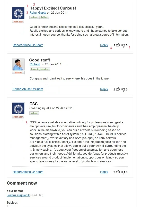
Proposed changes to comments

About the changes

  1. Removed 'new' from the headline of each comment. As we add more and more items, stuff like 'new' and color coding is visual clutter distracting from the content.
  2. Changed the headline from blue to black--the idea being it would be blue on rollover, just like the headlines on the homepage.
  3. Removed 'by' as it's well understood that the linked account name is the commenter. We looked at some other sites like Wired and this looks fairly standard.
  4. Moved the thumbs up/thumbs down to the bottom right corner near 'reply' with the idea being that replying and liking/disliking are the two actions a user can make on any comment.
  5. No green/red coding on the numbers next to thumbs up/thumbs down. The icons are enough to get across the point. We also reduced the size of the type to 10pts.
  6. No column wrap for the body of the content. Everything should line up with the headline, commenter name, and badges.


Community reports


Email from Erlend Sogge Heggen


Hope this is the place to recommend web tweaks.

See this: http://i.imgur.com/qV4PL.png

As the title explains, I think the "thumbs" feature should be re-arranged.

  • It messes with the comment formatting
  • It's got its own visual glitches

Peter Borsa bug report

I found a little bug when I voted a comment. It can be see here, http://rookery9.aviary.com.s3.amazonaws.com/6837000/6837342_5609.png

Please add any feedback in the comments below.

New mock-up added on March 2

Mock-up 2


Avatar
Jason Hibbets is a Community Director at Red Hat with the Digital Communities team. He works with the Enable Architect, Enable Sysadmin, Enterprisers Project, and Opensource.com community publications.

6 Comments

I like the changes. Great work Jason. ;)

I like all 6 recommended changes. I especially like the idea of keeping the only two "actions" together; the logic is strong in this one!

Looking at this preview, only one thing bothers me a little: I'm not keen on the unnecessary amount of whitespace on the left, under the commenter's avatar. There's plenty of breathing space elsewhere on this site to not feel crammed in, so personally I'd like to keep the comments reasonably compact. Here's my quick edit of the preview:
http://i.imgur.com/e3EwK.jpg

That's a good point. I'll bring that back to the designer, although they may say that certain whitepsace is good :)

With this change I also think it would look better to keep all the badges in once place, like so:
http://i.imgur.com/vj8jg.jpg

Its 'type' is already distinguished by the red color, so I think it makes sense to place it alongside the others, especially when the paragraph is placed directly beneath it as I've suggested as I noticed in my first picture that the avatar took up an unnecessary amount of height space as compared to the title+author+badges.

Another observation of mine, heh. I'm just wondering, will "Subject:" for comments remain mandatory? I personally find them rather redundant sometimes, wasting minutes trying to come up with an appropriate title for my single-paragraph comment. Both the current and previewed design for the comment blocks is rather dependent on titles to look right though.

I don't know if it's possible, but if the author+badges could be moved slightly upwards to restore the balance with the avatar aligned on the left, it might look okay:
http://i.imgur.com/k7hkf.jpg

Hi everyone. Thanks for all the feedback and suggestions. I wanted to point out the latest mock-up. We plan to move forward with this version in our development environment.

I'm happy to let you know that we were able to incorporate some of your changes into the latest design. Here are a few highlights:

1) Remove the subject.

2) The role based badges (rock star, newbie) will be placed under the user avatar.

3) Remove 'new' from the headline of each comment.

4) Remove 'by' from the user byline.

5) Move the thumbs up/thumbs down to the bottom right corner near 'reply.'

6) No green/red coding on the numbers next to thumbs up/thumbs down.

7) No column wrap for the body of the content. Everything should start under the avatar, commenter name, and badges.

8) Display user add-on badges under the user byline. Notice we went with a bottom-alignment.

That's it. We hope you like it and, of course, it's always open for other improvements.

Jason

Creative Commons LicenseThis work is licensed under a Creative Commons Attribution-Share Alike 3.0 Unported License.