

Good photography doesn't just happen. Careful attention to lens settings, depth-of-field charts, and lighting will produce quality images but even those, since the days of the earliest photography, have been taken into the darkroom and adjusted.
Read the other parts in this series: Part 1: Introduction to Kdenlive
Part 2: Advanced editing technique
Part 3: Effects and transitions
Part 5: All about audio
Part 6: Workflow and conclusion
Kdenlive's color correction suite easily rivals any professional video editing application and in many ways surpasses the basic tools often found in the expensive industry application. Let's look at the typical workflow of color correction, and then the tools.
Workflow
color correction comes into play fairly late in the post production process for two reasons. First, you don't want to spend hours color correction footage only to find that later in the edit, the scene is cut entirely from the movie. Second, adding color effects to all of your footage is burdensome on your computer and logistically difficult for you to keep track of during intensive editing.
So you'll wait until picture lock to start color correction; frequently it's done at roughly the same time as the sound mix is being done. The workflow of post production itself will be discussed in further detail in the final article of this series.
Without exception, color correct your work scene by scene. Your eye treats color very subjectively; a shade of blue that looks "too bright" one moment starts to fall into place after the eye has stared at it long enough, so you want to emmerse yourself in one scene, and adjust the colors only within that scene so that your eye accepts the colors and character of that scene as normal. When the camera cuts to a different scene, both you as the colorist and the audience understand that the colors should be different; we're in a different location now, so of course the colors of our hero's skin tone can be drastically different and we'll understand why. Within the same scene, of course, that tends to not be the case.
The human element
The human eye naturally gravitates to other humans, so unless you're making a documentary about animals or plants, your audience mostly cares about the humans in your movie. Or at least, their eyes mostly care about the humans. For that reason, a good colorist first targets the human in the shot.
Luma values
Start with the Luma. "Luma" is the term used for the levels of your picture's brightness values; if you were to desaturate your picture so that it was black-and-white only, then you'd be looking, essentially, at the pure luma values of your image.
The reason this is significant is because celluloid has a wide tolerance for luma (according to the "response sensitivity" of the film stock film). Think of it as a resolution for the scale from darkest black to brightest white; first of all, celluloid can read darker shadows and brighter highlights, and second of all the gradiation between those two extremes is constant and even, so that even in the darkest shadows there is still great detail.

Video represents a relatively small inset within the celluloid sensitivity spectrum, with its darkest value being early in the shadow levels of celluloid, and its potential white level being quite early in celluloid highlights. Anything below this dark level or above the light level bottoms out quickly and actually causes distortion (which is precisely why your video camera has a "zebra stripes" function on it). Furthermore, the progress from dark to bright is not constant and features less variation than celluiloid.
In other words, your audience is accustomed to seeing a medium with a color range almost as rich as real life, and are instead being presented with a digital reproduction. Since most video is shot to capture reality (or suggest that it has captured some form of reality), and to the audience "reality" on film is "The Look Of Celluloid" (yes, the film industry has trained audiences that film grain and perfect cinematography equals Reality), the colorist's goal is to fake a more filmic look and feel for their video.
The most effective way to fake celluloid-like luma in your video is to "crush" the darks and "pop" the brights; in other words, increase the contrast. There are many ways to do this but my favourite is the Curves tool.
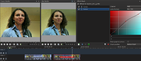
To add a curve to a clip, right-click the clip in the timeline and select Add Effect > color Correction > Curves. Activate the Effects Tab (see the previous article on how to modify your layout and add tabs to your interface). The curve adjustment interface defaults to the Red/Cyan channel, so use the drop-down menu in the top right to select Luma instead.
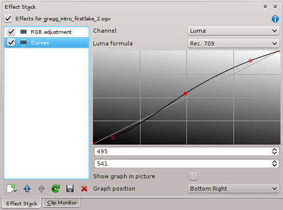
Bring the bright level up by clicking the top part of the curve and dragging it to the left. Bring the dark level down by clicking the bottom end of the curve and dragging it to the right. This makes the gradiation between the two extremes less constant, so the result is that the image now has more drastic dark levels and more drastic bright levels.
Note that this is actually lessening your video's luma variance, in other words it's making it even less like celluloid by further restricting the luma potential. However, to the audience's eyes, it now looks more like celluloid because the dark areas of the image are richer and the bright areas appear brighter. Like on film.
Levels
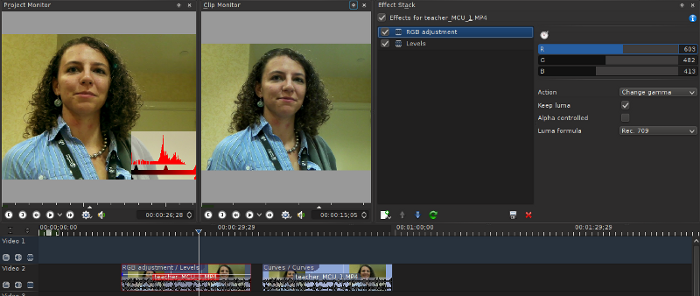
Another Luma modifcation tool is the Levels effect, accessed by right-clicking the clip > Add Effect > color Correction > Levels. It's a less graphical interface so might be less user-friendly but it's a powerful way to control the input and output levels of each value. Its controls are available in the Effect Stack as long as the clip is highlighted.
As with the Curves, the default channel is Red, so if you want to target the Luma values first then use the drop-down menu in the top right of the Effect Stack to choose Luma.
colors
Next, you can manipulate the chroma values of your image. This is done in the exact same way as you would adjust for celluloid: use your human subject as your guide. Human skin, regardless of tone, loves amber. Increasing the red and yellow values in a shot with human flesh in it makes the subject look warmer and more alive and vibrant.
You can use the same toolset as you did for Luma adjustment, but be sure to add a new effect for each channel you adjust. You cannot use the same effect for different channels; you will simply be overwriting the luma adjustment if you switch an existing curve over to the Red channel.
The order of the effects matter. It's a stack, so anything at the top of the stack is effecting all effects below it. This is why I start with the Luma values; I find that if I adjust color first and then place a Luma curve on top of all these, I find that the colors are in danger of becoming posterized and need to be dialed down. So start with the Luma, and then move on to the colors.
If you're using curves for the color adjustment, then knowledge of basic complementary colors will help. As I've stated in an article on a different video editing application (written back in the dark ages, before I'd switched to a free software solution), there's a simple mnemonic that my cinematography teacher gave me to remember the relation of colors in the digital world; it comes in the form of some stock trade advice: "Buy General Motors and RC Cola".
Translated that's:
Buy = BY (Blue and Yellow) General Motors = GM (Green and Magenta) RC Cola = RC (Red and Cyan)
Ergo, if you add red to a shot you are necessarily reducing cyan. If you add green, then you reduce magenta, and so on, and vice versa. The Curves interface makes this abundantly clear, since one side of the curve will be, for instance, red, and the other cyan. You can target certain areas of the image according to which part of the curve you manipulate; you can add red primarily to the midtones (where human skin tone is) by moving the middle of the curve more into red. Constrain the darks and highlights to prevent their red levels from changing.
You can also use the Levels tool for color manipulation. Select the red channel to begin with, and adjust the different levels of red. I find this slightly less useful since it's not possible to target just the midtones, and yet sometimes it produces a rich result nevertheless, so try it out.
Yet another tool you can use for color adjustment is the RGB Adjustment effect. This is a straight-forward manipulation of the levels of the RGB values in the image. Again, there is no target just a specific range, ie, just the highlights or just the midtones so I tend to reserve it for overall adjustments. But combined with other filters, I've used it for primary skintone adjustment, depending largely on the lighting situation and color depth of the video.
Things that look broken
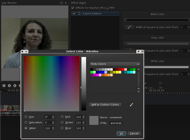
The tool that most video editors and colorists will default to when looking for quick color correction will be the 3 Point Balance effect, because in some professional applications that's the name of the go-to tool for color correction.
The 3 Point Balance tool in Kdenlive is nothing more than a dumbed-down curve frontend. When it is first applied, the image inexplicably turns cyan, and the color-select droppers are completely literal, such that if you select some area of the image as your white point, it assigns cyan as your white point, turning your image into a bad parody of a cartoon effect.
The correct way to use this tool is probably not to use it; use the more powerful curves tool instead. But if you like this simplified interface, then manually select shades of gray using the color picker (obtained by clicking on the color swatch by the Black Level, Gray Level, and White Level.
You'll also notice that there is no color wheel interface in Kdenlive. To any traditional colorist, this will probably be a deal-breaker. Luckily, I'm not a traditional colorist and neither should you be. The tools of the trade are changing and the color correction tools in Kdenlive have proven themselves to be powerful, flexible, and effective. They have easily matched the color tools in any other professional video editor used in the production facility I am a part of, and in many ways they are more efficient. The ability to manipulate colors on a curve, for instance, therefore having a built-in ability to immediately target the luma range that those colors are changing within, is an amazing time-saver.
Saturation
Finally, the saturation of the image can be adjusted; you can created a more vibrant look with very saturated colors, a dull and stark image with less saturated shades, go completely black and white with a saturation level of zero.
The tool for this is fairly staight-forward: Add Effect > color Correction > SOP/Saturation. Add this to a clip and use the controls in the Effect Stack to modify the Slope/Offset/Power of individual channels, or the levels of the overall saturation. A level of zero saturation will render a black and white image.
Copying values between clips
Obviously if you had to re-apply and re-do the color correction from one shot of your subject to the next, I wouldn't be recommending you do any color correction in Kdenlive. But it's easy to copy color settings between clips.
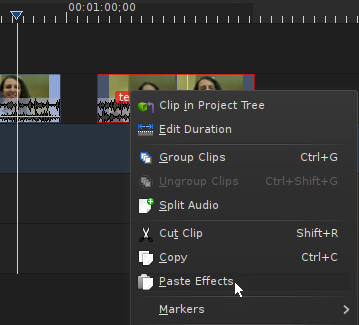
The first method is to right-click on the clip in the timeline containing the color effects. Move to the clip in need of the same (or similar, if you just want to start from approximately the same place) color adjustments and right-click on it. Choose Paste Effects.
Now tweak the color adjustments as needed.
You can also save your own effect settings such that they will be available in your effect menu. In the Effect Stack, click the Save icon under the effect you wish to save. Enter a new name for the effect. From now on, you can apply that effect with those settings onto any clip by right clicking on the clip > Add Effect > Custom.
color Effects
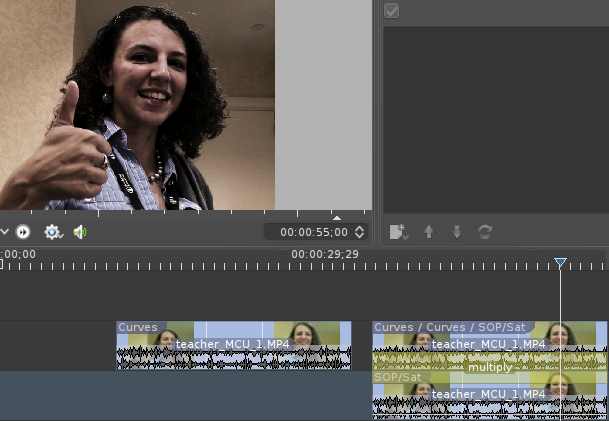
As a final note on stylizing your image's look and feel, remember that you have different compositing options available via the right-click > Add Transition menu. By layering one clip on top of itself and adding a multiply transition between them, and then adjusting the saturation or color values of the bottom clip, you can create a new composited image with some very interesting effects, such as the classic "bleach bypass" look.
Selective color Correction and Rotoscoping
If your subject is not moving, or if they are moving and you have a lot of time on your hands, you can rotoscope the subject to isolate it from the rest of the image. You're then able to affect only what is visible within your selection.
Rotoscoping and masking is something of an art and is often considered a relative to animation, especially when your subject is moving around and you need to create a rotoscope that moves accordingly. But the basics are simple; add a rotoscope to your video clip, select the area you wish to keep, and composite.
To try this, place a video on Track 2, right click on it and select Misc > Rotoscoping. In the Effect Stack, set the Mode to Alpha so that anything not selected is converted to an alpha channel and ensure that the Alpha Operation is set to Write on Clear. In the Project Monitor, click around the object that you wish to effect on that layer.
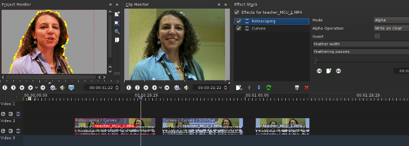
After you close your selection, only that object will be visible in that video track. Now add another clip on Track 3, just under than clip and right click on the top track to add a composite transition (see the previous article on Transitions and Effects for more information). In the context of color correction, I add the same clip under itself so that it appears that there has been no rotoscope at all. It looks like one complete image. But now add a new effect onto the top track, such as a curve, and adjust its color. You've successfully isolated adjustment on that object to only that object.
Obviously the use of rotoscoping goes far beyond color correction, but since it's usually touted as a "killer feature" of dedicated color correction applications, it's worth mentioning here.
Conclusion
This article shows that Kdenlive is not just a capable video editor, but also a color correction suite that matches some of the high end color applications available. Not only is it flexible, but it's efficient. Don't let its lack of some traditional conventions fool you; powerful color correction is easy with Kdenlive!


3 Comments