QGIS is a free and open source geographic information system (GIS) that is extensible, interoperable with other GISes, and used by a ton of people (including me) who have geographic data to analyze and visualize. It's a great platform with an enormous set of capabilities, which can seem daunting on first approach. If you're interested in getting your feet wet in geographic data analysis and visualization, the following basic tips will help you get started with QGIS.
Exploring the spatial join problem
Relational database users are familiar with the concept of a table join, which is a way of associating data in one table with data in another. For example, suppose I have one table that lists employees ("Employee") and another that lists branches of the company ("Office"). I can add a value to the Employee table that indicates the office where the employee works:

Fig. 1: Related tables
The field OfficeId in the Employee table "points to" the correct row in the Office table. In the database world, OfficeId is said to be a primary key in the Office table and a foreign key in the Employee table.
Since the office is at a location, there is a spatial thing happening here—I know the address of the office, so I can find it on OpenStreetMap, for example. What if, instead of an OfficeId field, I had a field specifying the office location on both the Employee and Office tables. Therefore, my relational database would be extended with an operator that is used to verify that two locations are equivalent; for example, that the Cartesian distance between those two points is less than some small number. This kind of spatial relationship problem comes up in all sorts of interesting problems.
For example…
I'm working on a writing project with some colleagues in Chile to explore issues related to hydroelectric power development there. One of the items we want to include in the project is a map showing the location of existing hydroelectric generation facilities. Along with that map, we want to summarize the information related to those facilities by watershed. A watershed is the area of land that drains into a river system and eventually to the sea (or another body of water that may be landlocked). Watersheds are important for all sorts of land management reasons, as they tend to define ecosystems, climatic zones, and even traditional practice areas. The figure below, made with QGIS, shows parts of two watersheds (the areas delimited by the thick blue lines, with their names—Río Itata and Río BíoBío—in blue italic boldface) and the power generation facilities (symbolized by blue diamonds):
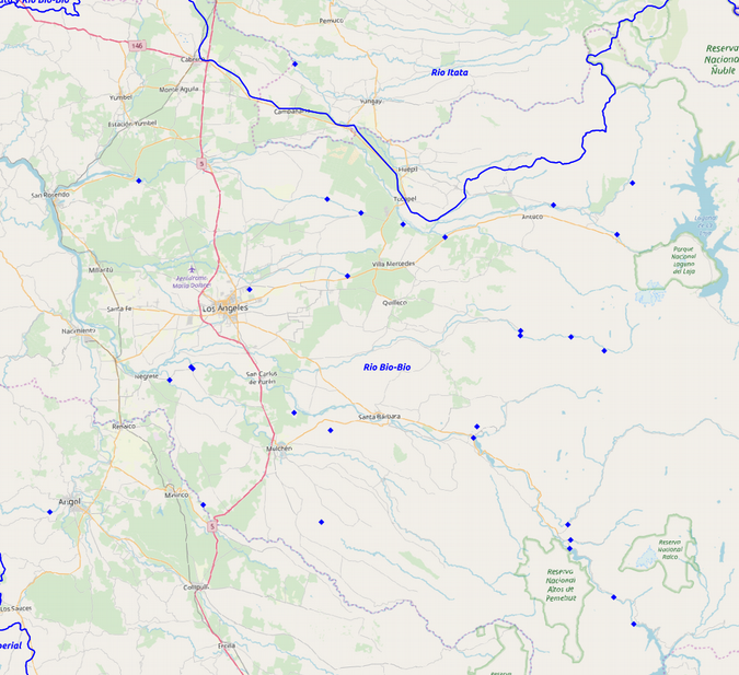
Fig. 2: A portion of the area of interest showing watersheds and generation stations. Map data © OpenStreetMap contributors.
In the same way that my relational example showed two tables of related data, this map shows two spatial datasets: watersheds and hydroelectric generation stations. The watersheds are represented as features that have spatial extent (or area) and location; the generation stations are represented as points, which have location only. Both datasets include attributes that help identify each feature defined in the dataset; for example, the name of the watershed or the amount of power the generating station produces.
Suppose this summarizing task requires determining how much power is generated in each watershed. One way to do this is to go through the generating station dataset and assign a value to each record that points to the watershed that contains the point. I can carry out this task manually because I can observe which points lie within which watersheds. This is pretty laborious. But, given that the two datasets already define the spatial nature of the watersheds and points, and given that QGIS can read this information and generate a map, can QGIS figure out this relationship for me?
Installing QGIS
In order to use QGIS, it must be installed. The versions offered in various distros' repositories can be quite old, to the point of being unable to load various useful plugins because of incompatibilities between the plugin dependencies and the libraries offered by the distribution (e.g., Qt libraries).
There are often newer alternatives to the ones in the repos. For example, both Fedora and Ubuntu offer GIS projects that incorporate all sorts of useful spatial analysis tools. Another alternative is to download it from the QGIS site (as I'm writing, both the new long-term release, version 3.4.4, and the previous long-term release, 2.18.28, are available). In my experience, it's better to select the new long-term release to avoid problems similar to those in the older versions in the repositories. However, currently much of the online content available for QGIS references the older QGIS 2 versions, and it may take some puzzling to determine how to accomplish things in QGIS 3.
I downloaded the latest long-term release from the QGIS site and started it up:
Fig. 3: QGIS running on my desktop
Getting the data
I'm using publicly available watersheds data from Chile's Ministry of National Assets' (Ministerio de Bienes Nacionales) IDEChile website on the page Cuencas Banco Nacional de Aguas (Watersheds National Water Bank). To get the data, I click on the button marked Descargar to download the data as a .zip file and extract the file (Cuencas_BNA.zip) into a folder.
The hydroelectric generating plant data is available from Chile's Ministry of Energy (Ministerio de Energía) IDEEnergía website starting from this web mapping page. On the left-hand side of that page under the word Overlays, I click on the link "Centrales Generación Eléctrica" to expand the menu below, which offers several more links, including "Hidroeléctricas." I right-click on that link to bring up a sub-menu that includes Export to SHP:
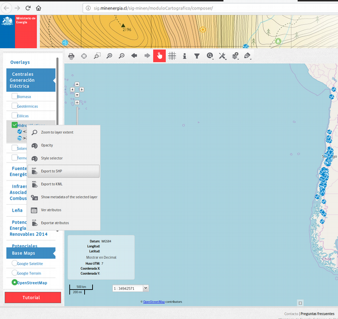
Fig. 4: Ministry of Energy IDE Energía site showing sub-menu to download hydroelectric plant data
When I click on that link, it opens a form:
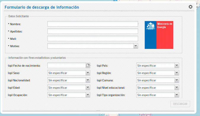
Fig. 5: Download data collection form
To activate the download, I need to fill in the top part of the form with my first name (Nombre), my surname (Apellidos), my email address (Mail), and my reason for downloading (Motivo); I chose "Investigación." When I click on the Descargar button in the lower-right corner of the form, the data arrives as a .zip file (Hidroeléctricas.zip), which I extract into a folder.
Getting ready to do the spatial join
The first step in my analysis is to load the layers into my Layers window (lower-left in Fig. 3) by using the top menu to choose Layer > Add layer > Add vector layer, which opens the data source manager:
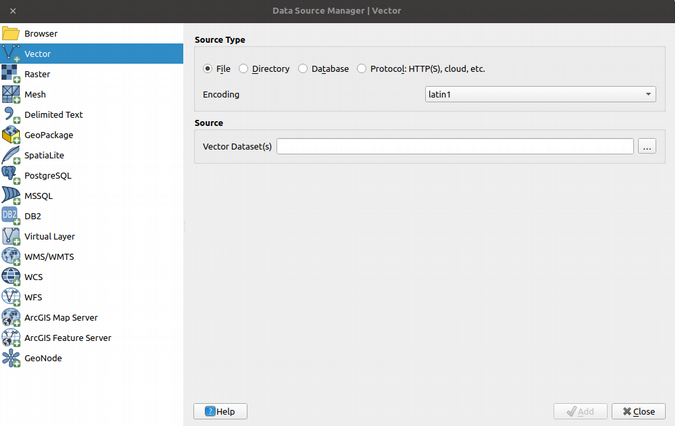
Fig. 6: The Add Vector Layer data browser
Before I go looking for the data, it's worth explaining why I chose a vector layer and not one of the other offerings. Vector data, in GIS-speak, are spatial entities represented by points, lines, or polygons (along with a few other specialized data types). Other types of spatial data exist; most notably raster data, which is similar to images but incorporates other information such as the location of the raster on the Earth's surface. This article gives an easy introduction to this terminology.
My hydroelectric generating plant data is modeled as points with attributes (such as power generated, plant name, etc.). It is stored in shapefile format, one of a (very large) number of vector formats in use today. Note that the data source manager above defaults to File format (correct for shapefiles). My encoding is set to Latin1, which (in my experience) is the most common character encoding for shapefiles. Clicking on the … button next to Vector Dataset(s) opens a file browser that I can use to find my shapefile. Note that shapefiles are actually groups of files with different three-letter extensions: .shp for the shapefile geometry data, .dbf for the attributes, and so on. To add my layer, I select the XXXX.shp file; QGIS knows to associate the other files with this to create the full layer. Finally, once the source is identified in the data source manager, I can click the Add button at the bottom right; my layer is added to the Layers panel, and the points appear on the spatial view panel:
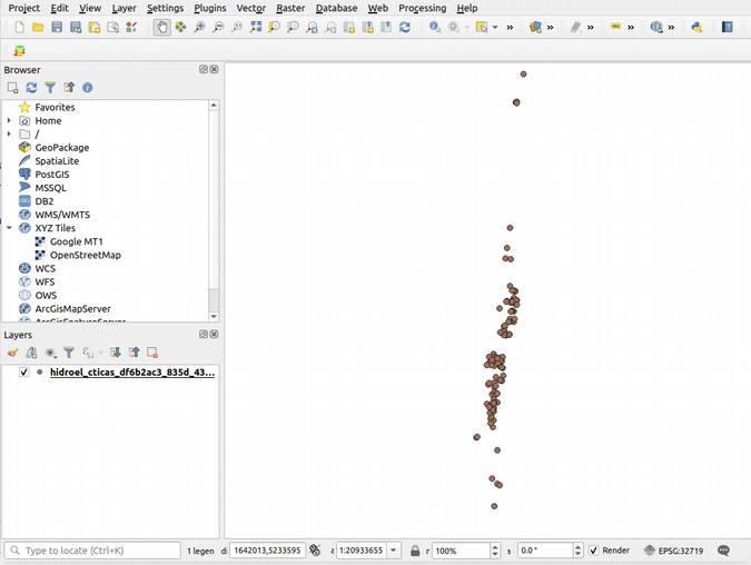
Fig. 7: QGIS screen showing the plant layer added and the plant positions in the spatial view panel
Similarly, I can add the watersheds, which are polygons:
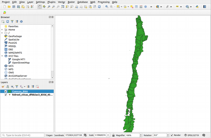
Fig. 8: QGIS screen showing the watershed layer covering the plant data in the spatial view panel
Unfortunately, the watershed polygons (in green above) cover the plant positions, making for a pretty ugly map. QGIS renders the layers in last-first order, so to get the watersheds under the plant positions, I could drag the watershed layer down. I can also right-click on each layer, which gives me a number of options to change the names shown in the layer screen, change the properties (e.g., symbolization, labeling), open the attribute tables, and so on.
I want to have something more pleasant to look at, so I:
-
Add the OpenStreetMap layer (right-click > OpenStreetMap in the browser window);
-
Rearrange the layers so that plants are at the top and OpenStreetMap is on the bottom (drag the layers to rearrange);
-
Change the names shown on the layers (right-click > Rename);
-
Change the symbology so the watershed polygons are transparent with a thick blue line and plants are blue diamonds (right-click > Properties > Symbology);
-
Label the watersheds in blue italic text (right-click > Properties > Labels);
-
Zoom in a bit (using the zoom tool on the toolbar).
Here's the result:
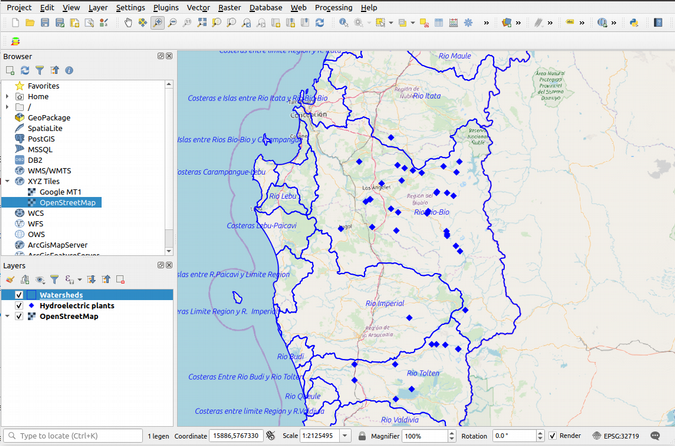
Fig. 9: Cleaned up symbology and watersheds with labels
OK, now that I can stand to look at the map, I'll move on to the calculations.
Doing the spatial join
To carry out the spatial join, use the top menu's Vector > Data management tools > Join attributes by location, which brings up the following dialog box (I filled in the values I want in the fields offered):
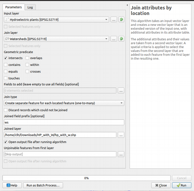
Fig. 10: Spatial join dialog box
I selected the plants as the Input layer and the watersheds as the Join layer to put the watershed info onto the plant records. By selecting intersects as the Geometric predicate, I calculate the polygon with which each point intersects or, since we're talking points and polygons, the polygon within which each point lies. I use a prefix of "ws" for the joined-on attributes and specify a resulting output layer (as a shapefile in this case):
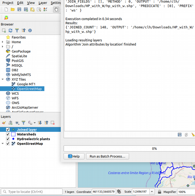
Fig. 11: Spatial join completed
After I dismiss the dialog box, I can look at the attributes for the Joined layer by right-clicking on the layer and selecting Open attribute table, where I can see the joined-on attributes:
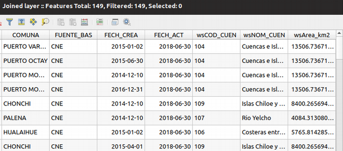
Fig. 12: Joined-on attributes watershed code (wsCOD_CUEN), name (wsNOM_CUEN), area (wsArea_km2)
Finally, what about the summary of hydroelectric power by watershed? If I were using a spreadsheet program like LibreOffice Calc, I would use a pivot table to accomplish this task; certainly, that's possible—I can open the .dbf file for my Joined layer.
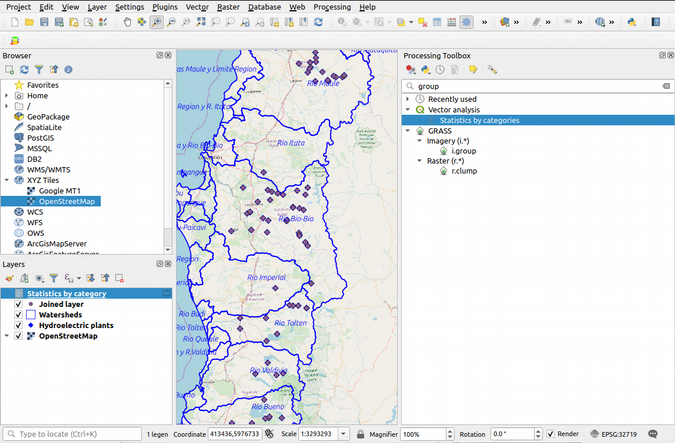
Fig. 13: Calculating group totals: statistics by categories
But QGIS has a lot of analysis tools. If I open the Processing Toolbox using the top menu's Processing item and searching for "group," I can see in Vector Analysis the tool Statistics by categories:
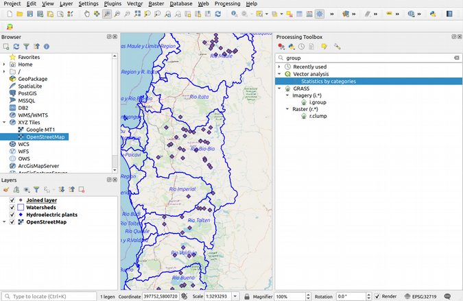
Fig. 14: Calculating group totals: statistics by categories
If I double-click on that tool, I see:
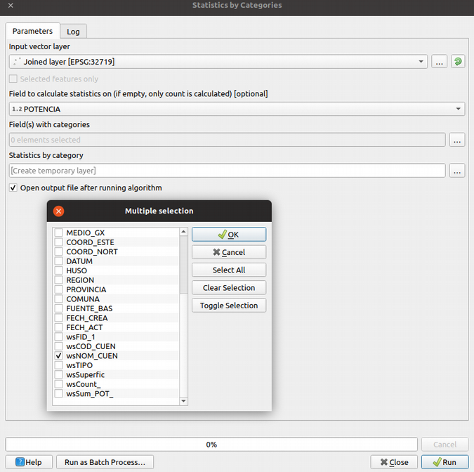
Fig. 15: Setting up statistics by categories
I've selected the "POTENCIA" field (i.e., the hydroelectric potential in megawatts) for calculating statistics. I've defined the field "wsNOM_CUEN" as containing the categories I want to summarize against. Clicking OK on the category selector and then Run creates a new attribute table layer, Statistics by category, on which I can right-click and select Open attribute table:

Fig. 16: Statistics by category
For example, I can see that the Bueno River watershed ("Río Bueno") has a sum of 185.516MW of hydroelectric potential developed.
And that's it. To review, we've: learned how to install QGIS; learned a bit about vector geospatial data and geometric operations on such data; created a spatial join; and analyzed the results of the spatial join using something like pivot tables.


5 Comments