The GNOME desktop turns 20 on August 15, and I'm so excited! Twenty years is a major milestone for any open source software project, especially a graphical desktop environment like GNOME that has to appeal to many different users. The 20th anniversary is definitely something to celebrate!
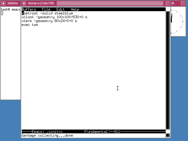
Why is GNOME such a big deal? For me, it's because it represented a huge step forward in the Linux desktop. I installed my first Linux system in 1993. In the early days of Linux, the most prevalent graphical environment was TWM, the tabbed window manager. The modern desktop didn't exist yet.
opensource.com
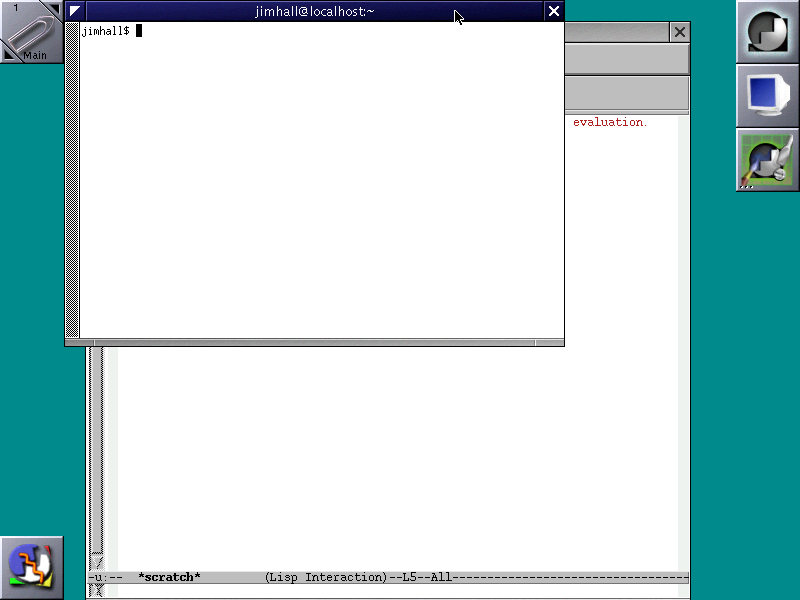
But as Linux became more popular, we saw an explosion of different graphical environments, such as FVWM (1993) and FVWM95 (1995), and their derivatives, including Window Maker (1996), LessTif (1996), Enlightenment (1997), and Xfce (1997). Each filled a different niche. Nothing was integrated. Rather, FVWM and its clones simply managed windows. Toolkits were not standardized; each window might use a different one. As a result, early Linux graphical environments were a mishmash of various styles. Window Maker offered the most improvements, with a more uniform look and feel, but it still lacked the integration of a true desktop.
opensource.com
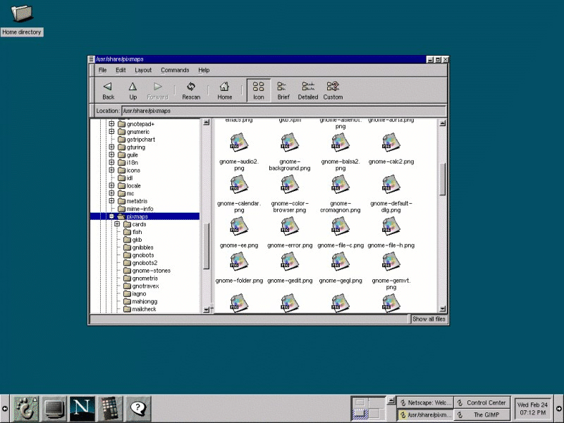
I was thrilled when the GNOME project released a true Linux desktop environment in 1999. GNOME 1 leveraged the GTK+ toolkit, the same object-oriented widget toolkit used to build the GIMP graphics program.
The first GNOME release looked very similar to Windows 98, the then-current version of Microsoft Windows, a wise decision that immediately provided a familiar graphical interface for new Linux users. GNOME 1 also offered desktop management and integration, not simply window management. Files and folders could be dropped on the desktop, providing easy access. This was a major advancement. In short order, many major Linux distributions included GNOME as the default desktop. Finally, Linux had a true desktop.
opensource.com
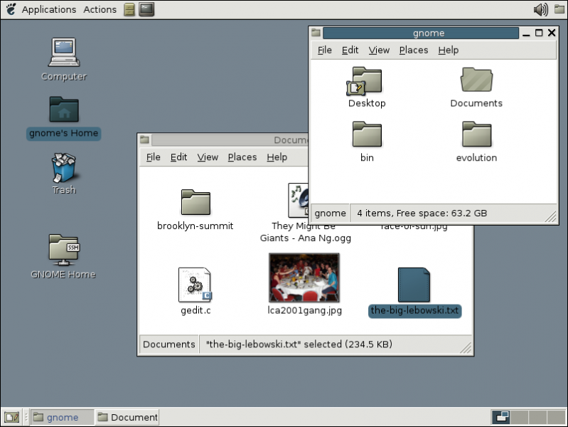
Over time, GNOME continued to evolve. In 2002, GNOME's second major release, GNOME 2, cleaned up the user interface and tweaked the overall design. I found this quite invigorating. Instead of a single toolbar or panel at the bottom of the screen, GNOME 2 used two panels: one at the top of the screen, and one at the bottom. The top panel included the GNOME Applications menu, an Actions menu, and shortcuts to frequently used applications. The bottom panel provided icons of running programs and a representation of the other workspaces available on the system. Using the two panels provided a cleaner user interface, separating "things you can do" (top panel) and "things you are doing" (bottom panel).
opensource.com
I loved the GNOME 2 desktop, and it remained my favorite for years. Lots of other users felt the same, and GNOME 2 became a de facto standard for the Linux desktop. Successive versions made incremental improvements to GNOME's user interface, but the general design concept of "things you can do" and "things you are doing" remained the same.
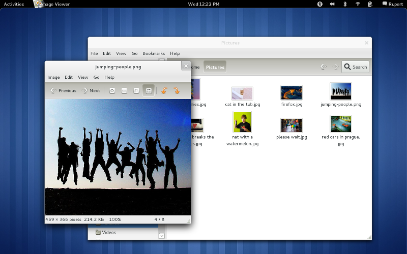
Despite the success and broad appeal of GNOME, the GNOME team realized that GNOME 2 had become difficult for many to use. The applications launch menu required too many clicks. Workspaces were difficult to use. Open windows were easy to lose under piles of other application windows. In 2008, the GNOME team embarked on a mission to update the GNOME interface. That effort produced GNOME 3.
opensource.com
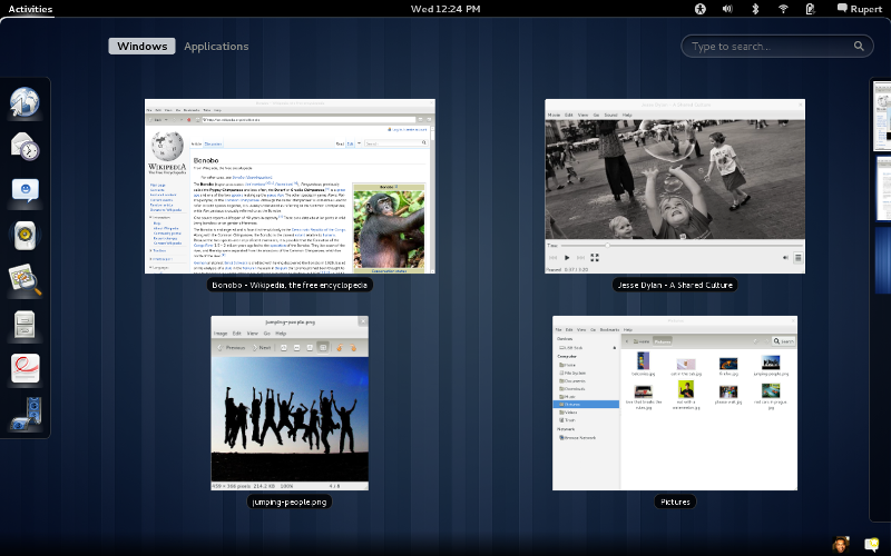
GNOME 3 removed the traditional task bar in favor of an Overview mode that shows all running applications. Instead of using a launch menu, users start applications with an Activities hot button in the black bar at the top. Selecting the Activities menu brings up the Overview mode, showing both things you can do (with the favorite applications launcher to the left of the screen), and things you are doing (window representations of open applications).
opensource.com
Since its initial release, the GNOME 3 team has put in a lot of effort to improve it and make it easier to use. Today's GNOME is modern yet familiar, striking that difficult balance between features and utility.
4 reasons GNOME is my favorite GUI
Here at GNOME's 20th anniversary, I'd like to highlight four reasons why GNOME 3 is still my favorite desktop today:
1. It's easy to get to work
GNOME 3 makes it easy to find my most frequently used applications in the favorite applications launcher. I can add my most-used applications here, so getting to work is just a click away. I can still find less frequently used applications in the Applications menu, or I can just start typing the name of the program to quickly search for the application.
2. Open windows are easy to find
Most of the time, I have two or three windows open at once, so it's easy to use Alt+Tab to switch among them. But when I'm working on a project, I might have 10 or more windows open on my desktop. Even with a large number of open applications, it's straightforward to find the one that I want. Move the mouse to the Activities hot corner, and the desktop switches to Overview mode with representations of all your open windows. Simply click on a window, and GNOME puts that application on top.
3. No wasted screen space
With other desktop environments, windows have a title bar with the name of the application, plus a few controls to minimize, maximize, and close the window. When all you need is a button to close the window, this is wasted screen space. GNOME 3 is designed to minimize the decorations around your windows and give you more screen space. GNOME even locates certain Action buttons in the window's title bar, saving you even more space. It may not sound like much, but it all adds up when you have a lot of open windows.
4. The desktop of the future
Today, computers are more than a box with a monitor, keyboard, and mouse. We use smartphones and tablets alongside our desktop and laptop computers. In many cases, mobile computing (phones and tablets) displaces the traditional computer for many tasks. I think it's clear that the mobile and desktop interfaces are merging. Before too long, we will use the same interface for both desktop and mobile. The key to making this work is a user interface that truly unifies the platforms and their unique use cases. We aren't quite there yet, but GNOME 3 seems well positioned to fill this gap. I look forward to seeing this area develop and improve.


11 Comments