

In this article, Ciarrai Cunneen and I describe how to do a paper-based usability test, using an early redesign of the GNOME Settings app as an example. The updated Settings features in GNOME 3.26, released on September 13.
When writing open source software, we often obsess about making our logic elegant and concise, coming up with clever ways to execute tasks and demonstrate ideas. But we sometimes forget a key fact: Software is not useful if it is not easy to use.
To make sure our programs can be used by our intended audience, we need usability testing. Usability is basically asking the question, "Can people easily use this thing?" or "Can real people use the software to do real tasks in a reasonable amount of time?" Usability is crucial to the creative process of building anything user-based. If real people can't use our software, then all the hard work of creating it is pointless.
Usability testing lets us see where people struggle with the software and what they find easy. By repeating usability tests throughout the development lifecycle—creating a design, testing it, tweaking the design, then testing it again—developers can quickly iterate to a design that works well for everyone.
Usability testing doesn't require significant effort, nor any particular expertise, to generate useful results. As my experience shows, anyone can do usability testing with only a little preparation.
Ways to test usability
You can test software a variety of ways; there is no "one true method" to usability testing. For example, if you have already developed a user interface (UI), a traditional, software-based usability test might be most helpful. But if you are looking at a new design and want to see how users will like it, you can do a usability test using a paper prototype and ask testers to walk through the interface as though they were responding to specific tasks in the software.
That's what we did when we wanted to evaluate a proposed redesign for the GNOME Settings application.
You may be familiar with GNOME, one of the most popular graphical desktops for Linux systems. The GNOME project is working to improve the desktop experience and make GNOME more accessible to new and experienced users.
In early 2016, GNOME decided to make a major UI update to its Settings application. This visual refresh shifts from an icon-based menu to drop-down lists and adds important changes to several individual Settings panels. The GNOME design team wanted to test these early-stage design changes to see how easily real people could navigate the new GNOME Settings application. Previously, GNOME relied on traditional usability tests, where users explore the software's UI directly. But this wouldn't work, since the software updates hadn't been completed.
Through an Outreachy internship in summer 2016, I worked with the GNOME design team to examine the usability of GNOME. Outreachy helps people from underrepresented groups get involved in free and open source software. Jim Hall, Allan Day, and Jakub Steiner from the GNOME design team coached me on test design and analysis.
Paper prototype testing
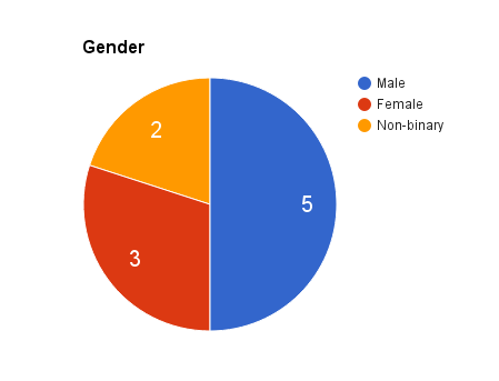
I conducted a paper prototype test of the new GNOME Settings menus with 10 test participants, representing a mix of genders (male, female, and non-binary) and ages (between 20 and 40 years old). Every tester claimed to use the internet daily, and only three testers had used GNOME before.
opensource.com
opensource.com
opensource.com
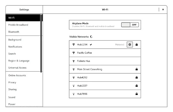
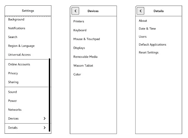
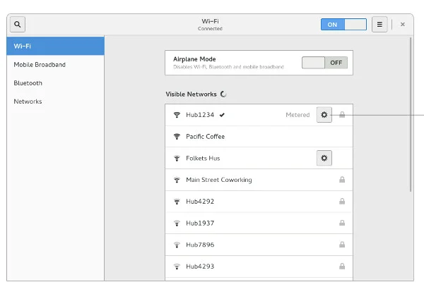
The usability test used a paper mockup of the new design. The mockup included two printed images of the proposed new GNOME Settings application panel and one printed image of the WiFi panel. Testers were asked to select the setting that represented the first place they would go to complete a task.
The paper mockups represent the look of the Settings application design update, including the full drop-down menu and sub-menus for Devices and Details. I cut out the sub-menus and hid them from view until the participants selected either Devices or Details from the Settings menu to complete a task.
opensource.com
opensource.com
opensource.com
For my test, I presented each tester with 23 tasks and asked them to respond with their first menu choice for completing each one. Each of these "scenario tasks" presented a brief context, then asked the tester to do something specific. For example, one scenario task asked how testers would connect a laptop to a second display:
"You're at the office and you want to show a work presentation with a projector. Which setting would you try first to connect your laptop to the projector?"
Most testers made their decision in less than a minute, which seems in line with how most users actually use software. Most real users don't deliberate too much when looking for an option; they make their best choice for how to access the functionality. If they don't find the feature they are looking for, users may get irritated, but they usually click around a bit to find the function they want.
Analyzing the results
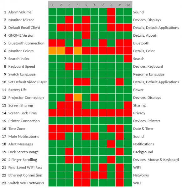
A heat map is an easy way to summarize usability test results. This colored grid represents each tester in a separate column and each scenario task on a separate row. The first column describes each task with a few keywords. The 10 subsequent columns represent the responses from each of the testers, color-coded based on accuracy: green represents a correct response, red indicates an incorrect response, and orange shows a correct Devices or Details selection and an incorrect sub-menu selection. The right-hand column shows the correct responses to each task.
opensource.com
Looking at the heat map, you can easily spot the "cool" rows with lots of green; these indicate that the testers found these tasks easy to do. You can also see several "hot" rows with orange and red, tasks where testers encountered difficulty.
The heat map provides a quick overview of the usability test results and is a quick way to spot problem areas. But to interpret the results in more depth, we need to dig deeper than just the heat map. Referring back to the notes I captured while observing the testers, we can uncover what happened during the usability test and why testers reacted the way they did. Let's examine several tasks that worked well and others that were more difficult.
What worked well
I think it's important to note that there were twice as many "easy" than "difficult" tasks, so the new GNOME Settings menus fared well. A few key tasks that were easy for testers:
"1. You set an alarm on your laptop. Now you want to make sure that it will be loud enough to hear from across the room. Where would you look in the Settings app to change the volume of the alarm?"
The alarm volume settings are located in the Sound panel in Settings. This was an easy task for all but one participant. Testers said that it was an easy choice because alarms have a sound, and if you are trying to adjust that sound, then the Sound panel is the most obvious option. The tester who got this task wrong thought an alarm was a notification and assumed the relevant adjustments would be in the Notifications panel.
"9. You are going out of town for a week and having a friend house-sit for you. She wants to use your desktop computer while you are gone and you are happy to oblige. Your friend's native language is Spanish while yours is English. You think it would be nice to set your computer to Spanish for her so that she can use it more efficiently. Where would you look to switch the language to Spanish?"
All participants knew to change the desktop language in the Region & Language panel. It was the only option that mentioned language and seemed the clear choice for everyone.
"11. In a few minutes, you are expected to be in a two-hour long lecture. You want to take notes on your laptop during the talk. Where in Settings would you look to see how much battery charge you have left in order to know whether you have to run to your car and get the charger before the lecture starts?"
All testers knew to look under the Power panel for information about the laptop's battery life. Testers indicated this seemed similar to their experience with laptop power settings on other operating systems.
"15. You just bought a new printer. Which setting would you choose first to connect the new printer to your computer over WiFi?"
Every tester successfully identified Devices as the first place to click when looking to set up a printer, then Printers as the correct sub-menu option. This is interesting, because the testers didn't always select Devices as the most likely setting for other hardware questions. Either all testers had viewed the Devices panel at least once before this question and remembered that Printers was a sub-option, or they readily associated printers with devices.
Overall, I think that testers did well when the new Settings menus reflected the organization of other operating systems. The battery life task is a good example of this. Most (if not all) testers were familiar with checking the remaining battery charge, as it is a common thing for laptop users to do. Testers said they typically associated "Power" with the battery charge on their own systems, so perhaps it is not surprising this task was easy for all; everyone responded within seconds to this task.
What didn't work as well
When we are learning new interfaces, it's rare to figure things out on the first try, which explains some incorrect test answers. The trick to usability testing is separating these expected errors from patterns that indicate where the software is falling short. These two tasks fell into that latter category:
"6. You are working on a few design projects and want to adjust the way your monitor handles colors so that none of the image quality is lost. Which setting would you try first to change the default colors?"
None of the testers knew how to update color profiles in GNOME. I think this has to do with the fact that none of the participants had tried to complete a similar task on any operating system before. This task was a bit more obscure, and no participant associated color with the Details menu option.
"14. You find that you don't like only having 5 minutes of idleness before your screen locks on your system. Where in Settings would you go first to adjust the wait time from 5 to 10 minutes."
None of the participants successfully identified Privacy as the way to change the wait time on the lock screen. Many of the testers chose the Power panel and explained that they consider the lock screen to be a power-saving mechanism. I think that's because on other operating systems, the screen dimmer takes effect at the same time the screen locks.
The following tasks were somewhat less difficult:
"3. You want to have your Thunderbird account to be the email that opens whenever GNOME is asked to open an email client. Which setting would you try to make Thunderbird your official email?"
Several testers thought that they would set their email client in Online Accounts. Their general reasoning was that an email account qualifies as an online account. I think if they had seen the Default Applications sub-menu in Details without having to open a new panel, some testers would have chosen that as the correct answer. Still, I can understand why these testers were confused about what type of action could be taken in the Online Accounts panel. Even though the scenario task asked about the email client and not the email account, many users see email account as the important part, so Online Accounts seemed to be the better option.
"5. You are about to watch a movie on your computer. The internal sound is too low, so you get out a Bluetooth speaker. Where in the Settings app would you go to connect the speaker to your computer?"
A lot of testers didn't associate the Bluetooth panel with the task of connecting a speaker that uses the Bluetooth standard. Some testers didn't know what "Bluetooth" meant. Others just didn't see it in the menu.
"16. You are living abroad for several months in a country with a time zone 6 hours ahead of yours. Where in Settings would you go to adjust the time zone to reflect your new location?"
Many of the testers selected Region & Language to change their time zone; those who did said they associated time zones with a region. There didn't seem to be another option that addressed the user's location, so they chose Region.
"17. You are listening to music on your computer. At the same time, you are torrenting a number of files. You don't want the notification sound to disrupt your music each time a file successfully downloads. Which setting would you try first to mute the volume of the notification?"
Testers who didn't choose Sound as the place to adjust the volume of a file download alert thought Notifications would be the place to go, because they viewed Notifications as the right location for any task related to system messages.
"22. You're at the office trying to get work done. The WiFi has gone down three times already today and you are frustrated with waiting. You have an Ethernet cable plugged in and set up already; which panel would you try first in the Network Settings to switch over from WiFi to Ethernet?"
Several testers had trouble figuring out where to switch over to an Ethernet connection. Of those who got it wrong, most thought that it would be part of the WiFi subpanel. Some of the testers had not dealt with Ethernet cables and didn't know where to look, although everyone was familiar with the concept of an Ethernet connection.
In general, testers had trouble with tasks that seemed unfamiliar. For example, testers who had never connected a computer to a projector mentioned that they were just sort of shooting in the dark when choosing a setting. This is an unfortunate part of the testing process. It is hard to anticipate tasks that cover the breadth of settings you want to test but also seem easy and familiar enough for all testers.
Takeaways for your own usability tests
As this experience demonstrates, usability testing is simple. Anyone can do it! It's surprising how much you can learn just by watching a few testers use your software, even if they're only using a paper prototype to respond to sample tasks.
You can easily apply usability testing to your own projects. Start by looking at who uses your software and consider why they use it. From this set of assumptions, jot down a few sample tasks that represent how your users might use the software in a real-world situation. These are the scenario tasks for your usability test. Then ask a few people to sit down with you to do a usability test. Ask each tester to do the scenario tasks, one task at a time. Watch them, and take note of what they do and say. With a handful of volunteers, you can quickly see what areas of the interface work well, and what parts of the program need more work.
Here are a few general lessons I learned in my testing that may help you in your usability tests.
- Ask testers to "think out loud" as they do the test so you can hear their rationales. In my paper prototype test, I asked testers for reasons for their choices with open-ended questions like, "What does X setting make you think of?" instead of, "Why did you make X choice?" Many testers forgot once they began the test and had to be prompted to talk out loud.
- Consider showing testers the current environment (if one exists) prior to performing the usability test. I think it would be good for testers to see the whole picture before starting the usability test. For example, this would have helped in question #7: "You would like to be able to access photos from GNOME Shell search. Which setting would you try first to see if photos can be indexed in a search?" I had to explain to several users how a Shell search happens in GNOME. It would have been easier to show them this before the test.
- Let testers preview the material beforehand. I noticed that not all testers read through the menu items before the test began, so they failed to notice some of the Settings panel options when they needed them. Sometimes they noticed a panel a few questions after it would have been useful to them.
Above all, the key to usability testing is to do it iteratively. Create your design, test it, update your design based on that feedback, then test it again. Keep repeating until you reach a plateau where more changes don't seem to further improve the usability of your program. At each iteration, your program will become easier to use, and ultimately you'll end up with software that anyone can use.
Ciarrai Cunneen also contributed to this article. Ciarrai participated in the 2016 Outreachy internship program, performing usability testing for GNOME. They have a passion for open source development, digital security, and futurism.


Comments are closed.