Fundamentally, beta testing is a test of a product performed by real users in the real environment. There are a number of names for this type of testing—user acceptance testing (UAT), customer acceptance testing (CAT), customer validation and field testing (common in Europe)—but the basic components are more or less the same. All involve user testing of the front-end user interface (UI) and the user experience (UX) to find and resolve potential issues. Testing happens across iterations in the software development lifecycle (SDLC), from when an idea transforms into a design, across the development phases, to after unit and integration testing.
The Product Lifecycle Management (PLM) beta stage is the perfect opportunity to get feedback from the target market and plan for the road ahead. There's a broad spectrum of testing in this phase, ranging from front-end or UI-related testing (involving UI functionality, visual look and feel, and UI-level interaction), to UX (including user testing with A/B or split testing, hypothesis, user behavior tracking and analysis, heatmaps, user flow and segment preference, and exploratory testing and feedback loops).
If you ask most people why beta testing and related tools are important, they'll name things such as shortening of beta cycles, reduced time investment, increased tester participation, improved feedback loops and visibility. However, all the reasons why beta testing is so critical can be narrowed down to two major issues, both of which are predominant in the beta testing phase of the SDLC:
- The intersection of humans and technology
- Usability and quality standards
The intersection of humans and technology
Samir Dash. CC0 1.0
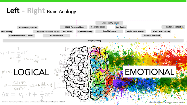
Human users are more emotionally connected to the aspects of the product that are validated or verified in beta testing. Also, when we define criticality from the traditional software approach, the areas that are tested during UAT/beta mostly fall into Class 3 and 4. But, because these also touch core human aspects, they are very important.
This video of a boy wearing glasses to correct color blindness illustrates what I mean about technology's ability to touch human emotions. The glasses technology addresses "accessibility," which is evaluated in beta testing. Accessibility affects many, many people; U.S. census data indicates that one in five people has a disability, yet few websites conform to the WC3's accessibility guidelines.
Viewing this video could lead developers, designers, and testers to ask, "What can we do for this father and son?" Beta testing validates and verifies that the technology meets target users' needs.
Usability and quality standards
Samir Dash. CC0 1.0
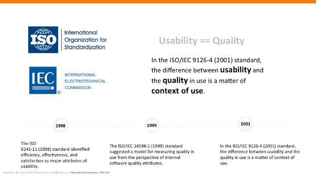
The International Standards Organization (ISO) standards around quality vs. usability have evolved over time. In 1998, ISO identified efficiency, effectiveness, and satisfaction as major attributes of usability. Just a year later, in 1999, the proposed model approached quality in light of internal software quality and external factors.
In 2001, the ISO/IEC 9126-4 standard defined the difference between usability and quality as a perceptible thin line, suggesting that the difference between usability and quality is a matter of context. It also distinguished between external and internal quality and defined related metrics. Under this standard, external quality can be measured only by using the product in the environment where it is intended to be used. Therefore, without doing usability/HCI testing in the right context, the quality control process is incomplete. Note that "context" is fundamental to beta testing (i.e., "real users in a real environment"), which strengthens the case for beta testing.
Challenges of beta testing
Now that we've outlined why beta testing is so important, let's explore the challenges involved with it. Note that the defined standards, including ISO/IEC 9126, are static—none really describe the relationship between phases in the product development cycle and appropriate usability measures at specific project milestones. Additionally, the standards give relatively few guidelines about how to interpret scores from specific usability metrics. And, specific to usability as a quality factor, note that usability is the aspect of quality where metrics must be interpreted.
Today's top beta-testing tools leave interpretation to the customer's or end user's discretion. This is our top challenge in beta testing: How can we filter out pure perception from actual and valid issues and concerns? Most issues are related to user testing, split testing, and front-end testing; there is no optimized, single-window solution smart enough to effectively handle all of it. Real users in the real environment generally can't comprehend all aspects of beta testing. Since we're testing their perspective, there's no way to validate it with data from some benchmark/standards.
The 2015-16 World Quality Report, from Sogeti, Capgemini, and HPE, indicated that expectations from beta testing are changing dramatically. It suggested customers want a more reliable way to test quality and functionality, along with regular usability and user testing, in real, customer-facing environments.
Rising complexities and challenges from changes in technology, development, and delivery mechanisms and approaches are affecting the entire testing scenario, not just the beta test phase. According to the 2017-18 World Quality Report, the test environment and test data continue to be the Achilles' heel for QA and testing, compounded by increasing challenges of testing in agile development. There is now a demand for automation, mobility, and ubiquity, along with smartness, in software quality testing. Many believe analytics-based automation solutions would produce smarter QA and smarter test automation, for overall QA and testing, and for beta testing specifically, even when testing deals with functional aspects of the product.
There's a large vacuum among popular beta testing solutions in benchmarking functional aspects along with the usability and user-testing aspects. Basically, popular beta testing solutions lack "smartness" and automation; there is ample space around smart testing using cognitive technologies, automation, and machine learning.
Other challenges become obvious if we evaluate user needs from a corresponding persona's viewpoint. For example, even if we assume the solution is validating a product's functional aspects, the end user or customer may not recognize it. The product owner, customer, or the end user who are the "real users in a real environment" may not have enough understanding of the underlying technology to sign off on its testing results. It's like the classic example of a customer shopping for second-hand car who wants to look under the hood, even though he doesn't have the knowledge to identify a problem.
For a beta testing tool to empower the end user with the right information to make a decision about a product, the tool should give the user peace of mind while also validating the product. Unfortunately, many small tools that try to solve some little issues to empower the user (e.g., the Google Chrome extension that analyzes CSS to identify alignment problems) are scattered. The reality is that there is no single-window extension or widget-based solution available to solve the user-empowerment problem. Most tools are meant for developers or testers, not for customers without specialized skills, so they're not comprehensible to the general customer/end user.
With the focus on DevOps, many Continuous Integration (CI)/Continuous Delivery (CD) solutions are being developed and integrated with other solutions looking at the rising complexities of technology stacks, languages, frameworks, etc. Within a CI/CD model, automation solutions in testing are mostly engaged in the "pre-beta" stage of the SDLC. Additionally, running them typically requires skilled devs or test specialists, which doesn't work well in beta testing where you're measuring the "real user in the real environment."
There is another challenge to consider, even assuming we enable all these automation features in beta testing: Automation's high volume of data creates an "information explosion," and many users struggle to get a consolidated, meaningful view of a product's specific context with so much information to consider. To solve these challenges, we need smart, connected, single-window beta testing solutions with automation that end users can understand without help from the geeks.
Envisioning the ideal beta test solution
Over the past few years, I have been working on BetaStudio, a model and a proof of concept (POC) for the ideal beta testing solution. The ideal solution would:
- Utilize data from all stages of SDLC and PLM, incorporate standards and specs, and integrate end user testing data to provide more meaningful insights to the customer.
- Test the real application in the real environment by the real users.
- Be customer and end-user centric.
- Test the "soft" aspects of the application (usability, accessibility, cosmetic, etc.).
- Be smart enough to compare and analyze these soft aspects of the application against functional testing data.
- Use machine learning and cognitive technologies to make meaningful recommendations, not just relay information about bugs and potential issues.
Samir Dash. CC0 1.0
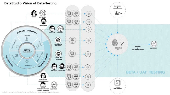
This BetaStudio vision touches upon all the above "ideal solution" criteria, as well as all the interaction points of the different personas (e.g. customer, end user, developer, tester, product owner, project manager, support engineer, etc.) across the whole PLC. It utilizes automation along with machine learning components, such as computer vision (CV) and natural language processing (NLP), to gather information that can be processed by cognitive technology to generate both insights about the product and relevant recommendations. The system also incorporates data from standards and specs as well as the design benchmarks generated from the design phase of the SDLC, so that meaningful insights can be generated.
Bringing this vision to life
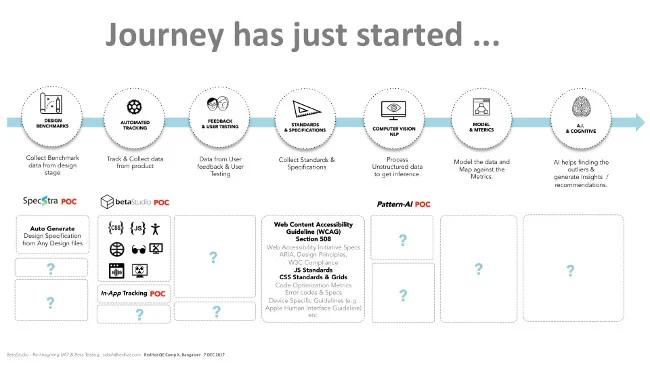
We are just beginning the journey to translate this vision into reality.
Samir Dash. CC0 1.0
The first step will involve creating the design benchmark, based on the information acquired in the design stage, and generating metrics that will compare the product's features against this design benchmark.
In the second step, data from automated and manual tracking of the product during runtime in real time will be categorized and collated.
The third step involves creating features to support the user feedback cycle and user testing aspects (e.g., exploratory, split testing capabilities).
The fourth step would be to collect all the relevant standards and specifications (e.g., Web Content Accessibility Guideline Section 508; Web Accessibility Initiative Specs ARIA; Design Principles; W3C Compliance; JS Standards; CSS Standards & Grids; Code Optimization Metrics Error Codes & Specs; device-specific guidelines, e.g., Apple human interface guidelines, etc.)
The fifth step is about building the critical components, such as CV and NLP units, that would process all the data collected in all these stages and generate the desired metrics and inferences.
The sixth step involves building the unit to generate the model to map the data and compare it against the metrics.
The final step is to build the cognitive unit that can compare the data and apply the correct models and metrics to carry out the filtering of the data and generate the insights that can be shared as actionable output to the end user/customer.
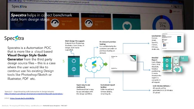
While experimenting for BetaStudio, I have explored different aspects and built some bare-bone POCs. One of these, Specstra, is a BetaStudio component that can help create a design benchmark from design files.
Samir Dash. CC0 1.0
Specstra is focused on testing a product's visual look and feel. Typically, more than 30% of these types of issues are non-functional and mostly cosmetic, so there is no reliable solution or standards to benchmark them against. At a minimum, one-third of the things flagged during beta/UAT testing are mostly cosmetic and alignment issues, including Category 3 and 4 types. These mostly happen because the two personas—developer and designer—involved have defined their own boundaries by a mythical fine line.
Roughly 45% of developers don't know how to implement design principles or the heuristics of UX in code, so they depend on scattered tools, solutions, or UI patterns to create "design first-aid" for their code. Similarly, 50% of designers don't know about most of the evolving technological solutions about design, such as using a CSS grid to accommodate different devices, screen resolutions, etc.
About 70% of projects don't include detailed design specs to benchmark against, in part because detailing out a spec for design requires costs and skills. When detailed designs with specs are provided, many times the designs are not standardized, also most of them do not have clear and detailed specs. Also, because different tools are used to carry out design, it isn't always easy to have a centralized place where all the design's information is available for benchmarking.
In my proof of concept, Specstra serves much like a cloud-based visual design style guide generator, which uses third-party design source files and allows users to use their preferred design tools (e.g., Photoshop, Sketch, Illustrator, PDF, etc.).
Learn more
If you'd like to learn more about Specstra, watch this demo video:
You can learn more about BetaStudio in this video:
You can also read my article 'Specstra' — Experimenting with Automation in Design Industry on Design at IBM's Medium channel.
Finally, as an open source project, BetaStudio's code is available on GitHub; feel free to explore it there.
Developing the ideal beta testing solution will take time and effort, and the concept will evolve over time. But the journey to connect and explore how to make it a reality is well underway. If you have thoughts or questions, or would like to join the journey, please share your thoughts in the comment section below.
This article is based on a paper presented at RedHat QE CampX in Bangalore on December 7, 2017.


Comments are closed.