If you want people to find your website useful, they need to be able to read it. The colors you choose for your text can affect the readability of your site. Unfortunately, a popular trend in web design is to use low-contrast colors when printing text, such as gray text on a white background. Maybe that looks really cool to the web designer, but it is really hard for many of us to read.
The W3C provides Web Content Accessibility Guidelines, which includes guidance to help web designers pick text and background colors that can be easily distinguished from each other. This is called the "contrast ratio." The W3C definition of the contrast ratio requires several calculations: given two colors, you first compute the relative luminance of each, then calculate the contrast ratio. The ratio will fall in the range 1 to 21 (typically written 1:1 to 21:1). The higher the contrast ratio, the more the text will stand out against the background. For example, black text on a white background is highly visible and has a contrast ratio of 21:1. And white text on a white background is unreadable at a contrast ratio of 1:1.
The W3C says body text should have a contrast ratio of at least 4.5:1 with headings at least 3:1. But that seems to be the bare minimum. The W3C also recommends at least 7:1 for body text and at least 4.5:1 for headings.
Calculating the contrast ratio can be a chore, so it's best to automate it. I've done that with this handy Bash script. In general, the script does these things:
- Gets the text color and background color
- Computes the relative luminance of each
- Calculates the contrast ratio
Get the colors
You may know that every color on your monitor can be represented by red, green, and blue (R, G, and B). To calculate the relative luminance of a color, my script will need to know the red, green, and blue components of the color. Ideally, my script would read this information as separate R, G, and B values. Web designers might know the specific RGB code for their favorite colors, but most humans don't know RGB values for the different colors. Instead, most people reference colors by names like "red" or "gold" or "maroon."
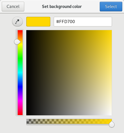
Fortunately, the GNOME Zenity tool has a color-picker app that lets you use different methods to select a color, then returns the RGB values in a predictable format of "rgb(R,G,B)". Using Zenity makes it easy to get a color value:
color=$( zenity --title 'Set text color' --color-selection --color='black' )In case the user (accidentally) clicks the Cancel button, the script assumes a color:
if [ $? -ne 0 ] ; then
	echo '** color canceled .. assume black'
	color='rgb(0,0,0)'
fi
My script does something similar to set the background color value as $background.
Compute the relative luminance
Once you have the foreground color in $color and the background color in $background, the next step is to compute the relative luminance for each. On its website, the W3C provides an algorithm to compute the relative luminance of a color.
For the sRGB colorspace, the relative luminance of a color is defined as
L = 0.2126 * R + 0.7152 * G + 0.0722 * B where R, G and B are defined as:if RsRGB <= 0.03928 then R = RsRGB/12.92
else R = ((RsRGB+0.055)/1.055) ^ 2.4if GsRGB <= 0.03928 then G = GsRGB/12.92
else G = ((GsRGB+0.055)/1.055) ^ 2.4if BsRGB <= 0.03928 then B = BsRGB/12.92
else B = ((BsRGB+0.055)/1.055) ^ 2.4and RsRGB, GsRGB, and BsRGB are defined as:
RsRGB = R8bit/255
GsRGB = G8bit/255
BsRGB = B8bit/255
Since Zenity returns color values in the format "rgb(R,G,B)," the script can easily pull apart the R, B, and G values to compute the relative luminance. AWK makes this a simple task, using the comma as the field separator (-F,) and using AWK's substr() string function to pick just the text we want from the "rgb(R,G,B)" color value:
R=$( echo $color | awk -F, '{print substr($1,5)}' )
G=$( echo $color | awk -F, '{print $2}' )
B=$( echo $color | awk -F, '{n=length($3); print substr($3,1,n-1)}' )
(For more on extracting and displaying data with AWK, Get our AWK cheat sheet.)
Calculating the final relative luminance is best done using the BC calculator. BC supports the simple if-then-else needed in the calculation, which makes this part simple. But since BC cannot directly calculate exponentiation using a non-integer exponent, we need to do some extra math using the natural logarithm instead:
echo "scale=4
rsrgb=$R/255
gsrgb=$G/255
bsrgb=$B/255
if ( rsrgb <= 0.03928 ) r = rsrgb/12.92 else r = e( 2.4 * l((rsrgb+0.055)/1.055) )
if ( gsrgb <= 0.03928 ) g = gsrgb/12.92 else g = e( 2.4 * l((gsrgb+0.055)/1.055) )
if ( bsrgb <= 0.03928 ) b = bsrgb/12.92 else b = e( 2.4 * l((bsrgb+0.055)/1.055) )
0.2126 * r + 0.7152 * g + 0.0722 * b" | bc -l
This passes several instructions to BC, including the if-then-else statements that are part of the relative luminance formula. BC then prints the final value.
Calculate the contrast ratio
With the relative luminance of the text color and the background color, now the script can calculate the contrast ratio. The W3C determines the contrast ratio with this formula:
(L1 + 0.05) / (L2 + 0.05), where
L1 is the relative luminance of the lighter of the colors, and
L2 is the relative luminance of the darker of the colors
Given two relative luminance values $r1 and $r2, it's easy to calculate the contrast ratio using the BC calculator:
echo "scale=2
if ( $r1 > $r2 ) { l1=$r1; l2=$r2 } else { l1=$r2; l2=$r1 }
(l1 + 0.05) / (l2 + 0.05)" | bc
This uses an if-then-else statement to determine which value ($r1 or $r2) is the lighter or darker color. BC performs the resulting calculation and prints the result, which the script can store in a variable.
The final script
With the above, we can pull everything together into a final script. I use Zenity to display the final result in a text box:
#!/bin/sh
# script to calculate contrast ratio of colors

# read color and background color:
# zenity returns values like 'rgb(255,140,0)' and 'rgb(255,255,255)'

color=$( zenity --title 'Set text color' --color-selection --color='black' )
if [ $? -ne 0 ] ; then
	echo '** color canceled .. assume black'
	color='rgb(0,0,0)'
fi

background=$( zenity --title 'Set background color' --color-selection --color='white' )
if [ $? -ne 0 ] ; then
	echo '** background canceled .. assume white'
	background='rgb(255,255,255)'
fi

# compute relative luminance:

function luminance()
{
	R=$( echo $1 | awk -F, '{print substr($1,5)}' )
	G=$( echo $1 | awk -F, '{print $2}' )
	B=$( echo $1 | awk -F, '{n=length($3); print substr($3,1,n-1)}' )

	echo "scale=4
rsrgb=$R/255
gsrgb=$G/255
bsrgb=$B/255
if ( rsrgb <= 0.03928 ) r = rsrgb/12.92 else r = e( 2.4 * l((rsrgb+0.055)/1.055) )
if ( gsrgb <= 0.03928 ) g = gsrgb/12.92 else g = e( 2.4 * l((gsrgb+0.055)/1.055) )
if ( bsrgb <= 0.03928 ) b = bsrgb/12.92 else b = e( 2.4 * l((bsrgb+0.055)/1.055) )
0.2126 * r + 0.7152 * g + 0.0722 * b" | bc -l
}

lum1=$( luminance $color )
lum2=$( luminance $background )

# compute contrast

function contrast()
{
	echo "scale=2
if ( $1 > $2 ) { l1=$1; l2=$2 } else { l1=$2; l2=$1 }
(l1 + 0.05) / (l2 + 0.05)" | bc
}

rel=$( contrast $lum1 $lum2 )

# print results

( cat<<EOF
Color is $color on $background

Contrast ratio is $rel
Contrast ratios can range from 1 to 21 (commonly written 1:1 to 21:1).

EOF

if [ ${rel%.*} -ge 4 ] ; then
	echo "Ok for body text"
else
	echo "Not good for body text"
fi
if [ ${rel%.*} -ge 3 ] ; then
	echo "Ok for title text"
else
	echo "Not good for title text"
fi

cat<<EOF

The W3C says this:

1.4.3 Contrast (Minimum): The visual presentation of text and images of text has a contrast ratio of at least 4.5:1, except for the following: (Level AA)

    Large Text: Large-scale text and images of large-scale text have a contrast ratio of at least 3:1;

    Incidental: Text or images of text that are part of an inactive user interface component, that are pure decoration, that are not visible to anyone, or that are part of a picture that contains significant other visual content, have no contrast requirement.

    Logotypes: Text that is part of a logo or brand name has no minimum contrast requirement.

and:

1.4.6 Contrast (Enhanced): The visual presentation of text and images of text has a contrast ratio of at least 7:1, except for the following: (Level AAA)

    Large Text: Large-scale text and images of large-scale text have a contrast ratio of at least 4.5:1;

    Incidental: Text or images of text that are part of an inactive user interface component, that are pure decoration, that are not visible to anyone, or that are part of a picture that contains significant other visual content, have no contrast requirement.

    Logotypes: Text that is part of a logo or brand name has no minimum contrast requirement.
EOF
) | zenity --text-info --title='Relative Luminance' --width=800 --height=600
At the end, I like to include reference information about the W3C recommendations as a reminder for myself.
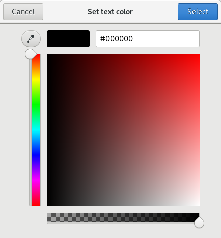
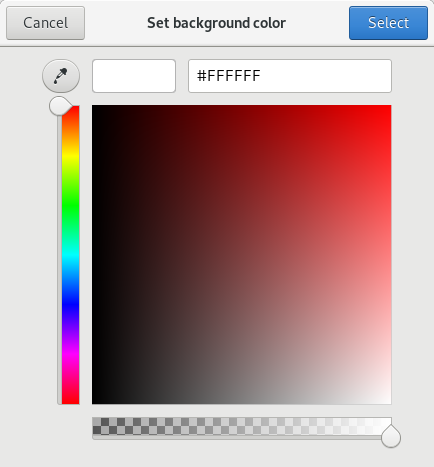
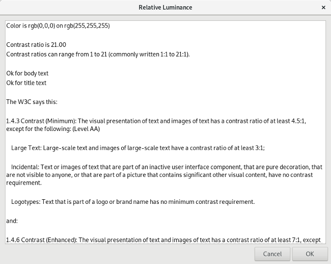
The Zenity color picker does all the hard work of interpreting colors, which the user can select by clicking in the color wheel or by entering a value. Zenity accepts standard hex color values used on websites, like #000000 or #000 or rgb(0,0,0) (all of those are black). Here's an example calculation for black text on a white background:
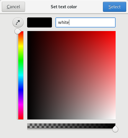
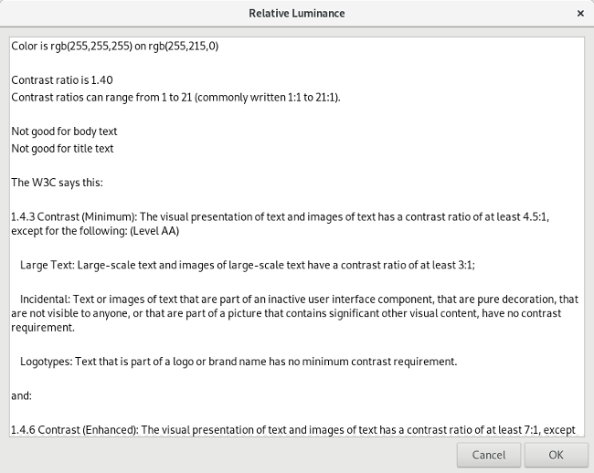
Zenity also understands standard color names like cadetblue or orange or gold. Enter the color name in Zenity then hit Tab, and Zenity will convert the color name into a hex color value, as in this example calculation for black text on a gold background:
opensource.com




4 Comments