Before GNOME 3 there was (unsurprisingly) GNOME 2, which had gained an ardent fanbase during its reign as one of the common default Linux desktops. The Mate project (named after the yerba mate plant) began as an effort to continue the GNOME 2 desktop, at first using GTK 2 (the toolkit GNOME 2 was based upon) and later incorporating GTK 3. Today, Mate delivers a familiar desktop environment that looks and feels exactly like GNOME 2 did, using the GTK 3 toolkit. Part of that desktop is the Caja file manager, a simple but robust application that helps you sort and organize your data.
Install Caja
Caja isn't exactly a stand-alone application. It's tightly coupled to the Mate desktop, so to try it you must install Mate.
You may find Mate included in your Linux distribution's software repository, or you can download and install a distribution that ships Mate as its default desktop. Before you do, though, be aware that it's meant to provide a full desktop experience, so many Mate apps are installed along with the desktop. If you're running a different desktop, you may find yourself with redundant applications (two PDF readers, two media players, two file managers, and so on). To evaluate Caja without making major changes to your computer, install a Mate-based distribution in a virtual machine using GNOME Boxes.

(Seth Kenlon, CC BY-SA 4.0)
Clear layout
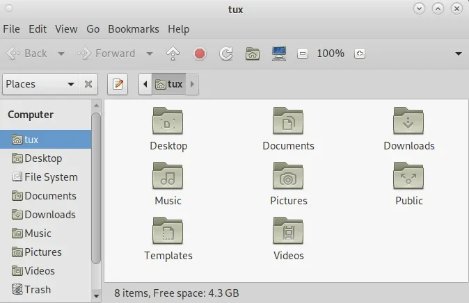
The thing that you're likely to notice first about Caja is its clear and direct layout. There's a toolbar across the top of the Caja window with buttons for common tasks. I love this kind of design. Function isn't hidden away in a right-click menu, nor discoverable only after an action, nor buried in a menu. The "obvious" actions for the window are listed right across the top.
Under the main toolbar is the location bar. This displays your current path, either as a series of buttons or as editable text. Use the Edit button to the left of the path to toggle whether it's editable or not.
Configurable
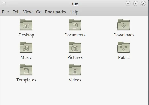
For longtime users of GNOME 2 or Caja, the main toolbar can be redundant, especially once you know the keyboard shortcuts to invoke common actions. That's why the Caja interface is configurable. You can disable major components of the Caja window from the View menu, including:
-
Main toolbar
-
Location bar
-
Side panel
-
Extra panel
-
Status bar
In short, you can make Caja as minimal as you want it to be.

(Seth Kenlon, CC BY-SA 4.0)
Tag your folders
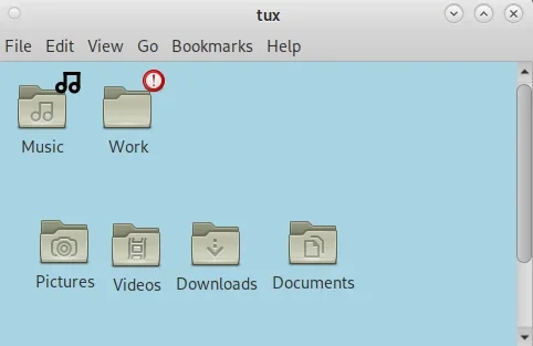
Some people are "visual" people. They like to organize files and folders according to how they perceive their data, rather than how the computer interprets it. For instance, if the two most significant folders for you are Music and Work, it can be hard to convince a computer that there's any relationship between those two. Alphabetically, there's a lot that should get started between the two, and the contents of each may be completely different (media files in one, spreadsheets in another).
Caja offers some assistance.
With Caja, you can place directories manually within a window, and Caja remembers that placement. What's more, Caja has a variety of emblems available for you to use as visual labels. You can find them in the Edit menu, in Backgrounds and Emblems. Drag and drop them onto files and folders to help them stand apart.

(Seth Kenlon, CC BY-SA 4.0)
Caja
As file managers go, Caja is one of the most inviting. It's configurable enough to appeal to many different use cases, and in those configuration options, you're likely to find a workflow that works for you. If you're a fan of GNOME 2, then you're sure to find Caja familiar, and if you've never used GNOME 2 then you might just find your new favorite desktop in Mate.


Comments are closed.