

Adding a light and dark mode to my side project www.fediverse.to was a fun journey. I especially loved how intuitive the entire process was. The prefers-color-scheme CSS property contains the user's color scheme—light or dark. I then define SASS or CSS styles for both modes, and the browser applies the style the user wants. That's it! The seamless flow from operating system to browser to website is a huge win for users and developers.
After tinkering with www.fediverse.to I decided to add light and dark modes to this website as well. I began with some internet research on how to best approach this. This GitHub thread shows the current progress of the feature. And this in-depth POC demonstrates how challenging the process can be.
The challenge
The biggest challenge is that sometimes SASS and CSS don't play well with each other.
Let me explain.
From my earlier post on light and dark themes, to create both styles I needed to define CSS like this:
/* Light mode */
:root {
   --body-bg: #FFFFFF;
   --body-color: #000000;
}

/* Dark mode */
@media (prefers-color-scheme: dark) {
   :root {
       --body-bg: #000000;
       --body-color: #FFFFFF;
   }
}
This is simple enough. With the styles defined, I use var(--body-bg) and var(--body-color) in our CSS. The colors to switch based on the value of prefers-color-scheme.
Bootstrap 5 uses Sass to define color values. My website's color scheme in _variables.scss looks like this:
// User-defined colors
$my-link-color: #FFCCBB !default;
$my-text-color: #E2E8E4 !default;
$my-bg-color: #303C6C;
The solution seems obvious now, right? I can combine prefers-color-scheme with the variables above, and boom!
// User-defined colors
:root {
 --my-link-color: #FFCCBB;
 --my-text-color: #E2E8E4;
 --my-bg-color: #303C6C;
}

/* Dark mode */
@media (prefers-color-scheme: dark) {
 :root {
 --my-link-color: #FF0000;
 --my-text-color: #FFFFFF;
 --my-bg-color: #000000;
  }
}
Additionally, I need to replace the $ values with their -- variants in _variables.scss. After making the change and running jekyll build, I get the following:
Conversion error: Jekyll::Converters::Scss encountered an error while converting 'css/main.scss':
                    Error: argument `$color2` of `mix($color1, $color2, $weight: 50%)` must be a color on line 161:11 of _sass/_functions.scss, in function `mix` from line 161:11 of _sass/_functions.scss, in function `shade-color` from line 166:27 of _sass/_functions.scss, in function `if` from line 166:11 of _sass/_functions.scss, in function `shift-color` from line 309:43 of _sass/_variables.scss from line 11:9 of _sass/bootstrap.scss from line 1:9 of stdin >> @return mix(black, $color, $weight); ----------^
             Error: Error: argument `$color2` of `mix($color1, $color2, $weight: 50%)` must be a color on line 161:11 of _sass/_functions.scss, in function `mix` from line 161:11 of _sass/_functions.scss, in function `shade-color` from line 166:27 of _sass/_functions.scss, in function `if` from line 166:11 of _sass/_functions.scss, in function `shift-color` from line 309:43 of _sass/_variables.scss from line 11:9 of _sass/bootstrap.scss from line 1:9 of stdin >> @return mix(black, $color, $weight); ----------^
             Error: Run jekyll build --trace for more information.
The error means that the Bootstrap mixins expect color values to be, well, color values, and not CSS variables. From here, dig down into the Bootstrap code to rewrite the mixin. But I must rewrite most of Bootstrap to get this to work. This page describes most of the options available at this point. But I was able to make do with a simpler approach.
Since I don't use the entire suite of Bootstrap features, I was able to add light and dark mode with a combination of prefers-color-scheme, some CSS overrides, and a little bit of code duplication.
Step 1: Separate presentation from structure
Before applying the new styles to handle light and dark modes, I performed some clean-up on the HTML and CSS.
The first step is ensuring that all the presentation layer stuff is in the CSS and not the HTML. The presentation markup (CSS) should always stay separate from the page structure (HTML). But a website's source code can get messy with time. You can skip this step if your color classes are already separated into CSS.
I found my HTML code peppered with Bootstrap color classes. Certain div and footer tag used text-light, text-dark, bg-light, and bg-dark within the HTML. Since handling the light and dark theme relies on CSS, the color classes had to go. So I moved them all from the HTML into my custom SASS file.
I left the contextual color classes (bg-primary, bg-warning, text-muted, etc.) as-is. The colors I've picked for my light and dark themes would not interfere with them. Make sure your theme colors work well with contextual colors. Otherwise, you should move them into the CSS as well.
So far, I've written 100+ articles on this site. So I had to scan all my posts under the _posts/ directory hunting down color classes. Like the step above, make sure to move all color classes into the CSS. Don't forget to check the Jekyll collections and pages as well.
Step 2: Consolidate styles wherever possible
Consolidating and reusing styling elements ensures you have less to worry about. My Projects and Featured Writing sections on the home page displayed card-like layouts. These were using custom CSS styling of their own. I restyled them to match the article links and now I have less to worry about.
There were several other elements using styles of their own. Instead of restyling them, I chose to remove them.
The footer, for example, used its own background color. This would have required two different colors for light and dark themes. I chose to remove the background from the footer to simplify the migration. The footer now takes the color of the background.
If your website uses too many styles, it might be prudent to remove them for the migration. After the move to light/dark themes is complete, you can add them back.
The goal is to keep the migration simple and add new styles later if required.
Step 3: Add the light and dark color schemes
With the clean-up complete, I can now focus on adding the styling elements for light and dark themes. I define the new color styles and apply them to the HTML elements. I chose to start with the following:
- --body-bg for the background color.
- --body-color for the main body/text color.
- --body-link-color for the links.
- --card-bg for the Bootstrap Card background colors.
:root {
 --body-bg: #EEE2DC;
 --body-color: #AC3B61;
 --body-link-color: #AC3B61;
 --card-bg: #EDC7B7;
}

/* Dark mode */
@media (prefers-color-scheme: dark) {
 :root {
 --body-bg: #303C6C;
 --body-color: #E2E8E4;
 --body-link-color: #FFCCBB;
 --card-bg: #212529;
  }
}
With the colors defined, I changed the CSS to use the new colors. For example, the body element now looks like this:
body {
 background-color: var(--body-bg);
 color: var(--body-color) !important;
}
You can view the rest of the CSS changes on GitLab.
You can override Bootstrap 5 defaults if it's compiled with your Jekyll source and not from the CDN. This might make sense to simplify the custom styling you need to handle. For example, turning off link decoration made life a little easier for me.
$link-hover-decoration: none !default;Step 4: The Navbar Toggler
Last but not least: The navbar toggler. In Bootstrap 5, navbar-light and navbar-dark control the color of the toggler. These are defined in the main nav element and .navbar. Since I am not hard-coding color classes in the HTML anymore, I need to duplicate the CSS. I extended the default Sass and added my theme colors.
.navbar-toggler {
  @extend .navbar-toggler;
  color: var(--text-color);
  border-color: var(--text-color);
}

.navbar-toggler-icon {
  @extend .navbar-toggler-icon;
  background-image: escape-svg(url("data:image/svg+xml,<svg xmlns='https://www.w3.org/2000/svg' viewBox='0 0 30 30'><path stroke='#000000' stroke-linecap='round' stroke-miterlimit='10' stroke-width='2' d='M4 7h22M4 15h22M4 23h22'/></svg>"));
}
The code above is the default Bootstrap 5 toggler CSS code, with some minor changes. One thing to note here: For the toggler icon, I hardcoded stroke= #000000 since black works with my theme colors. You may need to be more creative about picking colors schemes that work well across the board.
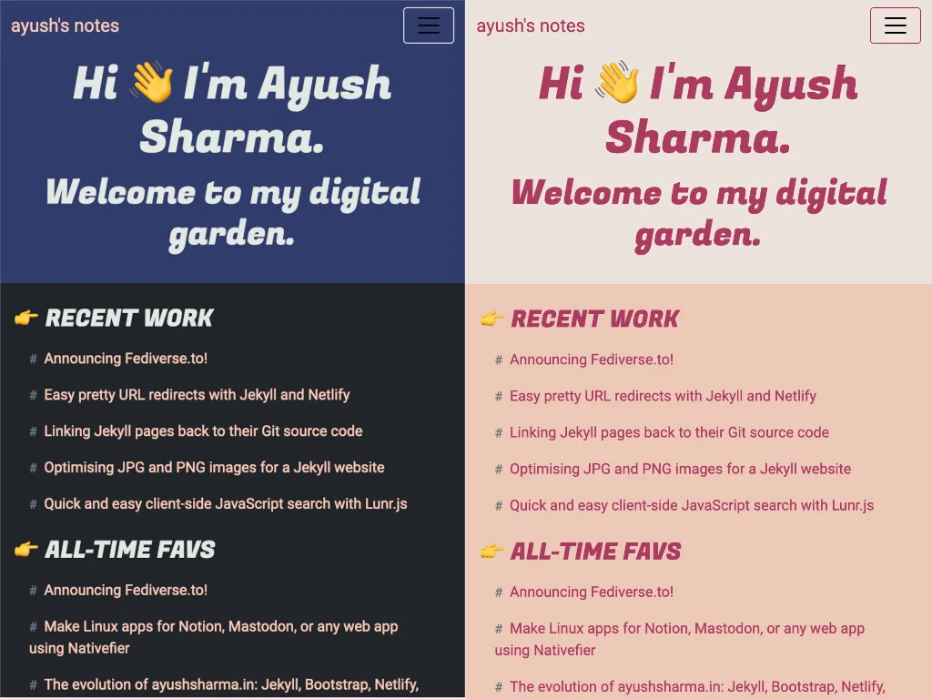
(Ayush Sharma, CC BY-SA 4.0)
And that's about it! The light and dark modes now work as expected!
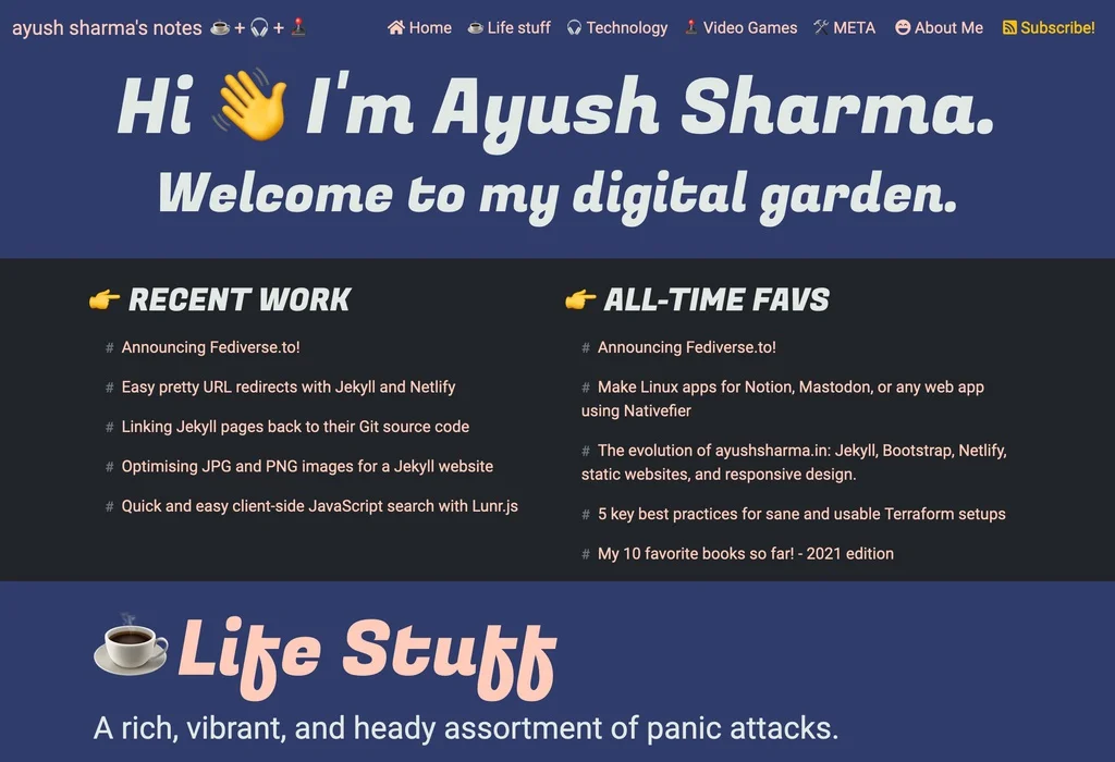
(Ayush Sharma, CC BY-SA 4.0)

(Ayush Sharma, CC BY-SA 4.0)

(Ayush Sharma, CC BY-SA 4.0)

(Ayush Sharma, CC BY-SA 4.0)
Wrap up
Bootstrap 5 is complex, to say the least. There is a lot to think about when overriding it with your custom styling. Providing light and dark variants for every Bootstrap 5 component is difficult, but it's possible if you don't have too many components to deal with.
By ensuring that the markup stays in Sass/CSS, reusing styles, and overriding some Bootstrap 5 defaults, it's possible to achieve light and dark modes. It's not a comprehensive approach, but it is practical and serviceable until Bootstrap 5 decides to provide this feature out of the box.
I hope this gives you more practical ideas on how to add light and dark themes to your own website. If you find a better way to use your own CSS magic, don't forget to share it with the community.
Happy coding :)
This article originally appeared on the author's blog and has been republished with permission.


Comments are closed.