

Organizations are increasingly adopting open source software development models and open source aspects of organizational culture. As a result, interest in how open source communities succeed is reaching an all-time high.
Until recent years, measuring the success of open source communities was haphazard and anecdotal. Ask someone what makes one community more successful than another, and you will likely get observations such as, "The software is great, so the community is too," or "The people in this community just mesh well." The problem with these evaluations is not that they are necessarily wrong, but that they don't provide information that others can use to reproduce successful results. What works for one community is not necessarily going to work for another.
Research universities, businesses, and other organizations interested in determining what makes open source projects successful have begun to collaborate on finding ways to measure aspects of community in a qualitative and data-driven way. One of the more prominent efforts is CHAOSS, a Linux Foundation project focused on creating metrics, metrics models, and software to better understand open source community health on a global scale. Unhealthy projects hurt both their communities and the organizations relying on those projects, so identifying measures of robustness isn't just an interesting project. It's critical to the open source ecosystem.
CHAOSS is a great tool for looking at a pressing set of questions. First, how should community health be defined? Second, as metrics begin to take shape, how can we transition from reacting to one-off requests for data-based information about a given community to creating an entire process pipeline, literally and theoretically, for this work? The development of Project Aspen is the culmination of this pipeline, which will ultimately bring community data analysis to everyone.
Collecting community data
In 2017, Harish Pillay created Prospector with the aim of presenting information from core data sources in a graphical dashboard. This resonated with CHAOSS, which had a goal to better understand the health of open source communities. Prospector was donated to CHAOSS in 2017. Project Aspen builds upon that work.
Aspen is backed by a database generated from the Augur Project, a CHAOSS-based project that collects, organizes, and validates the completeness of open source software trace data. With this database, we can store all types of data points around the Git-based repositories from which we collect data, such as pull requests, reviews, and contributors. The data is already collected and cleaned, which, from a data science perspective, is where the most significant time drains occur. The continued data collection allows us to act agilely when questions arise. Over time, we will grow our pipeline to collect data from many other avenues in addition to Git-based repositories, such as Stack Overflow and Reddit.
As Augur regularly collects data on our selected repositories, the data is updated within a week and cleaned. With all the data collection and most preprocessing already completed, we are much better equipped to answer the analysis questions we receive and generate our own questions too. No matter where the questions come from, the same analysis process is necessary.
For every visualization or analysis, community leaders need to consider these questions:
- What perspective are you looking to gain or give?
- What question can you directly answer from the data available to you?
- What assumptions am I making, and what biases may I hold?
- Who can I work with to get feedback and a different perspective?
Everyone's individual experiences and expertise impact the lens through which they look at a problem. Some people have experience in code review, while others' expertise lies in community management. How can we start comparing community aspects like apples to apples instead of oranges? Quantifying what people in different roles in open source are looking at when examining a project community can address this problem.
Community metrics empower all members to communicate in a common domain and share their unique expertise. Different perspectives lead to further insights, and Project Aspen uses data to make those insights more accessible to the entire community through data visualizations.
Assumptions and analysis
Analysis is a tool for narrative building, not an oracle. Data analysis can help take the ambiguity and bias out of inferences we make, but interpreting data is not simple. A bar chart showing an increase in commits over time is not, by itself, a positive indicator of community health. Nor is a stable or decreasing number always a negative sign. What any chart gives you is more information and areas to explore.
For instance, you could build from a commits-over-time visualization, creating a graph that plots the "depth" of a commit, perhaps defined as the number of line changes. Or you could dive into the specific work of your community to see what these trends actually represent.
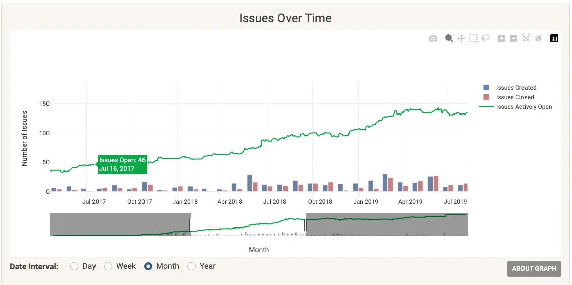
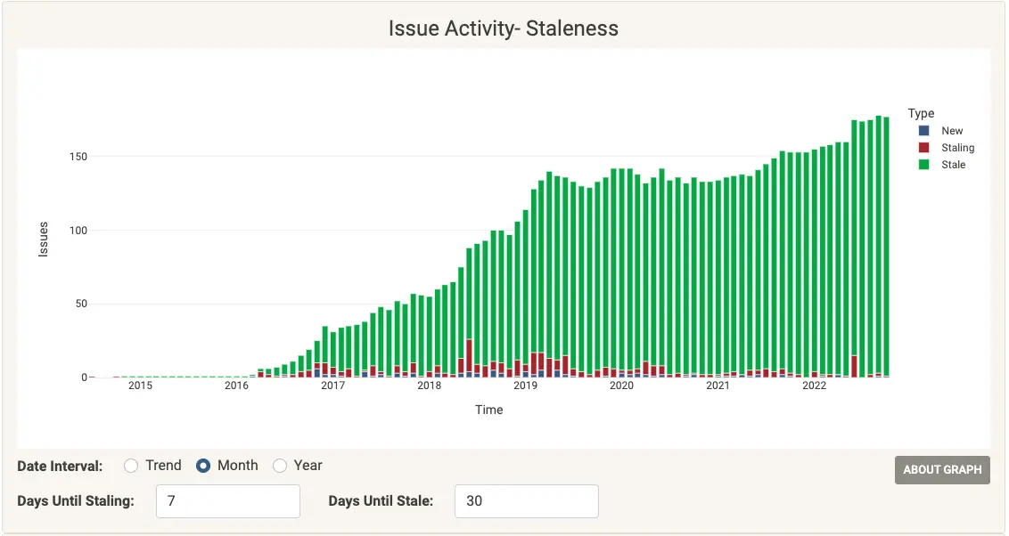
Comparing an issues-over-time graph (Figure 1) to an issues staleness graph (Figure 2) is a great illustration of why perspective matters. These visualizations reflect the same data but reveal completely different insights. From the issue staleness graph, we can see not only how many issues are open, but how many have been open for various time intervals.
This figure shows that over many months, there's relative consistency in how many issues are opened and closed:
(Cali Dolfi, CC BY-SA 4.0)
On the other hand, this figure highlights the growing number of issues that have been open for over 30 days:
(Cali Dolfi, CC BY-SA 4.0)
The same data populates each graph, but a fuller picture can only come from seeing both. By adding the perspective of the growth in issue staleness, communities can clearly see that there is a growing backlog of issues and take steps to understand what it means for their community. At that point, they will be well-equipped to devise a strategy and prioritize actions based on both good data and thoughtful analysis.
Using data wisely
Including multiple points of view also provides much-needed insight and helps guard against false positives and gamification. Economists have a saying: "When a measure becomes a target, it ceases to be a good measure." In other words, measures used to reward performance create an incentive to manipulate measurement. As people learn which measures bring attention, money, or power, open source communities run the risk of encouraging actions taken just to play the system. Using multiple perspectives to define success will keep your metrics meaningful, so they have genuine value in maintaining your community.
To that end, Project Aspen is an exciting tool for building your own knowledge and making better decisions about communities. Whether you want to understand where your community is most vulnerable or the seasonality of activity within the community, having quality data to inform your analysis is essential. To see some of the work being done around community data analysis, please check out our Git repositories or the demo 8Knot app instance.
This article was originally published with Red Hat Research Quarterly and has been republished with the author's permission.


Comments are closed.