Do you remember Monopoly and Life and Clue, and all those old classic board games you played as a kid because sometimes you were just that bored? Do you recall ever reading the instructions? Probably not, because nobody reads the instructions for those games. We all had a friend who kinda knew how to play the game, so they taught us how to play, and that was good enough. (Seriously, go back and re-read the instructions for Monopoly; I'll bet you Internet money that you've never played the actual game.)
If you ever did try to read the instructions, you found that they'd been written back in 1962, and read almost identically to the repair manual to the General Electric Refrigerator. They were just as detailed, just as complete, and just as interesting.
Does this sound familiar to you?
Think again. Does it possibly sound too familiar to you? Well, it should, because this is the exact same problem that software documentation still has today.
Tabletop gaming instructions
I'll never forget the first time I bought a modern tabletop game. I opened the box and took a deep breath. It was time to read the instructions.
To my surprise, the instructions were written on just half a sheet of paper, in big typeface, with lots of whitespace and three big numbers with Ikea-style illustrations that were almost insultingly obvious:
- Deal five cards to each player. (Picture of a five card hand, exposing the reader to the different types of cards they'll encounter during a game.)
- Place a Quest card on the table, play as instructed. (Picture of what a Quest card looks like.)
- Play two cards each turn. Do what the cards tell you to do. Winner is the first person to accomplish what's written on the most recent Quest card played.
"You're playing!"
That was it. Those were the (altered for the sake of this example) instructions. Three steps and one big shout that hey, don't look now but you're playing the game already, and you're up and running.
To be fair, there were a lot of nuances that those three steps did not in any way cover. Luckily, there were three more paragraphs that the author snuck in after the "You're playing!" pronouncement, providing more details on the types of cards, what they mean, and so on.
And there were lots of times during those first few games where we had to stop game play and scratch our heads, asking "Wait, we can't play this card after that card can we? What happens now?" For an answer, we went back to the rules and looked in the little reference section on the back of the rule sheet, learning about the technicalities of the game as we went along.
But you see, it tricked us; we didn't feel like we were reading the instructions because we were actively playing the game. We weren't reading instructions, as such; we were using the rules as reference. It was practically part of the game.
Making software documentation part of the game
Not everything fits into three steps, three follow-up paragraphs, and a reference section. But you'd be surprised at how much better instructions are when that's what you aim for. For example:
Three easy steps
- Give your reader a clear entry point. People reading a user guide want to know how to use your application, not to understand the philosophy that drove you to write it.
- Enumerate the things a user must do. It's a form of good bedside manner; it's not strictly necessary, but it helps a user understand exactly what your application expects from them. It's a checklist so they know that these are the right steps to take when approaching this application.
- Drop your user off at a spring board, not a pit full of spikes. After your enumerated "getting started" list, make sure your users are set to go further. This was your sales pitch: look how easy it is to get started! it only took three steps! Now wouldn't you like to read the next three paragraphs to find out what cool things you can do from here? If your user comes down off your three-step introduction staring at a blank screen with no idea of what could possibly be next, you need to either rewrite your documentation, or maybe you need to rewrite the application.
That's it!
Yes, announce to your user, often, where they are in your documentation. It might seem patronizing, but your reader has no idea where they are along the path to becoming a pro at this strange new app. So tell them. Did they just do 50% of what your application is capable of doing? Or have all they done is configure it so that it will launch on their system? Tell them. Let them know. Be clear, be honest, be excited. Assure them that this is all very normal, and let them in on what's happening, like whether or not they're meant to do these steps every single time they sit down to use the application, or whether it was a one-time setup that they'll never do again.
Communicate.
And that's all the introduction should be. Easy, assuring, affirming, ego-stroking. You're just selling your reader on the fact that you PROMISE your application is approachable. They can do this.
Three paragraphs
After you've assured your reader that they can take this application on and win, talk them through where they should go next. Are they using this application to construct widgets or to analyse widgets? It can do both, so the path to one is found in chapter 3 and the path to the other is in chapter 4. Are they setting this application up on a server or will it be used locally? Go to chapter 5 or 6, accordingly. And so on.
The purpose of the follow up section is to warn your reader what they're in for once they actually get down to work. You're describing the layout of the land, the opponents they'll encounter, the weapons and powerups they have access to, and so on. You don't necessarily have to tell them how to accomplish anything, you just need to explain to them what buttons to press in order to dive right in, and what chapter or section to turn to when they realise they probably ought to study up on this first.
Everything else
Look, by this time, you've got your user. The application isn't scary any more, they're ready to start using the thing. If they've made it to the meat-and-potatoes section, then the General Electric Refrigerator repair manual is more or less what they're looking for. I prefer to write a little more humanely than a literal refrigerator repair manual, but this is the section where details can be given, workflows analysed, frameworks discussed, design philosophies revealed, concepts explained, and so on.
If a user is here, then they're using your application enough to know what to ask. This is where you can spell out the function of each and every button, and every menu item, and which window panels do what.
Prove it
I know what you're thinking. You think that a quick 3-step intro can't be done, or if it is done then it'll be a useless, trite introduction that doesn't actually communicate useful information.
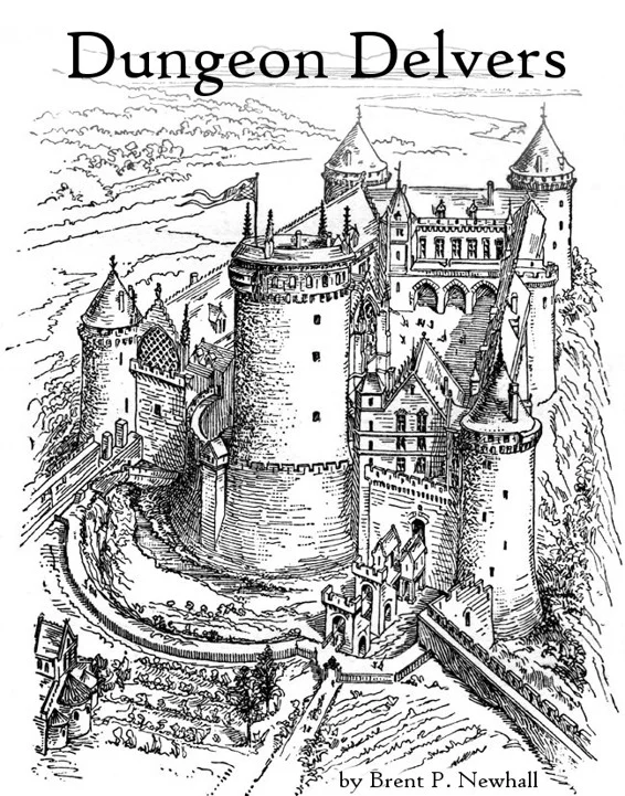
 But I beg to differ. The Creative Commons game, Dungeon Delvers, creates a fully functional role-playing game (RPG) framework in just six pages of poker card-sized frames, which you're meant to fold into a booklet and keep in your wallet, so you're always sure to have an RPG rulebook in the case of a sudden outbreak of role playing.
The infamously complex ruleset of Dungeoneer gets condensed onto a single card as a reminder for players about the phases of their turn.
So don't discount the power of the "elevator pitch". Not everything can be introduced in literally "3 Easy Steps!", but I guarantee if you shoot for that, then your documentation will do amazing things.
As an example, here's a quick introduction to a video editor. Not necessarily the easiest sort of application to introduce, right? It's probably impossible, but let's give it a go:
- Launch Flowblade and click the Add button in the middle panel.
- Double-click the clip thumbnail in the middle panel to open the video in the video monitor on the right.
- Using the i and o keys on your keyboard, mark the In and Out points of the footage you like. Add it to your timeline with the Append button on the far right of the middle button bar.
You're editing video! To learn more about editing, see chapter blah blah blah.
Or maybe it is possible, after all! Sure, for "3 easy steps" there are a lot of compound sentences, but your reader won't notice; they're too busy following instructions and being dazzled by the big numbers of your numbered list!
You see, I'm not saying documentation is honest. In fact, I'm saying it's all show! Grab hold of your reader fast, get them working with your application and they'll forget all about how intimidated they were to get started.
Outliers
Admittedly, there are some things that just don't fit this perfect model. Would I write a three step introduction to GlusterFS, a complex, scalable network filesystem? No, but the Gluster team wrote a six step introduction, which is A) a multiple of three and B) amazing.
Would I write a three step introduction to LVM, a RAID-like filesystem manager? No, but I've seen it done in seven steps (which, arguably, could be re-structured to get down to six or three steps, if I was stubborn).
The examples could continue, but the point isn't actually whether we can boil a Postfix configuration down to three easy steps (which, for the record, I have not been able to do), it's about whether we are aiming for simplified docs that provide an entry point, or whether we just slam prospective users with a manifest of every datatype contained in an application's code, inviting them to write their own darned user guide from it once they've figured out what it all means.
Give it a go the next time you write some documentation. You might surprise yourself, and, more importantly, your users.


3 Comments