In the golden age of data analysis, open source communities are not exempt from the frenzy around getting some big, fancy numbers onto presentation slides. Such information can bring even more value if you master the art of generating a well-analyzed question with proper execution.
You might expect me, a data scientist, to tell you that data analysis and automation will inform your community decisions. It's actually the opposite. Use data analysis to build on your existing open source community knowledge, incorporate others, and uncover potential biases and perspectives not considered. You might be an expert at implementing community events, while your colleague is a wiz at all things code. As each of you develops visualizations within the context of your own knowledge, you both can benefit from that information.
Let's have a moment of realness. Everyone has a thousand and one things to keep up with, and it feels like there is never enough time in a day to do so. If getting an answer about your community takes hours, you won't do it regularly (or ever). Spending the time to create a fully developed visualization makes it feasible to keep up with different aspects of the communities you care about.
With the ever-increasing pressure of being "data-driven," the treasure trove of information around open source communities can be a blessing and a curse. Using the methodology below, I will show you how to pick the needle out of the data haystack.
What is your perspective?
When thinking about a metric, one of the first things you must consider is the perspective you want to provide. The following are a few concepts you could establish.
Informative vs. influencing action: Is there an area of your community that is not understood? Are you taking that first step in getting there? Are you trying to decide on a particular direction? Are you measuring an existing initiative?
Exposing areas of improvement vs. highlighting strengths: There are times when you are trying to hype up your community and show how great it is, especially when trying to demonstrate business impact or advocate for your project. When it comes to informing yourself and the community, you can often get the most value from your metrics by identifying shortcomings. Highlighting strengths is not a bad practice, but there is a time and place. Don't use metrics as a cheerleader inside your community to tell you how great everyone is; instead, share that with outsiders for recognition or promotion.
Community and business impact: Numbers and data are the languages of many businesses. That can make it incredibly difficult to advocate for your community and truly show its value. Data can be a way to speak in their language and show what they want to see to get the rest of your messaging across. Another perspective is the impact on open source overall. How does your community impact others and the ecosystem?
These are not always either/or perspectives. Proper framing will help in creating a more deliberate metric.
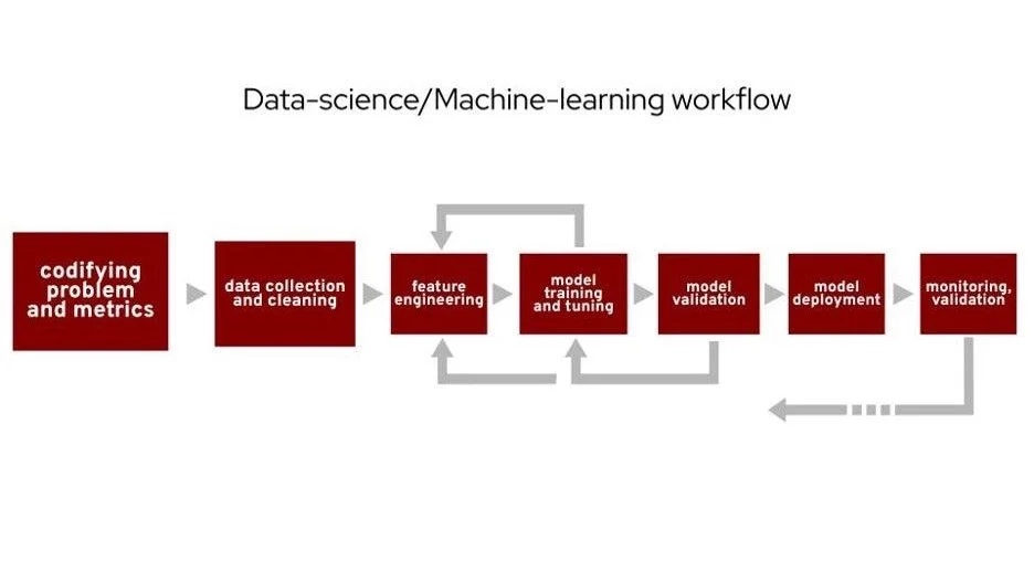
(Cali Dolfi, CC BY-SA 4.0)
People often describe some version of this workflow when talking about general data science or machine learning work. I will focus on the first step, codifying problems and metrics, and briefly mention the second. From a data science perspective, this presentation can be considered a case study of this step. This step is sometimes overlooked, but your analysis's actual value starts here. You don't just wake up one day and know exactly what to look at. Begin with understanding what you want to know and what data you have to get you to the true goal of thoughtful execution of data analysis.
3 data analysis use cases in open source
Here are three different scenarios you might run into in your open source data analysis journey.
Scenario 1: Current data analysis
Suppose you are starting to go down the analysis path, and you already know what you're looking into is generally useful to you/your community. How can you improve? The idea here is to build off "traditional" open source community analysis. Suppose your data indicates you have had 120 total contributors over the project's lifetime. That's a value you can put on a slide, but you can't make decisions from it. Start taking incremental steps from just having a number to having insights. For example, you can break out the sample of total contributors into active versus drifting contributors (contributors who have not contributed in a set amount of time) from the same data.
Scenario 2: Community campaign impact measurement
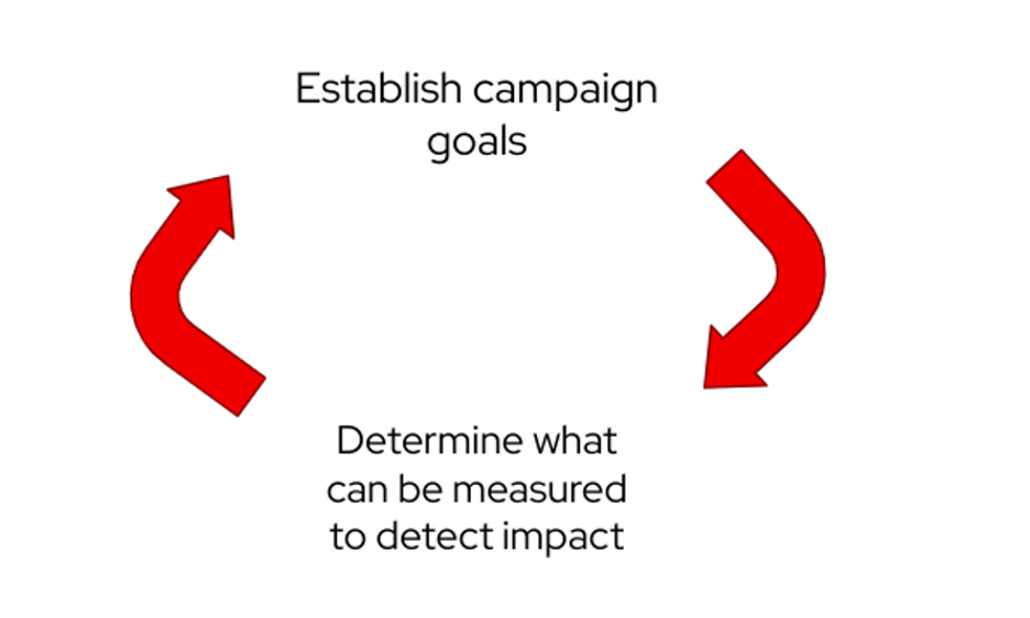
(Cali Dolfi, CC BY-SA 4.0)
Consider meetups, conferences, or any community outreach initiative. How do you view your impacts and goals? These two steps actually feed into each other. Once you establish the campaign goals, determine what can be measured to detect the effect. That information helps set the campaign's goals. It's easy to fall into the trap of being vague rather than concrete with plans when a campaign begins.
Scenario 3: Form new analysis areas to impact
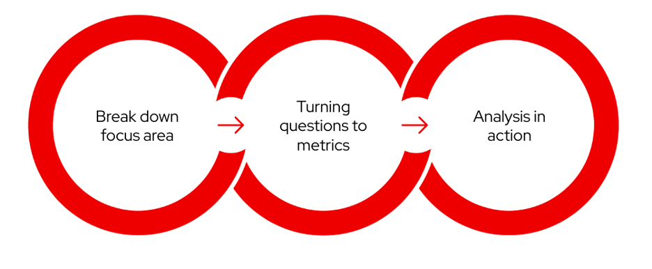
(Cali Dolfi, CC BY-SA 4.0)
This situation occurs when you work from scratch in data analysis. The previous examples are different parts of this workflow. The workflow is a living cycle; you can always make improvements or extensions. From this concept, the following are the necessary steps you should work through. Later in this article, there will be three different examples of how this approach works in the real world.
Step 1: Break down focus areas and perspectives
First, consider a magic eight ball—the toy you can ask anything, shake, and get an answer. Think about your analysis area. If you could get any answer immediately, what would it be?
Next, think about the data. From your magic eight-ball question, what data sources could have anything to do with the question or focus area?
What questions could be answered in the data context to move you closer to your proposed magic eight-ball question? It's important to note that you must consider the assumptions made if you try to bring all the data together.
Step 2: Convert a question to a metric
Here is the process for each sub-question from the first step:
- Select the specific data points needed.
- Determine visualization to get the goal analysis.
- Hypothesize the impacts of this information.
Next, bring in the community to provide feedback and trigger an iterative development process. The collaborative portion of this can be where the real magic happens. The best ideas often come when bringing a concept to someone that inspires them in a way you or they would not have imagined.
Step 3: Analysis in action
This step is where you start working through the implications of the metric or visualization you have created.
The first thing to consider is if this metric follows what is currently known about the community.
- If yes: Are there assumptions made that catered to the results?
- If no: You want to investigate further whether this is potentially a data or calculation issue or if it is just a previously misunderstood part of the community.
Once you have determined if your analysis is stable enough to make inferences on, you can start to implement community initiatives on the information. As you are taking in the analysis to determine the next best step, you should identify specific ways to measure the initiative's success.
Now, observe these community initiatives informed by your metric. Determine if the impact is observable by your priorly established measurement of success. If not, consider the following:
- Are you measuring the right thing?
- Does the initiative strategy need to change?
Example analysis area: New contributors
What is my magic eight-ball question?
- Do people have an experience that establishes them as consistent contributors?
What data do I have that goes into the analysis area and magic eight-ball question?
- What contributor activity exists for repos, including timestamps?
Now that you have the information and a magic eight-ball question, break the analysis down into subparts and follow each of them to the end. This idea correlates with steps 2 and 3 above.
Sub-question 1: "How are people coming into this project?"
This question aims to see what new contributors are doing first.
Data: GitHub data on first contributions over time (issues, PR, comments, etc.).
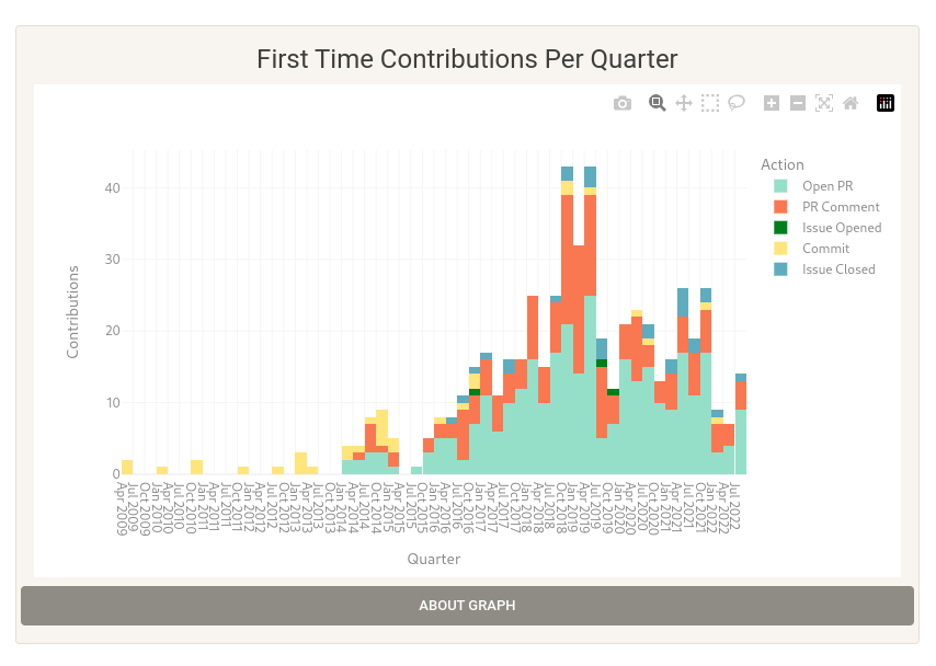
(Cali Dolfi, CC BY-SA 4.0)
Visualization: Bar chart with first-time contributions broken down by quarter.
Potential extension: After you talk with other community members, further examination breaks the information down by quarter and whether the contributor was a repeat or drive-by. You can see what people are doing when they come in and if that tells you anything about whether they will stick around.
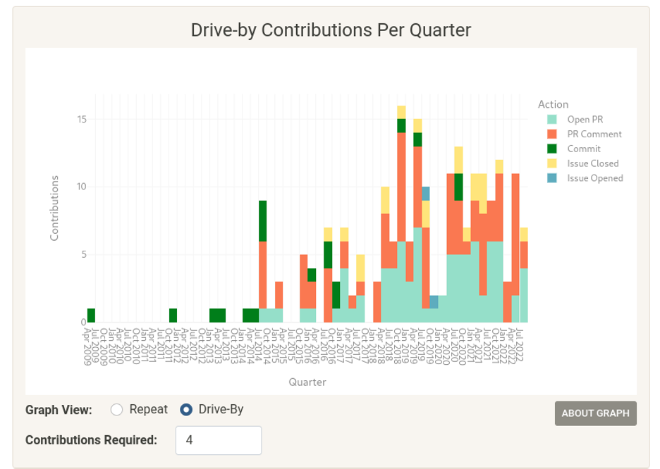
(Cali Dolfi, CC BY-SA 4.0)
Potential actions informed by this information:
- Does the current documentation support contributors for the most common initial contribution? Could you support those contributors better, and would that help more of them stay?
- Is there a contribution area that is not common overall but is a good sign for a repeat contributor? Perhaps PR is a common area for repeat contributors, but most people don't work in that area.
Action items:
- Label "good first issues" consistently and link these issues to the contribution docs.
- Add a PR buddy to these.
Sub-question 2: "Is our code base really dependent on drive-by contributors?"
Data: Contribution data from GitHub.
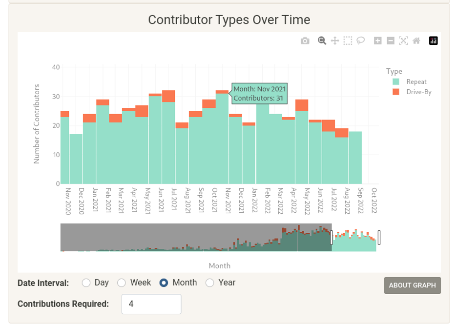
(Cali Dolfi, CC BY-SA 4.0)
Visualization: "Total contributions: Broken down by contributions by drive-by and repeat contributor."
Potential actions informed by this information:
- Does this ratio achieve the program's goals? Is a lot of the work done by drive-by contributors? Is this an underutilized resource, and is the project not doing its part to bring them in?
Analysis: Lessons learned
Number and data analysis are not "facts." They can say anything, and your internal skeptic should be very active when working with data. The iterative process is what will bring value. You don't want your analysis to be a "yes man." Take time to take a step back and evaluate the assumptions you've made.
If a metric just points you in a direction to investigate, that is a huge win. You can't look at or think of everything. Rabbit holes can be a good thing, and conversation starters can bring you to a new place.
Sometimes exactly what you want to measure is not there, but you might be able to get valuable details. You can't assume that you have all the puzzle pieces to get an exact answer to your original question. If you start to force an answer or solution, you can take yourself down a dangerous path led by assumptions. Leaving room for the direction or goal of analysis to change can lead you to a better place or insight than your original idea.
Data is a tool. It is not the answer, but it can bring together insights and information that would not have been accessible otherwise. The methodology of breaking down what you want to know into manageable chunks and building on that is the most important part.
Open source data analysis is a great example of the care you must take with all data science:
- The nuance of the topic area is the most important.
- The process of working through "what to ask/answer" is often overlooked.
- Knowing what to ask can be the hardest part, and when you come up with something insightful and innovative, it's much more than whatever tool you choose.
If you are a community member with no data science experience looking at where to start, I hope this information shows you how important and valuable you can be to this process. You bring the insights and perspectives of the community. If you are a data scientist or someone implementing the metrics or visualizations, you have to listen to the voices around you, even if you are also an active community member. More information on data science is listed at the end of this article.
Wrap up
Use the above example as a framework for establishing data analysis of your own open source project. There are many questions to ask of your results, and knowing both the questions and their answers can lead your project in an exciting and fruitful direction.
More on data science
Consider the following sources for more information on data science and the technologies that provide it with data:


Comments are closed.