I'm an ardent KDE Plasma Desktop user, but at work I happily use GNOME. Without getting into the question of which desktop I'd take to a desert island (that happens to have a power outlet), I see the merits of both desktops, and I'd rather use either of them than non-open source desktop alternatives.
I've tried the proprietary alternatives, and believe me, they're not fun (it took one over a decade to get virtual workspaces, and the other still doesn't have a screenshot function built in). And for all the collaboration that the KDE and GNOME developers do these days at conferences like GUADEC, there's still a great philosophical divide between the two.
And you know what? That's a good thing.
Missing the tree for the forest
As a KDE user, I'm used to options. When I right-click on an object, whether it's a file, a widget, or even the empty space between widgets, I expect to see at least 10 options for what I'd like to do or how I'd like to configure the object. I like that because I like to configure my environment. I see that as the "power" part of being a "power user." I want to be able to adapt my environment to my whims to make it work better for me, even when the way I work is utterly unique and maybe not even sensible.
GNOME doesn't give the user dozens of options with every right-click. In fact, GNOME doesn't even give you that many options when you go to Settings. To get configuration options, you have to download a tool called Tweaks, and for some you must install extensions.
I'm not a GNOME developer, but I've set up a lot of Linux computers for friends and colleagues, and one thing I've noticed is that everybody has a unique perception of interface design. Some people, myself included, enjoy seeing a multitude of choices readily available at every turn.
Other people don't.
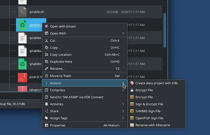
Here's what I see when I right-click on a file in the KDE Plasma Desktop:

(Seth Kenlon, CC BY-SA 4.0)
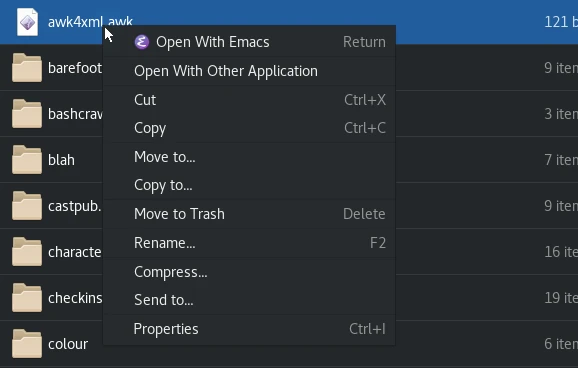
Here's what I see when I right-click on a file in the GNOME desktop:

(Seth Kenlon, CC BY-SA 4.0)
Including submenus, my Plasma Desktop has over 30 choices in a right-click. Of course, that's partly because I've configured it that way, and context matters, too. I have more options in a Git repository, for instance, than outside of one. By contrast, GNOME has 11 options in a right-click.
Bottom line: Some users aren't keen to mentally filter out 29 different options so they can see the one option they're looking for. Minimalism allows users to focus on essential and common actions. Having only the essential options can be comforting for new users, a mental relief for the experienced user, and efficient for all users.
Mistake vectors
As a Linux "power user," I fall prey to the old adage that I'm responsible for my own errors. It's the stuff of legend that Linux gives you access to "dangerous" commands and that, should you choose to use them, you're implicitly forgoing your right to complain about the results. For the record, I've never agreed with this sentiment, and I've written and promoted tools that help avoid mistakes in the terminal.
The problem is that mistakes are not planned. If you could plan your mistakes, you could choose not to make them. What actually happens is that mistakes occur when you haven't planned them, usually at the worst possible moment.
One way to reduce error is to reduce choice. When you have only two buttons to press, you can make only one mistake. It's also easier to identify what mistake you've made when there are fewer avenues to take. When you have five buttons, not only can you make four mistakes, but you also might not recall which button out of the five was the wrong one (and the other wrong one, and the other, and so on).
Bottom line: Fewer choices mean fewer mistakes for users.
Maintenance
If you've ever coded anything, this story might seem familiar to you. It's Friday evening, and you have an idea for a fun little improvement to your code. It seems like an easy feature to implement; you can practically see the code changes in your head. You have nothing better to do that evening, so you get to work. Three weeks later, you've implemented the feature, and all it took was a complete overhaul of your code.
This is not an uncommon developer story. It happens because code changes can have unanticipated ripple effects that you just don't foresee before making the change. In other words, code is expensive. The more code you write, the more you have to maintain. The less code you write, the fewer bugs you have to hunt.
The eye of the beholder
Most users customize their desktop with digital wallpaper. Beyond that, however, I expect most people use the desktop they've been given. So the desktop that GNOME and KDE developers provide is generally what people use, and in the end not just beauty but also the best workflow really are in the eye of the beholder.
I fall into a particular work style when I'm using KDE, and a different style of work when I use GNOME. After all, things are arranged in different locations (although I keep my KDE panel at the top of my screen partly to mimic GNOME's design), and the file managers and the layout of my virtual workspaces are different.
It's a luxury of open source to have arbitrary preferences for your tools. There's plenty to choose from, so you don't have to justify what you do or don't like about one desktop or another. If you try one and can't get used to it, you can always switch to the other.
Minimalism with Linux
I used to think that it made sense to use a tool with 100 options because you can just ignore the 95 that you don't need and focus on the five that you do. The more I use GNOME, however, the more I understand the advantages of minimalism. Reduced design helps some users focus on what matters, it helps others avoid confusion and mistakes due to a complex user interface (UI), and it helps developers maintain quality code. And some people just happen to prefer it.
There's a lesson here for users and developers alike, but it's not that one is better than the other. In fact, these principles apply to a lot more than just KDE and GNOME. User experience and developer experience are each important, and sometimes complexity is warranted while other times minimalism has the advantage.


7 Comments