Whoa. Thanks for all the feedback on the POSSE logo from everyone who voted and chimed in. Your comments are very useful.
The final results, in order from favorite to least favorite, are below. Both the voting and comments overwhelmingly selected logo number one as the best logo. We tend to agree. So, without further ado,we declare Owl number one is the winner, and the final logo is:
Crowned winner

Runner-up and Mr. Congeniality

Astute readers will notice we've made a few typography tweaks based on feedback. First of all, commenters wanted the typeface to be strong, bold, and print well on items (like t-shirts). So we're going with a sans-serif font that looks clean and meshes well with the owl.
As an added bonus, our fantastic designer Libby Levi tells us that the matching body font for that logo-font variant is Liberation Sans, a common free-as-in-freedom, GNU General Public License (GPL), font. We thought open licensing was an important consideration here--it allows more people to produce and remix POSSE materials without license obstacles.
The owl also comes in a few other colors:
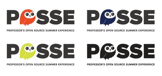
Or on a dark background:
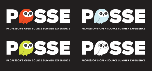
But the primary colors are orange, dark gray, and white. Bonus for t-shirt printing: All logo variants are two-color and look good in one-color, making screenprinting fantastically cheaper. (Which reminds us that the whiteboard markers we made for POSSE conference swag are now... antique.)
To fans of the runner-up logo: The little hand-drawn owl was a strong contender, and we admit to being fond of the style ourselves. Its scruffiness (some may call it 'hipness') doesn't seem quite appropriate for a professors' workshop, as multiple commenters pointed out. It's a funky look more appropriate for a younger crowd like, for instance, students. We'll be keeping this one in our back pocket. You never know--it might be useful in the future.
Thanks again to all those who voted, and stay tuned for more stories from this summer's POSSE cohort, which takes place July 23-24 in Raleigh, North Carolina.





2 Comments