Looking back to the start of the year, we could never have predicted what would befall our world as a result of COVID-19. Back then, the coronavirus was spreading in China, and while there were warnings of its potential to escalate across the world, few could imagine the tremendous shift it would bring to the status quo.
Today, we find ourselves living in a new normal. Working from home has become standard, the global economy is uncertain, hospitals are working harder than ever, and the world is waiting for a vaccine to provide reassurance that we can stop social distancing.
It is fair to say that we are living in uncertain times. Yet, hope is on the horizon. While we definitely missed the boat in predicting the current situation, as coronavirus evolves, we have opportunities to collect, analyze, and visualize data from various sources to predict its impact across the globe.
And what better way to do that than through open source technology, crowdsourced data, and community collaboration?
That's how the COVID-19 Community Dashboard Project was born. The COVID-19 Community Dashboard is a community-driven project to collect crowdsourced data related to the COVID-19 pandemic. The data is collected in collaboration with the engineering and data science communities, indexed in Elasticsearch, and made accessible to people through a friendly and engaging Kibana-based dashboard.
The goal is to provide an important resource for anyone looking for up-to-date information on the pandemic and its effects.
A community-driven opportunity
The open source community often comes together to create technology to benefit society or broad communities. In today's environment, the world is looking for clarity and knowledge. So, if we can build a centralized hub of information related to COVID-19 and visualize it for the public, we can help people get a clearer picture of the situation and gain valuable insights on patterns, problem areas, opportunities to help, future trends, long-term effects, and even positive byproducts.
So far, the COVID-19 Community Dashboard Project has ingested data sources into its platform, which is based on the popular open-source ELK stack, such as the number of cases worldwide, cases by country and state/province, the status of those affected by country (e.g., recovery rates), trends over time, and more. The dashboard enables anyone to review the global pandemic, a specific country's status, or even compare data and trends across countries.
COVID-19 trends visualized in Kibana
Using Kibana, an open source visualization tool, gives the COVID-19 Community Dashboard Project several advantages. In addition to its powerful visualization capabilities, Kibana is widely known throughout the community, which makes it easy for collaboration.
The dashboard was launched using John Hopkins University's Center for Systems Science and Engineering's (CSSE) public COVID-19 dataset, which aggregates multiple public data sources from the World Health Organization (WHO), multiple Centers for Disease Control and Prevention (CDC) agencies around the world, state and national government health departments, and more. The Community Dashboard currently reflects this extensive dataset.
So far, we have visualized the following data (note that this data is from late April).
Worldwide infection status
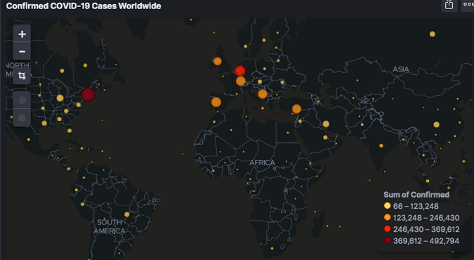
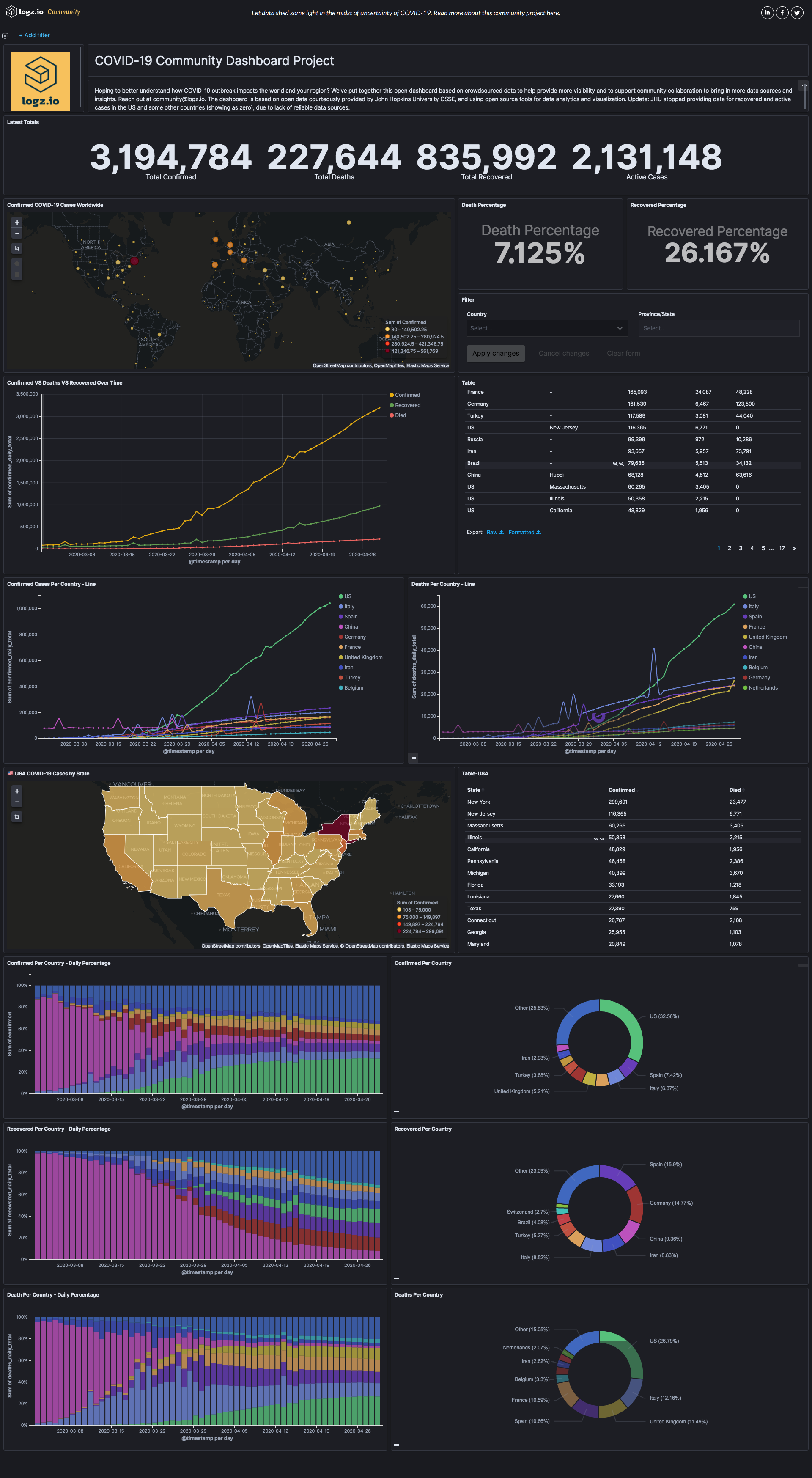
This visualization shows that over 2 million people around the world were diagnosed with the coronavirus that causes COVID-19 as of late April. There are likely many more undiagnosed cases, as not everyone has access to proper testing, and many carriers are asymptomatic.

This overview of worldwide infection status shows hotspots around the world.
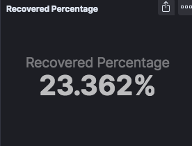
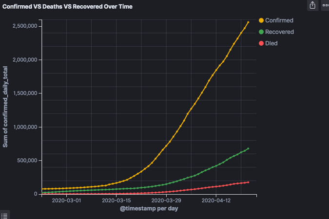
Looking for a silver lining? Over 23% of COVID-19 patients have already recovered, and over time, far more individuals are recovering than are dying from the virus. And the true recovery rate is far higher, as recovery data is partial in some countries.
Get local
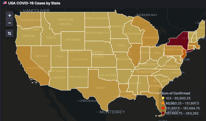
If you want to know the COVID-19 status in your area, you can filter data by country, state, or province.
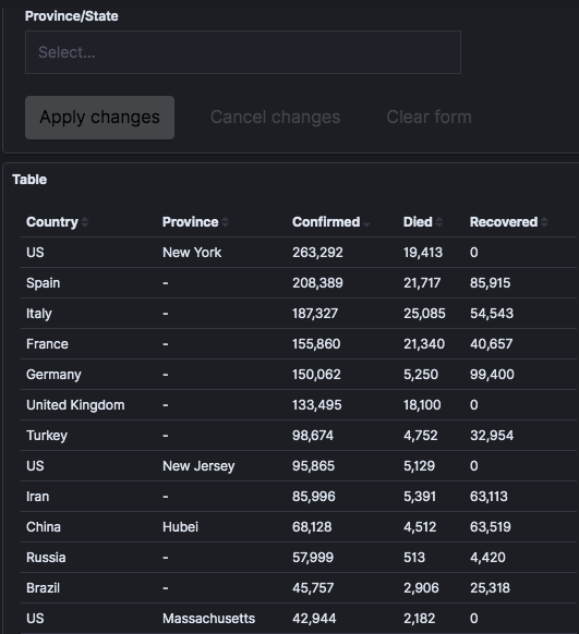
Using the United States as an example, you can see that New York far surpassed the rest of the country in coronavirus cases (and, as you can see in the table above, it even surpassed countries around the world, including Italy and Spain).
Compare countries
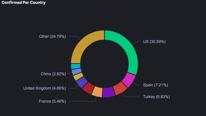
How does one country compare to others? You can use the dashboard to compare infection status and recovery rates in various places around the world.
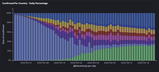
You can also see trends over time. In this view, for example, it's clear that as the percentage of worldwide infections grew in the United States (in green), it dramatically decreased in China (in light purple).
If you want to dig deeper by comparing your country to other reference countries/states, put those countries in the filter box, and the entire dashboard will filter to show only the selected countries. For example, see the infection rate in Spain compared to Italy:

View the full dashboard
The complete dashboard displays a wealth of information about the current status of COVID-19 worldwide.
Future goals
Beginning this project with health information is important, but we'd like to develop a more robust dashboard that delves into other important information, trends, and effects.
Some of our ideas include COVID-19's effects on:
- The economy (e.g., exchanges, specific significant stocks, oil prices, unemployment data by country/state/province, etc.)
- Air travel (e.g., where travel is still happening and the rate of cancellations)
- The environment (e.g., air pollution reduction from people staying home)
- Internet demand (e.g., app downloads, broadband usage, mobile data)
We're interested in knowing anything else you think is relevant to include to this project.
We also hope to add supplementary data to track research on the stages of laboratory trials of proposed treatments and vaccines for COVID-19. This would provide organized, optimistic information about the coronavirus and give people a place to get a clear picture of the global race for a cure (without the deluge of unclear or misleading information posted across the web).
Our vision is that this information will show how the world's infrastructure and culture are coping with the pandemic and to enable the open source community to collaborate and give back to the world on a larger scale.
If you want to contribute to the COVID-19 Dashboard project, contact us at community@logz.io with your ideas and data sources, APIs, suggested integrations, visualization, or anything else you would like to contribute, and we'll get you on board.




Comments are closed.