Get the highlights in your inbox every week.
Customize your Linux terminal with your favorite logo | Opensource.com
Customize your Linux terminal with your favorite logo
Replace your terminal's boring green-on-black color scheme.

I enjoyed using my terminal's green-on-black color scheme for many years. It is reminiscent of the DEC VT100/220 terminals that I used in college. I began to get bored with it earlier this year when I bought a tenkeyless keyboard from Hyper-X. The keyboard is black, and the keys are backlit in red, so I changed my terminal's colors to match. I think it looks really cool at night.
I use GNOME as my main desktop environment, and I prefer to stick with the standard GNOME Terminal. Here's how I customized its settings to achieve my new color scheme.I always like to keep the default profile as a fallback in case I really screw things up; it's good to have a baseline. So first, I cloned the default profile and named the new clone HyperX. I did my customizations in this profile and, once I was happy, set it to be the default.
Second, under the new profile's Colors tab, I changed Built-in schemes to Custom. Then, for Default color, I set Text to red (#FF0000) and Background to black (#000000). I haven't decided my favorite colors for Bold, Cursor, and Highlight, but they are easy to adjust.
Your distro logo
For beautiful screenshots of a terminal, there's no better command than screenfetch. Screenfetch autodetects your distribution and places an ASCII art version of the logo in your terminal window upon request. It also provides common information about your system, such as your user name, kernel version, uptime, and much more.
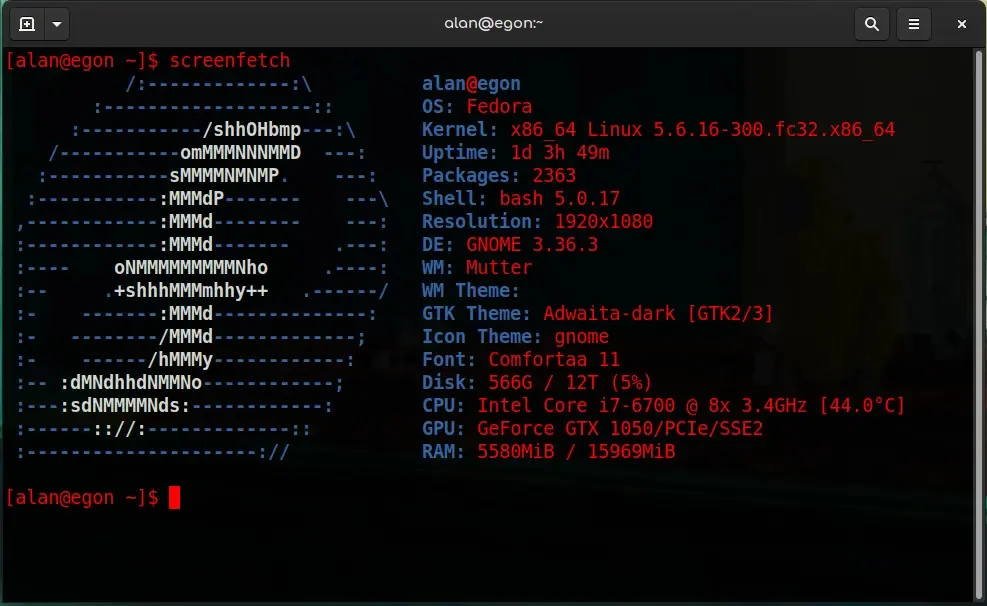
You can install screenfetch from your software repository, or from source code.
More than just a pretty effect
Cool desktop effects can be fun, but sometimes they're more than just visual treats. They can have a real benefit that alters how you work. For instance, I enable a transparent background for my terminal. I set it to a small amount, probably 10% opacity, so it doesn't interfere with my ability to read my terminal text. However, the benefit is that when my terminal is on top of another window (perhaps a browser page), I can read both. There's no need to Alt+Tab between the two windows.
Besides the neat effect, it is useful if you are only using one monitor.
What are your favorite terminal customizations? Please share them in the comments!
4 Comments, Register or Log in to post a comment.
The whole "green on black" theme is yet another example of how cargo-cult people are. The "x on black" display was created to save resources during the almost primitive days of computing, and this was the most cost-effective way. Using a terminal on a GUI today, the OS draws the whole window regardless if it's black on white or white on black. So it leaves us with the question of whether either is "better". There's no evidence that either is, but, since most of the other applications, like the browser is using a light background, switching from it to a dark background is forcing the eye to constantly refocus. And using "dark mode" isn't really a solution, you can't "dark mode" the sites, or your office documents, i.e. the content, just the chrome. The best solution is using a soft, pastel colour as background and black characters in front. But I guess it doesn't look cool enough. And speaking of which "I think it looks really cool at night."yes, it is. And 30 years from now, you'll live to regret that thought. Turn up the lights.
Your comment confuses me. Most people with whom I spoke about colour schemes don't cite aesthetics as the first reason to switch to a dark one, but rather the problem of bright blinding lights at night. I can personally attest that such a reason drove me to use a dark theme for my terminal, GTK, and even as injected CSS in websites I frequent.
As for the detrimental effects of using a dark theme, which your comment implies to be some sort of eye strain, can you please cite some sources? I tried to do some of my own research (only reading abstracts as I don't have the time or the resources to access Ergonomics papers), and arrived at the following conclusions:
* https://onlinelibrary.wiley.com/doi/abs/10.1111/cxo.12798 excessive exposure to intense lights may cause eye strain
* https://www.tandfonline.com/doi/abs/10.1080/00140130701306413 light-on-dark may cause performance
and reading comprehension issues…
* https://pubmed.ncbi.nlm.nih.gov/2210772/ or maybe not, but if you're going light-on-dark choose a background colour towards the blue, and make sure to use desaturated colours.
* https://www.sciencedirect.com/science/article/abs/pii/S0169814196000261 or maybe the effects are negligible as long as you're not doing red-on-green.
If you have any sources to your claims I would love to read them, as I have gained a sudden interest in the subject.
You can most certainly "dark mode" sites using stylish or other alternatives to it that not only make it super simple to do it by providing a handy theme repository with one click install without even leaving the extension but also allow you to create your custom css if you're knowleageable enough.
I'll steer clear of the Light vs. Dark discussion, but try Neofetch, also.