When a team of designers works together on a project, one of the most important goals is consistency. Whether you need a consistent look because of a corporate identity or just for visual cohesion, the look and layout of pages and screens must be reasonably similar within any given project. It's hard enough to do this as a solo artist, and it gets more complex with added contributors. It becomes a monumental task when several mock-ups from a design team must be approved by a client, signed off by an accessibility expert, and then translated by a team of programmers. It's difficult but manageable with the right tool, and the open source tool for the job is Penpot.
Penpot is an online design workspace where designers can create or import graphical elements, create mock-ups, and share those mock-ups with clients and collaborators. It is open source and relies on open formats like SVG, which means your contributors have lots of choices in what tools they use to contribute assets. To try Penpot, go to Penpot.app and create an account.
Getting started with Penpot
After you log in, you're presented with the Projects page. There are some demo files here, designed to provide you with an overview of the Penpot interface. A project in Penpot can have multiple pages. Select a page to view in the Pages panel.
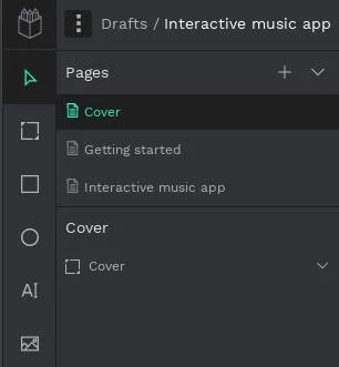
(Seth Kenlon, CC BY-SA 4.0)
A page in Penpot isn't like a page in the real world. A Penpot page is an infinite canvas. Middle-click and drag to move the canvas.
To zoom in and out, press Ctrl on your keyboard and then use your mouse wheel or do the equivalent action on the trackpad or tablet you use.
Zoom is an especially useful convention because Penpot is often used to design content for screens that are intended to scroll, not paginate.
Create an artboard
An infinite canvas means you can use the same workspace to display several different options for the same page type. You can design a light and dark theme, a mobile and desktop version, and then several different iterations of each. Because everything's on the canvas, you need a way to define an area for your design, and in the terminology of design apps, that's an artboard. An artboard is a container (think of it as a div, in CSS terms) for a mock-up. It's the part of the canvas you'll show someone when they ask to see your design ideas.
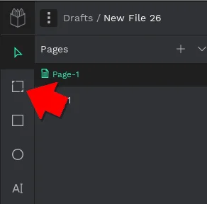
To create an artboard, click the Artboard icon in the left toolbar, or just press A on your keyboard.
(Seth Kenlon, CC BY-SA 4.0)
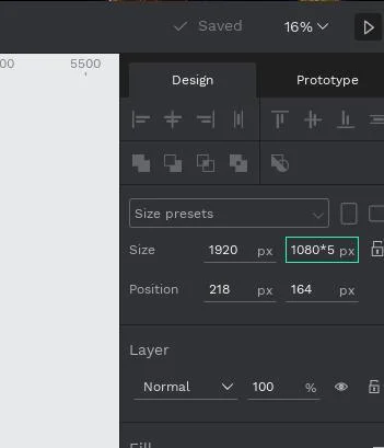
Click and drag on the canvas to create an artboard. If you're designing for a specific screen or page size, you can represent it with your artboard. If you need very specific sizes, you can adjust your artboard's dimensions in the properties panel on the right side of the Penpot interface.
(Seth Kenlon, CC BY-SA 4.0)
You can perform basic maths in the text fields, too. For example, if you know your design size is 1920 by 1080, but you need to allow for scrolling down the equivalent of five screens, enter 1080*5 as the height, and Penpot converts it to 5400 for you.
Drawing in Penpot
Penpot primarily uses SVG (Scalable Vector Graphics) for its design elements. SVG is a structured and open format that's easy for web developers to translate into code. Thanks to this feature, drawing in Penpot is as easy as drawing in Inkscape and, just as importantly, it's easy to align, duplicate, re-use, and export for use in any other application.

(Seth Kenlon, CC BY-SA 4.0)
In Penpot, you have these drawing tools:
- Rectangle (R): draw rectangles, and adjust for rounded corners and fills in the properties panel
- Ellipse (E): draw ellipses and circles
- Text (T): create text elements
- Image (Shift+K): import a bitmap image
- Curve (Shift+C): a pen with Bezier curves
- Path (P): a pen tool
You can adjust all design elements in the properties panel on the right of the interface. Most everything that can be adjusted also maps to a CSS property, so in a way, you're designing for the web in a graphical interface, meaning it's that much easier for the development team to translate design to implementation accurately.
Assets
One of the easiest ways to ensure consistency in design is to re-use assets. The fewer times a designer has to draw essentially the same button, the fewer opportunities there are for a rounded corner to be forgotten or the size to be wrong. Build a library of design elements and make those the vocabulary of your designers.
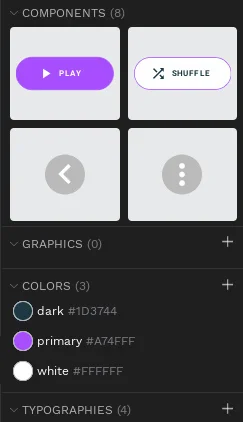
Creating a component library for your project is easy. Once you've designed an element, right-click on it, and select Create Component. The item is added to your project's Assets library.
(Seth Kenlon, CC BY-SA 4.0)
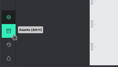
You can access your asset library by pressing Alt+I on your keyboard or clicking the Assets icon in the lower-left corner of the interface.
(Seth Kenlon, CC BY-SA 4.0)
Comments and feedback
A healthy feedback loop is vital for collaboration, and one way to provide feedback asynchronously is the Comment (C) tool. Using the Comment tool, collaborators on a project can safely post questions and observations anywhere in the workspace. Comments are threaded, so a conversation happens within one comment block, and a comment thread can be deleted when an issue has been resolved.
Prototype
Designing for interactive media is different from designing a magazine ad or a billboard. Things change based on viewer choices and application status. To capture the different states your design may go through as a user interacts with it, you can build a prototype, with no coding required.
A prototype lets you set any design element as a trigger to detect a click or mouse event and to take an action such as navigating to another artboard or opening an overlay. Your app won't actually work, but it'll look and act like it works.
Using open source for design
Penpot is an amazing and fun tool, not just as a design and prototyping platform but also as an online SVG illustration app. Use Penpot to mock-up an application so you can understand user interaction before writing code, use it to encourage design contribution, and enable collaboration between teams.
If you want to get started, but aren't sure where to begin, try opening this great demo project in Penpot to see how components are stored and connected.




Comments are closed.