

When you write documentation, whether that's for an open source project or a technical writing project, you should have two goals: The document should be written well, and the document should be easy to read. The first is addressed by clear writing skills and technical editing. The second can be addressed with a few simple changes to an HTML document.
HyperText Markup Language, or HTML, is the backbone of the internet. Since the dawn of the "World Wide Web" in 1994, every web browser uses HTML to display documents and websites. And for almost as long, HTML has supported the stylesheet, a special addition to an HTML document that defines how the text should appear on the screen.
You can write project documentation in plain HTML, and that gets the job done. However, plain HTML styling may feel a little spartan. Instead, try adding a few simple styles to an HTML document to add a little pizzazz to documentation, and make your documents clearer and easier to read.
Defining an HTML document
Let's start with a plain HTML document and explore how to add styles to it. An empty HTML document contains the
You can define a blank page with this HTML code:
<!DOCTYPE html>
<html>
  <head>
    <title>This is a new document</title>
  </head>
  <body>

  </body>
</html>
In another article about Writing project documentation in HTML, I updated a Readme file from an open source board game from plain text to an HTML document, using a few basic HTML tags like
<!DOCTYPE html>
<html>
  <head>
    <title>Simple Senet</title>
  </head>
  <body>
    <h1>Simple Senet</h1>
    <h2>How to Play</h2>

    <p>The game will automatically "throw" the throwing sticks
    for you, and display the results in the lower-right corner
    of the screen.</p>

    <p>If the "throw" is zero, then you lose your turn.</p>

    <p>When it's your turn, the game will automatically select
    your first piece on the board. You may or may not be
    able to make a move with this piece, so select your piece
    to move, and hit <i>Space</i> (or <i>Enter</i>) to move
    it. You can select using several different methods:</p>

    <ul>
      <li><i>Up</i>/<i>down</i>/<i>left</i>/<i>right</i> to
      navigate to a specific square.</li>

      <li>Plus (<b>+</b>) or minus (<b>-</b>) to navigate "left"
      and "right" on the board. Note that this will automatically
      follow the "backwards S" shape of the board.</li>

      <li><em>Tab</em> to select your next piece on the
      board.</li>
    </ul>

    <p>To quit the game at any time, press <b>Q</b> (uppercase
    Q) or hit <i>Esc</i>, and the game will prompt if you want
    to forfeit the game.</p>

    <p>You win if you move all of your pieces off the board
    before your opponent. It takes a combination of luck and
    strategy!</p>
  </body>
</html>
This HTML document demonstrates a few common block and inline elements used by technical writers who write with HTML. Block elements define a rectangle around text. Paragraphs and headings are examples of block elements, because they extend from the left to the right edges of the document. For example,
You can apply direct styling to this document to change the font, colors, and other text styles, but a more efficient way to modify the document's appearance is to apply a stylesheet to the document itself. You can do that in the
<!DOCTYPE html>
<html>
  <head>
    <title>Simple Senet</title>
    <style>

    </style>
  </head>
  <body>
    ...
  </body>
</html>
Defining styles
Since you're just starting to learn about stylesheets, let's demonstrate a basic style: background color. I like to start with the background color because it helps to demonstrate block and inline elements. Let's apply a somewhat gaudy stylesheet that sets a light blue background color for all
You define these using styles in the element { style; style; style; ... } and uses curly braces to group together several text styles into a single definition.
    <style>
p { background-color: lightblue; }
ul { background-color: lightgreen; }

b { background-color: yellow; }
i { background-color: pink; }
    </style>
Note that each style ends with a semicolon.
If you view this HTML document in a web browser, you can see how the
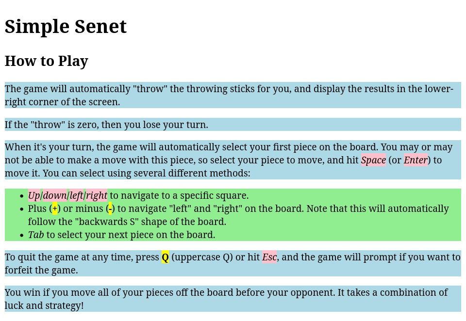
(Jim Hall, CC BY-SA 4.0)
Applying styles
You can use styles to make this Readme document easier to read. You're just starting to learn about styles, you'll stick to a few simple style elements:
- background-color to set the background color
- color to set the text color
- font-family to use a different text font
- margin-top to add space above an element
- margin-bottom to add space below an element
- text-align to change how the text is displayed, such as to the left, to the right, or centered
Let's start over with your stylesheet and apply these new styles to your document. To begin, use a more pleasing font for your document. If your HTML document does not specify a font, the web browser picks one for you. Depending on how the browser is set up, this could be a serif font, like the font used in my screenshot, or a sans-serif font. Serif fonts have a small stroke added to each letter, which makes these fonts much easier to read in print. Sans-serif fonts lack this extra stroke, which makes text appear sharper on a computer display. Common serif fonts include Garamond or Times New Roman. Popular sans-serif fonts include Roboto and Arial.
For example, to set the document body font to Roboto, use this style:
body { font-family: Roboto; }By setting a font, you assume the person viewing your document also has that font installed. Some fonts have become so common they are considered de facto "Web safe" fonts. These include sans-serif fonts like Arial and serif fonts such as Times New Roman. Roboto is a newer font and may not be available everywhere. So instead of listing just one font, web designers usually put one or more "backup" fonts. You can add these alternative fonts by separating them with a comma. For example, if the user doesn't have the Roboto font on their system, you can instead use Arial for the text body by using this style definition:
body { font-family: Roboto, Arial; }All web browsers define a default serif and sans-serif font that you can reference with those names. Users can change which font they prefer to use for serif and sans-serif, so aren't likely to be the same for everyone, but using serif or sans-serif in a font list is usually a good idea. By adding that font, at least the user gets some approximation of how you want the HTML document to appear:
body { font-family: Roboto, Arial, sans-serif; }If your font name is more than one word, you have to put quotes around it. HTML allows you to use either single quotes or double quotes here. Define a few serif fonts for the heading and subheading, including Times New Roman:
h1 { font-family: "Times New Roman", Garamond, serif; }
h2 { font-family: "Times New Roman", Garamond, serif; }
Note that the
h1, h2 { font-family: "Times New Roman", Garamond, serif; }When writing documentation, many technical writers prefer to center the main title on the page. You can use
h1 { text-align: center; }To help bold and italics text to stand out, put them in a slightly different color. For certain documents, I might use dark blue for bold text, and dark green for italics text. These are pretty close to black, but with just enough subtle difference that the color grabs the reader's attention.
b { color: darkblue; }
i { color: darkgreen; }
Finally, I prefer to add extra spacing around my list elements, to make these easier to read. If each list item was only a few words, the extra space might not matter. But the middle item in my example text is quite long and wraps to a second line. The extra space helps the reader see each item in this list more clearly. You can use the
li { margin-top: 10px; margin-bottom: 10px; }This style defines a distance, which I've indicated here as
Assuming you really just want to add an extra blank line between the list elements, you can also use
li { margin-top: 1em; margin-bottom: 1em; } The complete list of styles in your HTML document looks like this:
<!DOCTYPE html>
<html>
  <head>
    <title>Simple Senet</title>
    <style>
body { font-family: Roboto, Arial, sans-serif; }
h1, h2 { font-family: "Times New Roman", Garamond, serif; }
h1 { text-align: center; }
b { color: darkblue; }
i { color: darkgreen; }
li { margin-top: 1em; margin-bottom: 1em; }
    </style>
  </head>
  <body>
    <h1>Simple Senet</h1>
    <h2>How to Play</h2>

    <p>The game will automatically "throw" the throwing sticks
    for you, and display the results in the lower-right corner
    of the screen.</p>

    <p>If the "throw" is zero, then you lose your turn.</p>

    <p>When it's your turn, the game will automatically select
    your first piece on the board. You may or may not be
    able to make a move with this piece, so select your piece
    to move, and hit <i>Space</i> (or <i>Enter</i>) to move
    it. You can select using several different methods:</p>

    <ul>
      <li><i>Up</i>/<i>down</i>/<i>left</i>/<i>right</i> to
      navigate to a specific square.</li>

      <li>Plus (<b>+</b>) or minus (<b>-</b>) to navigate "left"
      and "right" on the board. Note that this will automatically
      follow the "backwards S" shape of the board.</li>

      <li><em>Tab</em> to select your next piece on the
      board.</li>
    </ul>

    <p>To quit the game at any time, press <b>Q</b> (uppercase
    Q) or hit <i>Esc</i>, and the game will prompt if you want
    to forfeit the game.</p>

    <p>You win if you move all of your pieces off the board
    before your opponent. It takes a combination of luck and
    strategy!</p>
  </body>
</html>
When viewed on a web browser, you see your Readme document in a sans-serif font, with serif fonts for the heading and subheading. The page title is centered. The bold and italics text use a slightly different color that calls the reader's attention without being distracting. Finally, your list items have extra space around them, making each item easier to read.
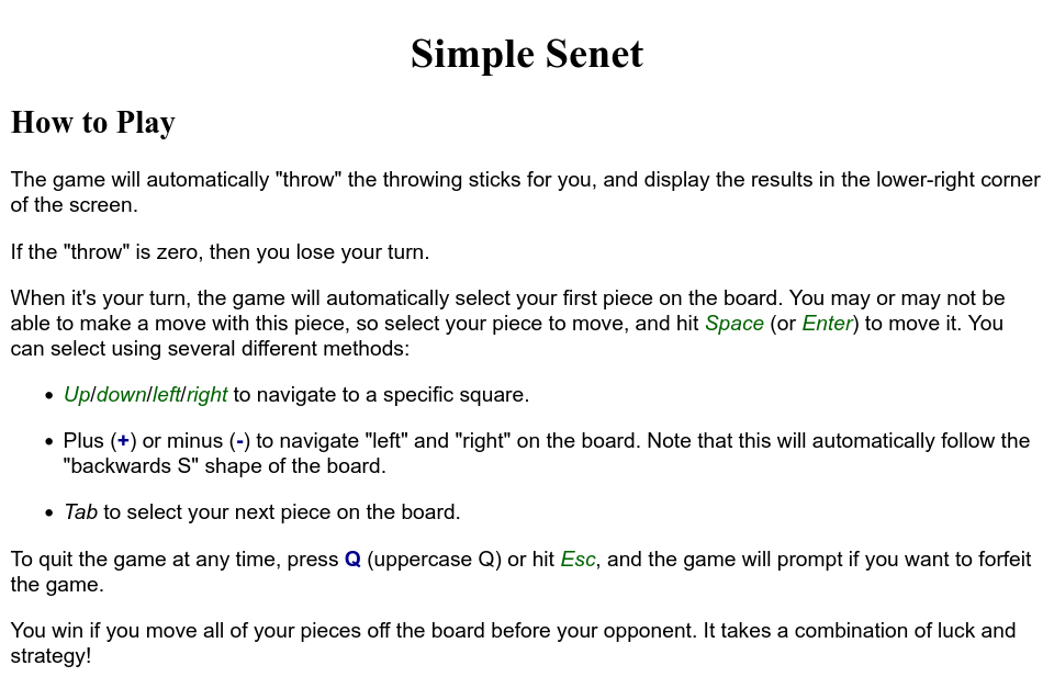
(Jim Hall, CC BY-SA 4.0)
This is a simple introduction to using styles in technical writing. Having mastered the basics, you might be interested in Mozilla's HTML Guide. This includes some great beginner's tutorials so you can learn how to create your own web pages.
For more information on how CSS styling works, I recommend Mozilla's CSS Guide.


Comments are closed.