New design brings an improved reader experience to Opensource.com

444 readers like this.
open source button on keyboard

Opensource.com

The Opensource.com team has been working diligently with our development team at Bluespark to complete a site redesign with three big goals in mind. Before we deploy these changes next week, here's a look at what we've been working on.

Site redesign goals

  1. Improve readability
  2. Improve mobile
  3. Provide more accurate, related content

oct2016_redesign.png

Improve readability

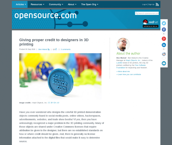
To improve the reading experience, we started by implementing a single-column layout to remove some of the clutter from the right sidebar. We also increased the font size to 1.2em, increased the line-height to 1.5em, and tightened up the line-width to 700 pixels. In a follow-up code sprint, we hope to apply these updates to other content types on the site.

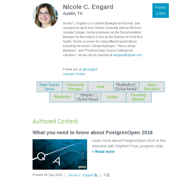
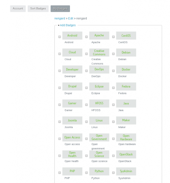
We also updated the user profile pages with a cleaner design. Be sure to check out your page and make any updates to your profile. You may notice that you can sport some new bling with some add-on badges that were quietly introduced a few weeks ago. Make sure you're logged in, select the "My badges" tab, then edit.

nengard_badges2.pngnengard_badges1.png

Improve mobile

Many of our readers are reading Opensource.com on their mobile device, so to create a better experience, we've updated our design approach to be responsive. We will be implementing a single-column layout to improve how the site appears on tablets and phones. And the improvements to readability mentioned above should also help. Additionally, we'll make some structural improvements to our header section and navigation to clean things up.

Provide more accurate related content

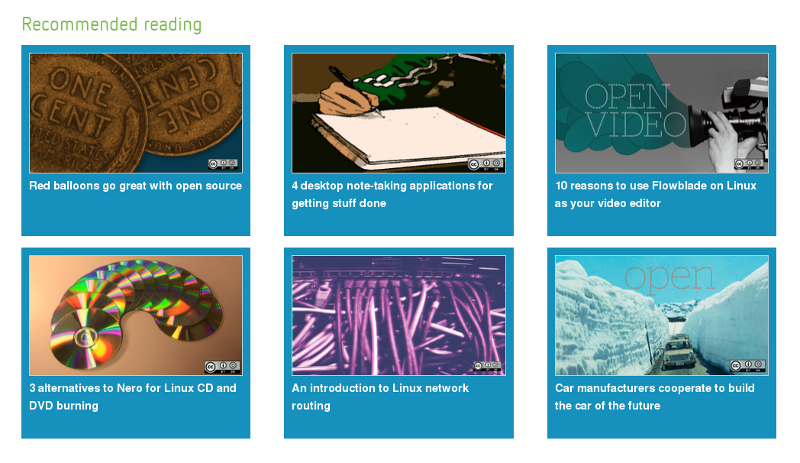
Opensource.com holds more than six years of articles, resources, polls, and more. Our goal is to present you, the reader, with the most content that helps you answer the questions you have, find the stories you care about, and learn something new. We made some improvements on how we present our "Recommended Reading" as well as the algorithm that dymanically generates the recommendations.

recommended_reading.png

Tag clean up is another project we've taken on during this redesign. We had more than 6,000 tags; some of them were used only once, and others were synonyms or close cousins to the tag we really wanted to use. Our team now has them down to under 500 tags, and this back-end work should improve how our articles are related to each other.

Feedback from readers

We welcome your feedback after the redesign goes live. We'll have a quick sprint after the release to clean-up a few outstanding issues and address any bugs.

Let us know what works for you, what doesn't, and other suggestions you might have for a better reader experience on Opensource.com.

Chime in on the comments or send us an email.

Avatar
Jason Hibbets is a Community Director at Red Hat with the Digital Communities team. He works with the Enable Architect, Enable Sysadmin, Enterprisers Project, and Opensource.com community publications.

14 Comments

Can we have an other background color than darkgray...?

My personal view, I like the simple single-column design even to move the right sidebar to the end of the article, related article recommend is good, but with a rectangle picture for related article might interfere with the beauty of simplicity. text hyper link, better, efficiently.

Good news on this front. We have another round of edits to the article page that will get us to a complete single column. We plan on moving the author bio to the bottom of the article and centering the entire page.

Thanks for your feedback.

In reply to by FQ

As a possible new reader, I'm somewhat turned off by the stretched banner image at the top of the website. I'm using javelin, chrome, gello (Cyanogenmod browser) and opera mini on a nexus 7. I find it somewhat ironic that the first article I read states a goal of improving the mobile experience, yet the first thing I see is being displayed poorly.

If you can send me a screenshot of what you're seeing that would be great: open@opensource.com. I'm not sure I fully understand what you're describing, however, we are looking to overhaul the header display during the current sprint.

In reply to by Anonymous (not verified)

It looks far better now. Previously the entire header was stretched instead of leaving space between the website title and the red hat logo; now everything's perfect and only the background image is changing.

The only change I would consider here is maybe making the entire header shorter (About 2/3 to 3/4 current height) on articles, if possible, and leaving it the way it is on the main page. A small sticky header like Ars Technica uses in articles (it shows when you scroll up and disappears when you scroll down, and the unnecessary upper area is only shown when scrolled all the way the top) would be nice for quickly getting back to the main page on longer articles or comment threads.

In reply to by jhibbets

We are actually looking to revise the header area to stream line it. And we definitely like the idea of the disappearing header and show again on scroll up to show again.

In reply to by Anonymous (not verified)

Code deployment is now live, please let us know if you have feedback or see things that need to be fixed.

Jason

Looking excellent, I haven't had any issues so far on the devices I've been using (FF 49.0.1 on Windows and Android Browser on Galaxy S6 Edge+).

The redesign looks really clean, good job!

I'm hoping the social media stuff doesn't float on the right all the time. I can figure out, all by my "widdle wonesome", without being badgered, whether I want to share something, and how to do it.

I like the new look!

I love the newest design! Looking great!

Creative Commons LicenseThis work is licensed under a Creative Commons Attribution-Share Alike 4.0 International License.