

Terminal emulators came up as a topic for me recently, and it got me thinking: What's everyone's favorite terminal font?
So I asked Opensource.com contributors to share what font they like to use. Here are their answers.
VT323
I like to use a different font (VT323) in my GNOME Terminal than the font I use (Source Code Pro) in my programming editors or other apps that use a monospace font. I just like the look of the classic VT-style font.
Sometimes, I switch to the original IBM EGA font, because to my eye it looks really nice. But I associate EGA with DOS, and I associate VT323 with classic Unix terminals, so I use VT323 most of the time. Here's my screenshot of GNOME Terminal using VT323 as the monospace font:
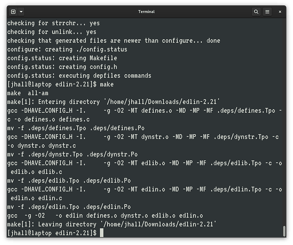
(Jim Hall CC BY-SA 4.0)
I set up the terminal using VT323 at 24 pt, which gives a nice big window. If I'm going to bring up a terminal window, I want to really use it to do real work, not just do one thing and exit. I'm probably going to stay in that terminal window for a while, so it should be big and easy to see. I also prefer 80x25, because I'm an old DOS command line guy and 25 lines looks "right" to my eyes:
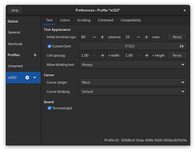
(Jim Hall CC BY-SA 4.0)
Monospaced fonts
I don't know that I have a specific font that I use. I usually use either DejaVu or Liberation Mono. I like monospaced fonts because they're easier to read. Even then, I don't want the letters to be too close together. The main thing is being able to tell a small "L" from the number 1, Q from O, and so on. It's also nice to have all special characters stand out clearly.
I also like a good contrast between the font and background, so I set the background to black and characters to white.
Hack
I like to use monospaced fonts, particularly for the terminal and coding because they're easier to read. I've been using the Hack font family for years. It provides a nice monospace font combined with additional glyphs and Powerline characters that I can use to display status on the command line.
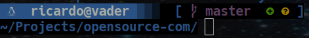
(Ricardo Gerardi CC BY-SA 4.0)
Here's the font preview generated with Fontpreview tool.
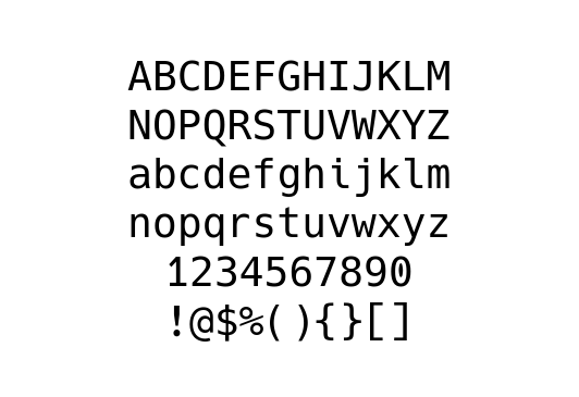
(Ricardo Gerardi CC BY-SA 4.0)
Victor Mono
I've been using Victor Mono for both my terminal and IDE for a few years. It's perhaps a bit of an acquired taste, because the italic characters are in a monospace cursive script. I like this because code comments have a distinct look that's noticeably different from the rest of the code. Here's what it looks like in a terminal:

(Chris Reynolds CC BY-SA 4.0)
I also use the Solarized Dark color scheme for both my IDE and the terminal. If I could, anything work or code related would all use the same color scheme, and the same fonts, so it all looks uniform. I've gone through various fonts over the years, but I always try to use the same thing in my terminal as in my IDE.
Monaco
At the moment, Monaco regular at 16 pt (so much better than 12 or 14 pt fonts).
Keeping it pretty in pink
This reminds me of the time I pranked the other devs on my team by making all of their terminals pink (I was the only woman). It was like a baby pink background with hot pink text.
I like to make my personal terminals pretty, but for work I leave it white on black and just make the font around 16 pt because I appreciate the larger font size.
I just leave my terminal set to SF Mono font, but I make it bolder and bump it up a few points so I can see it better. My favorite colors to use are pink or a nice aqua blue color. I also like the default style the terminal has, called "Novel".
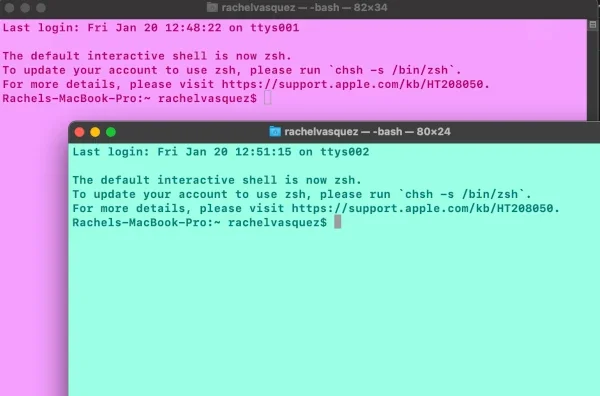
(RachieVee CC BY-SA 4.0)
Let's ask ChatGPT
For the heck of it, I decided to ask ChatGPT. Here was its response:
As a language model, I do not have personal preferences or the ability to have a favorite font. However, some popular terminal fonts include Monospace, Consolas, and Inconsolata. These fonts are popular because they are easy to read, have clear distinctions between different characters, and are highly legible even at small font sizes. Additionally, they are designed to work well with a variety of different operating systems and terminals, making them versatile choices for developers and users alike.
I generated this text in part with GPT-3, OpenAI's large-scale language-generation model. Upon generating draft language, the author reviewed, edited, and revised the language to my own liking and takes ultimate responsibility for the content of this publication.
Fantasque Sans Mono
$ grep font ~/.Xdefaults
URxvt*font: xft:FantasqueSansMono-Regular:pixelsize=12:antialias=true
I don't remember when I settled on Fantasque Sans Mono, but I guess it's been my default for the past 8 years now, both in Rxvt and Konsole. I don't know what font I'm using in my GNOME terminal. Probably whatever the default is on GNOME.
Jetbrains Mono
Lately, I have Tilix set as my default terminal. My Tilix config has similar settings to what Jim Hall uses. The few differences are:
- Cursor shape is underline instead of a block
- Font is Jetbrains Mono Nerd Font Mono Medium 14
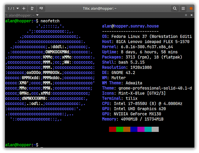
(Alan Formy-Duval CC BY-SA 4.0)


8 Comments