As an open community evolves, so does the way it expresses its identity to others. And having open conversations about how you'd like your community to be recognized is an important component of community engagement.
Simply put, your community's brand is what people (especially potential contributors) see first when they encounter you. So you want to make sure your brand reflects your community—its values, its principles, and its spirit.
And, of course, you want it to be something your regular contributors enjoy looking at frequently, something people are proud to wear on their conference t-shirts and place in their email signatures. You want it to be something that grows with the community for years to come.
The Open Organization community balanced all these considerations for months as we developed our own new logo and brand. In this article, we'll share how working the open way led to a spectacular new visual identity for our project.
Why rebrand?
In 2015, many of us (some for years) had been thinking about the role open principles can play in organizational transformation, and we'd been working to help others understand open culture. But we tend to celebrate one particular moment—publication of The Open Organization by Red Hat's then-CEO, Jim Whitehurst—as the genesis of the Open Organization community. The ideas in that book, and the initiative behind the “Ambassador" program, helped us find each other. So when we needed a symbol for our collaborative work, we simply adopted the logo so clearly and boldly positioned on the book's cover.
Yet The Open Organization was only one book, from one author, in one industry, in one part of the world. Even Jim acknowledged its limitations, noting that the book:
"… raises the question, what else is possible when we put aside our conventional organizations and begin to tap into the power of participative communities in all aspects of our lives and businesses? The potential is limitless, which is why I invite you to join our journey by engaging in the discussions on opensource.com."
Our community’s collective experience with those very participatory communities demonstrated—and continues to demonstrate—exactly what else is possible.
Together, then, we were able to augment Jim's experience at Red Hat (though we always welcomed his perspectives along the way). Over the past half-decade, the Open Organization community has grown from a small group of passionate people debating nascent ideas about the "cultural side" of open source to a bustling bunch of thought leaders who have literally written the definition of what it means to be an open organization. To put it in open source terms: Our entire upstream project continues to evolve from that founding gesture.
But to identify and represent ourselves, we continued using the logo from Jim's book. And too often, that meant people who encountered our work confused our vibrant community full of so many thinkers, writers, advocates, coaches, consultants, and leaders with ... a single book by a single person (albeit a great book by a well-respected person, which we never minded!).
We needed a new look—one that better communicated our identity as something much bigger.
How to get started
Red Hat's Open Studio graciously offered our community some branding help. These are the rockstar designers and brand strategists behind all of Red Hat’s corporate marketing initiatives (including the high-profile Open Brand Project)—so, naturally, we said yes.
Because understanding the community and what it represents is an important first step in developing a coherent brand, the Open Studio needed to get to know us.
They started joining our monthly calls, studied our community history and values, and explained that we should consider one of two strategic directions: evolving what we've built and creating something brand new.
Faced with branding decisions, any open community could follow these general pathways. Here's how they worked for us.
Option 1: Evolve what you've built
How do people already know you? Does your community reuse the same colors or patterns in the brand it has built over time? Ours certainly did!
In our case, the look and feel of the Open Organization book significantly influenced our community's brand and identity. We'd used it consistently and continuously since launch (just take a look at Figure 1), but the typeface and general color scheme remained strongly reminiscent of Red Hat. The overlapping, outlined shapes represent transparency and openness, which certainly resonated with our community's values, but the scale was all wrong for use as a logo. After all, this design was meant to act as an eye-catching book cover—but it wasn't built to do much more.
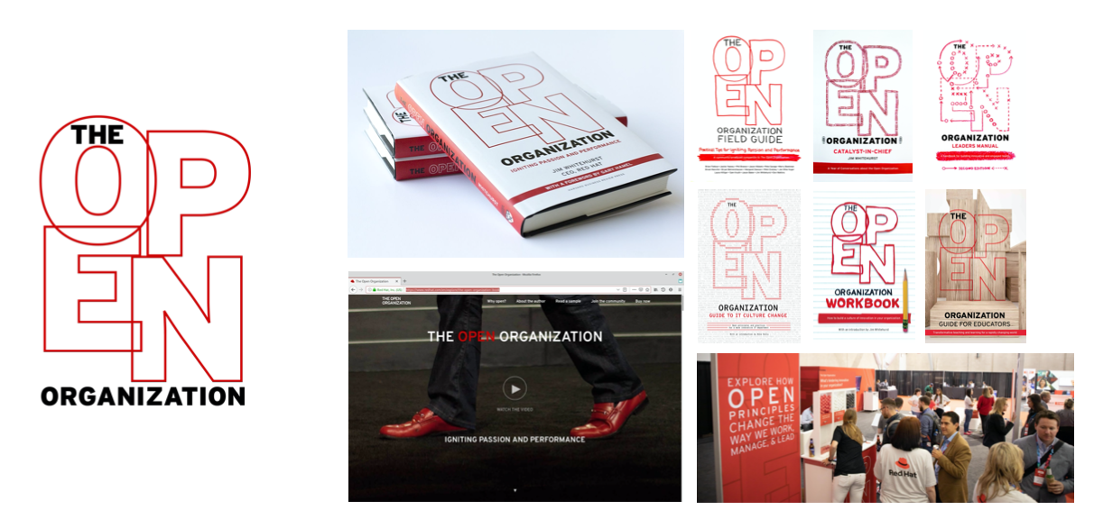
Figure 1: Our original logo and brand, in action
So one option available to us was to evolve this design, iterate on it to create something reminiscent of the familiar cover design but still fresh and compelling. So the Open Studio showed us a few mockups of what our brand might look like if we chose that path.
Option 2: Start something new
Taking a brand in a new direction is always a little risky, as any recognition (or "brand equity," as we heard the designers say) might be lost in the transition. Past work will look different, and people might be confused about the association between our work from then and now. But making a clean break with the past could also have benefits. For starters, it meant we were more free to imagine something wholly new.
So designers in the Open Studio also presented us with a second option, one that looked (in many ways) radically different than where we'd begun.
Making a choice
So we had a choice to make: evolve what we'd built, or launch something new?
Community discussion was lively. We worked with the Open Studio through three rounds of feedback and iteration, and, in the end, we decided to forge a brand new direction (see Figure 2).
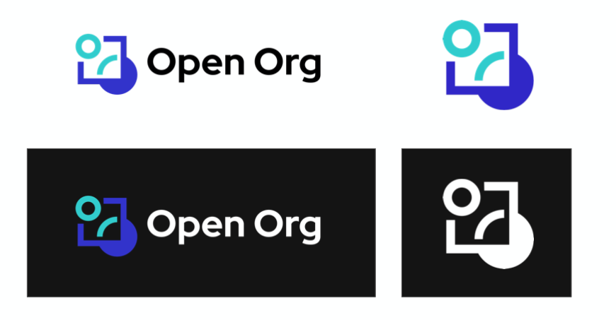
Figure 2: Our new logo, icon, and color scheme
The new brand incorporates circles or bubbles, shapes commonly used to represent collaboration and community. The square around the icon represents a traditional organization (see how the open principles cut through it?), and the broken strokes and white space signify transparency and adaptability. And to be sure the design expressed all five characteristics in the Open Organization Definition, the Open Studio incorporated inclusivity by—well, including our community in the entire design process itself. We also thought the symbol looks a little bit like a hug—a strong selling point for us!
Open Studio also supplied us with a consistent, flexible color palette, brand guidelines, and loads of tips on using our new brand powerfully and consistently. We’re extremely grateful for the help they provided.
The clearest measure of our successful collaboration is easy to pinpoint: Seeing our new logo makes us all smile.





Comments are closed.