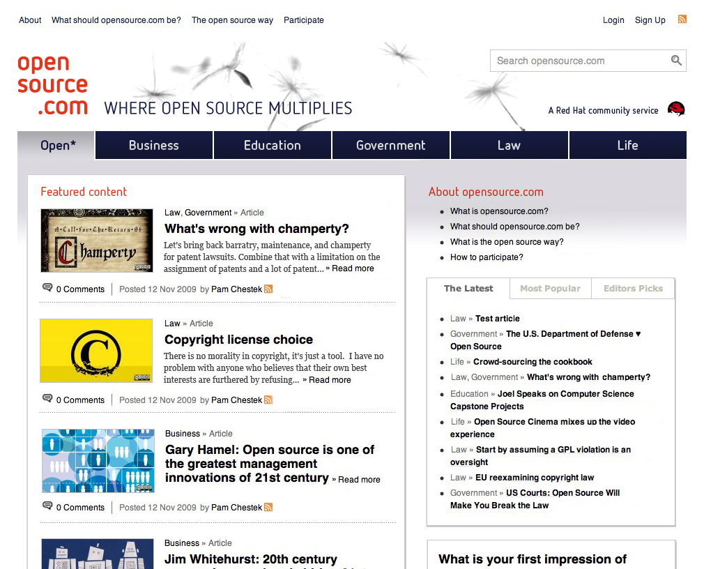
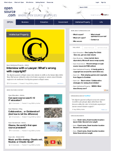
As you might imagine, we went through several site designs before arriving at where we are today. Our user feedback indicated that from our original design, the content was too far down the page. The featured articles were below the fold and there was not enough teaser text to entice our readers. We listened to our users and came up with the following design.

As you can compare from one of the original designs below, we reduced some space from the main navigation, got rid of the large images from the latest article posted to the main page, included more teaser text on the featured content, and added some gradient to the background.

This is where we are today. Our intentions are to continue to listen to our community and make improvements. We think these improvements bring the content to the front and make the front page more interesting and engaging.


Comments are closed.