Why do some people choose to make a website accessible? Some people are do-gooders who, like the World Wide Web Consortium (W3C), believe that "the web is fundamentally designed to work for all people, whatever their hardware, software, language, culture, location, or physical or mental ability." And, some people do it because they are compelled by law, based on Section 508 of the Americans with Disabilities act. Most federal and state institutions require that websites are accessible to people with a variety of disabilities. Though they may want to do good, their main motivation is to avoid costly legal problems.
No matter what your motivation is, everyone benefits from creating accessible websites. Four unexpected benefits of creating accessible websites include:
- Improved search engine optimization (SEO)
- Better user experience for all visitors and all devices
- Avoiding costly and embarrassing lawsuits
- Increasing the audience for your website by making it more inclusive
SEO
The W3C Link Purpose document describes how to properly label URLs: "The purpose of each link can be determined from the link text alone or from the link text together with its programmatically determined link context..." In short, links like this are not accessible:
- "More"
- "Read more"
- "Learn more"
- "Click here"
Just like you, people who use screen readers browse a page by looking at the headlines and links. As they tab through the site it reads those links to them. If the computer reads "More" the user asks, "More what?" There is no context to the link's purpose. Suggestions for better links:
- "More news"
- "Read full article"
- "Learn more about open source"
- "Click here to read more about Linux containers"
What does this have to do with SEO? Keywords in links are more valuable than plain text. For example, with "Learn More About Linux containers" you just added two keywords to your content. Good job! Bad link text is a missed SEO opportunity.
User experience
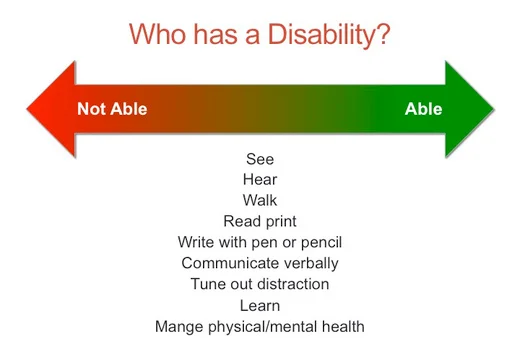
Chances are you have experienced a disability today. We experience temporary artificial disabilities on a daily basis, and the environments we are in change our abilities.
The devices that you browse the web on also have a variety of abilities for disabilities.
|
Disability |
Simulation |
Solution |
|
Impaired vision |
Use a phone in bright light |
Use higher contrast ratios on text |
|
Tremors / Arthritis |
Use a phone while walking |
Make touch targets like buttons larger |
|
Hearing loss |
Use a phone in a noisy rooms |
Put captions on videos |
On a day-to-day basis, even hour-by-hour, a person's abilities and disabilities change on a spectrum. Some people are always blind or have limited sight. Perhaps you need glasses. Perhaps you have 20-20 vision. We all live on this spectrum.

Legal
Harvard and MIT learned about the legal ramifications the hard way when they were sued by the National Association for the Deaf (NAD).
The fear is that as we move into the digital age, we're faced with a two-edged sword because in some cases, of course, technology can make the world more accessible to individuals with sensory impairments or disabilities. But in some cases, it can prove to raise new barriers and re-segregate our society. And that's why this issue is being so heavily litigated by individuals who fear that they're going to end up on the wrong side of the digital divide.
Being on the wrong side of this kind of litigation is far more expensive then dealing with it proactively, and this is not desirable publicity.
Audience
People prefer websites they can use. Half of people over the age of 40 start to experience presbyopia, which is normal age-related loss of the near-focusing ability that leads to the need for reading glasses or bifocals. Over 48 million Americans are deaf or hard of hearing. Over 7 million Americans are blind or have low vision. By making a website accessible it increases your audience to include those people.
How to get started
All the resources you need are open, and you can start improving today.
Start by testing your website for accessibility using the WebAIM Web Accessibility Evaluation Tool. It will point out problems as well as explain the success criteria to make your site pass. There is a free online version as well as a free Chrome extention.
Next, read these resources:
- Introduction to Web Accessibility
- Web Accessibility for Designers
- Getting Started with Web Accessibility from the W3C
I hope you will choose to keep accessibility in mind on your current and future projects.


5 Comments