Highlights from the next iteration of Opensource.com

We improved readability and your mobile experience.
422 readers like this.
Website updates

Opensource.com

The Opensource.com team has been working earnestly with our development team at Bluespark to release the next iteration of the site redesign we shared with you in October. Keeping our three goals of improved readability, mobile experience, and related content top of mind, we're ready to reveal a much "lighter" version of Opensource.com to our community.

I must first mention, that I would have preferred to share this update with more advance notice to our community. Our original plan was to do this code release at the end of June. We got ahead of the project timeline and the stars aligned to schedule the code release for the morning of Wednesday, June 14. With that said, my team has been tirelessly performing quality assurance in our development and staging environments.

While we probably missed a few things, I think you'll enjoy the new look. And maybe, by the time you read this, it will be on a new, lightweight version of the site. With that, I'd like to share a few highlights.

Improving readability

The first thing you'll hopefully be relieved of is the removal of the dark grey background. Gone! The fonts, font-weights, and line-heights have remained the same, and we've increased the text width just a touch. Bigger headlines and sub-headlines on article pages for those of us with aging eyes or larger screens.

sample_article.png

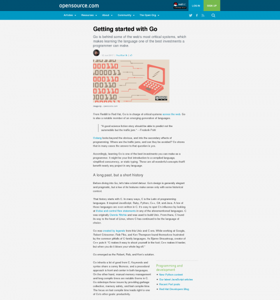
Preview of new article layout

Improving mobile experience

The second thing you may notice is a more streamlined header, thinner, crisper, and more mobile-friendly. The article pages now have a single-column layout (see ablove). We've added a short author bio at the top of articles and moved the expanded version of the bio to the bottom.

We've made a few adjustments to our hero-spot, the first area on the homepage where we are able to highlight a popular article. Our "tag" (also known as taxonomy) pages got a slight overhaul to match the new look and feel (see screenshot at the bottom).

homepage_sidexside.png

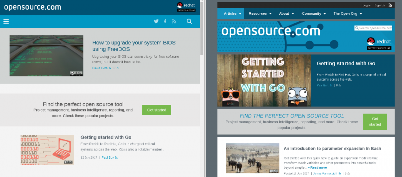
Side by side view of the new (left) and old (right) homepage

Providing better related content

While you're reading an article, you may notice a more eye-pleasing section at the bottom where recommended articles are shared. We removed the "boxy" feel and made it a more natural feeling part of the article. Lastly, for some of our more popular content including but not limited to programming, cloud, hardware, and other topics, we've been adding in additional menus as part of the articles—to hopefully link you to relevant content to help you continue your journey and exploring the world of open source.

sample_tag.png

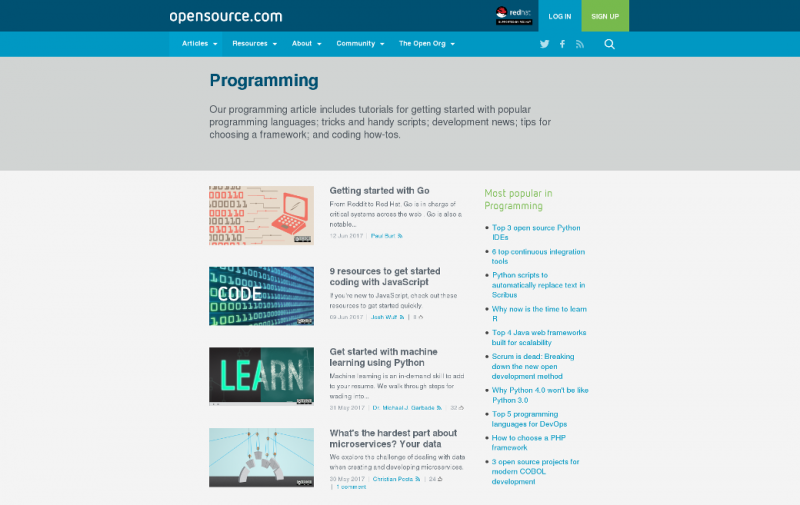
Preview of the taxonomy tag page

Feedback from readers

As always, we welcome your feedback and bug reporting. I'm really excited that this release will deliver a better reader experience on both desktop and mobile for Opensource.com community members and other visitors.

Chime in on the comments or send us an email.

Avatar
Jason Hibbets is a Community Director at Red Hat with the Digital Communities team. He works with the Enable Architect, Enable Sysadmin, Enterprisers Project, and Opensource.com community publications.

Contributors

9 Comments

redesign looks great! opensource.com already is a good designed website, but these tweaks make it even better. TNX

Code deployment is live and things are looking great. Please let me know if you find any issues or bugs by emailing open@opensource.com or add a comment below on what you like, or don't like.

Jason

Personally, I read English left-to-right, top to bottom, and feel old: Almost every web site I use becomes ever more vertical. This site now uses less than one-third of the available horizontal space available to me, making scrolling ever more necessary to read content. Although you say you've actually widened it. I think for me, maybe the removing of the dark gray has made the sides feel too bright and highlights the emptiness of the screen...

I like the thinner top of the page though.

Thanks for your feedback. A few thoughts on that. We want to be single-column to be more responsive to the variety of different devices people are using. Phones, tablets, side-by-side browsers on the desktop, etc all come to mind. For the line width, we did some research about this and found a few studies that say longer lines of text can be hard to read, so we're trying to find that delicate balance. Of course, there are varying opinions about this ;)

In reply to by kjcole

This is where, I think, there needs to be more education and browser flexibility so that users can easily and quickly have multiple customizable CSS -- so that I can "Zen Garden" the hell out of whatever sites I visit and not care what the designers prefer.

(When designing pages for someone else, I don't claim any artistic / design skills. I just make sure they contain valid HTML5, CSS, and that WAVE [http://wave.webaim.org/] doesn't complain too much about accessibility.)

In reply to by jhibbets

I like this format a lot.

I think the narrow line length makes reading much easier. I find that if I am reading something online that stretches across the screen I'll get about a third of the way across and start the next line.

That's my version of speed reading.

The narrow format is like a Teleprompter: I can keep my eyes fixed in one place without going back and forth. Scrolling is no problem, and being somewhat chronologically challenged with less-than-perfect vision, I find this very readable.

Even on my mammoth 27" iMac screen, the extra space on the sides does not bother me.

Just one note: in the "improving readability" section you have an unnecessary apostrophe::: and sub-headline's :::

Thank you.

You know, I went back and forth between sub-headline's and sub-headlines. That's for settling the debate ;)

Appreciate the feedback, enjoy the easy reading.

In reply to by JeffMacharyas

This update certainly does give the site a nice "fun and inviting" feel to it.

I do, however, miss having the ability to see how many comments an article has without having to click into the article. I often returned to the main page of Opensource.com to quickly see if there was any new discussion on the articles that interested me. Now I can't really do that.

Creative Commons LicenseThis work is licensed under a Creative Commons Attribution-Share Alike 4.0 International License.